

Your mage at 40% and rearranged to make it easier to read in Typophile's small window:
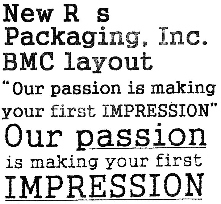

Very close to Courier (e.g. from Linotype) but it better matches to HY GungSo (Bold) available from Adobe.
I think the same glyphs are used in the Roman set of Gungsuh a Microsoft font supporting many codes pages and designed by HanYang I&C Co.,LTD. [2000]:
http://www.microsoft.com/typography/fonts/font.aspx?FMID=1512
You could use Serifa http://www.myfonts.com/search/serifa/fonts/ as a fairly similar substitute if you don't have a copy of HYGungSoStd or Gungsuh at hand. If you have a recent version of Windows you have Gungsuh installed.
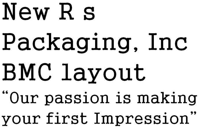
Captured from commoncrawl.org on 27 Apr 2015. original URL
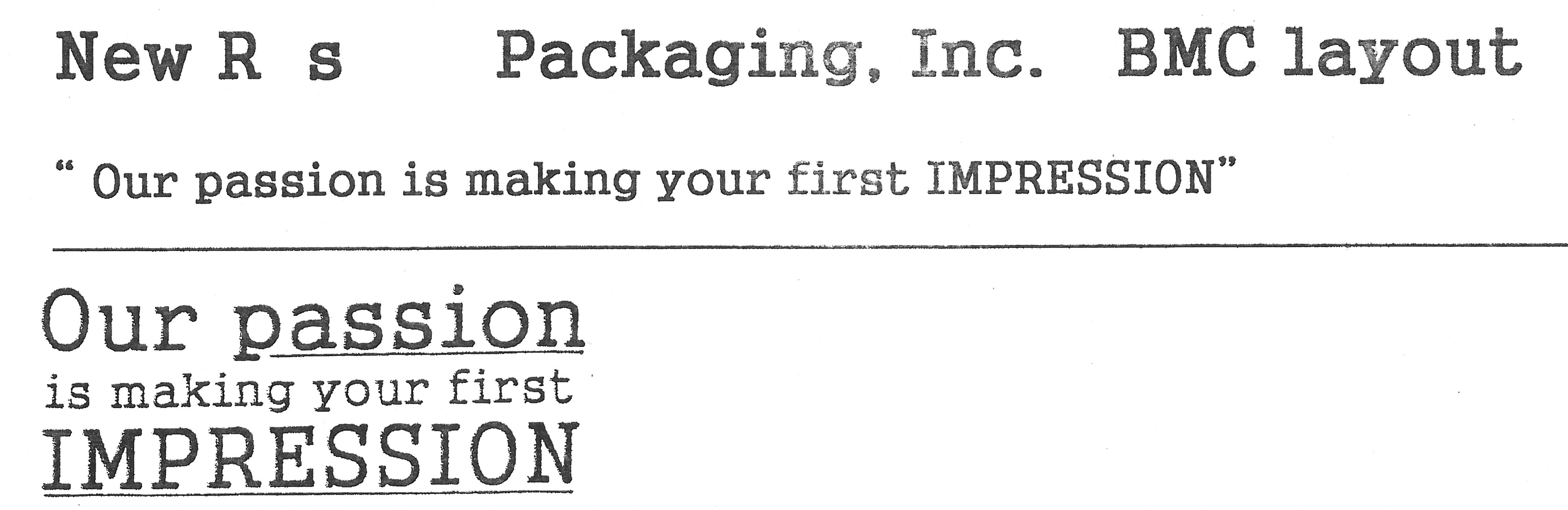
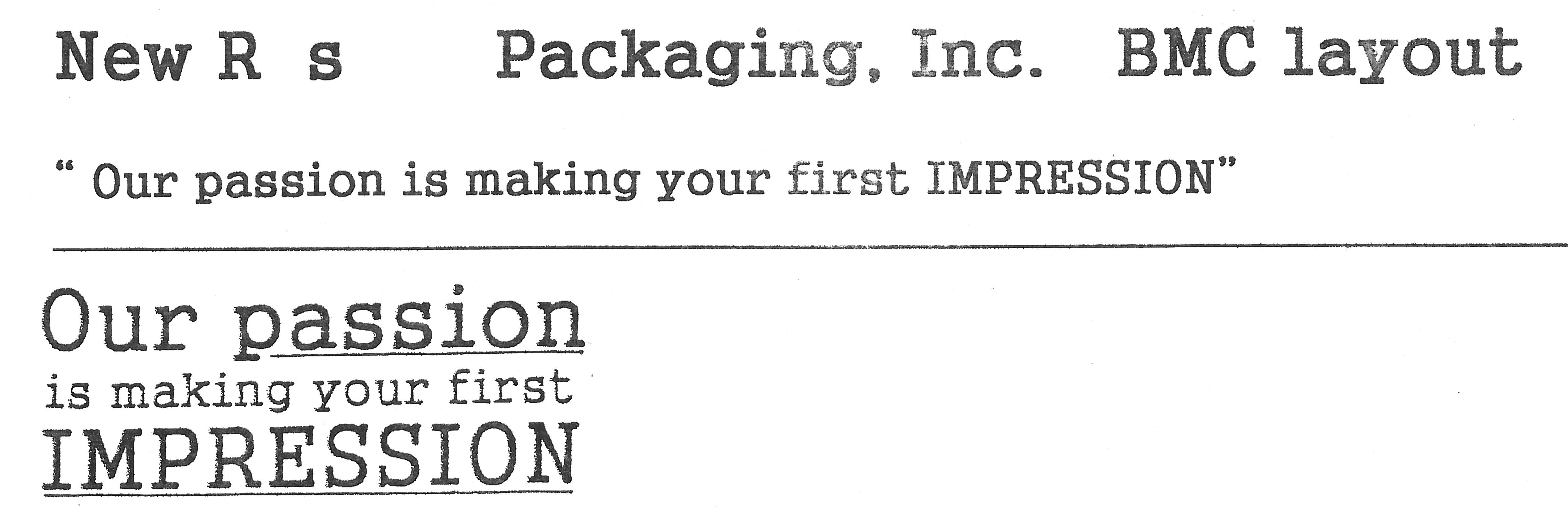
I checked the Latin glyph outlines in HY GungSo (Bold) and Gungsuh. I confirm that they do indeed match.
Don