
Black Letter font used on Skids label?
| Attachment | Size |
|---|---|
| 142728b 2.jpg | 57.36 KB |
Black Letter font used on Skids label?
| Attachment | Size |
|---|---|
| 142728b 2.jpg | 57.36 KB |

1979, the photo-lettering era. I'm not certain if this one is digitized.
I'ts a variation of Fette Fraktur first cut by Weber in 1875 http://www.myfonts.com/search/fette+fraktur/fonts/
There are significant differences in some capitals, less so in the lower case.
The _S_ might be an enlarged _s_.
If this was not a photo-lettering era redesign, a match might be found Gerhard Helzel's collection http://www.fraktur.biz/
And it's interesting to explore the Blackletter Revival at Moorstation at http://moorstation.org/typoasis/blackletter/
I would be interested in what our fraktur experts have to say.
Don
Hi, thanks for the reply - agree it looks like Fette Fraktur but it looks like a black weight and I agree it looks like they enlarged the lowercase s for cap S.

See Ralph Unger's version of Haenel Fraktur. Your lowercase 's' is in the number sign position and the 'k' is a tz ligature offered in the character set.
Note that if this was done with photolettering, they had all sorts of tricks to optically alter film fonts (wider, bolder).
Thanks, Don. Widening alone won't do the trick, as the counters end up too large (I tried it). Stretching and adding a slight stroke does get it very close.
Mike, this shows that some effort was put into making a new font from the original Haenel Fraktur model.
As you know the photo-lettering companies had very creative designers who completely redrew classic designs. Then the photo part came in to create the variations. But I still have no idea whether this redesign was done in that era or many years earlier. Also I would love to see a complete alphabet.
Don
Walden fonts offers an even narrower version.
Luc Devroye's page on Haenel.
Google Books offers a viewing of an old book that shows the typefaces (and decorative elements) of the Haenel Foundry. I went through the whole long thing and the only place I spotted Fette Haenel Fraktur (not with that name) was roughly 3/5 of the way down (no page #s) - and that was an outlined/shaded showing of a few words only.
Interesting viewing, nevertheless.
Mike, this is a fascinating book showing a huge variety of typefaces from around 1840 to 1850. I recognize a few as being digitized. As was the practice of the era almost none have names. Only stock numbers. Even different sizes of the same typeface have different numbers. Not certain if this is the one you are referring to, but I selected it because of the elaborate encrusted ornamentation
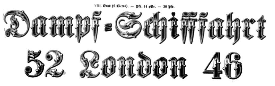
This is the image I found (unretouched):

So when its label reads ...
Zierschrift
No 64
... Zierschrift isn't part of the name? If not, I guess it just means "ornamental writing" (as Google translates it).
As an aside - Insert Image works for me maybe once in twenty tries, whether using IE or Chrome. VERY frustrating. Does anyone else have that problem?
Yes "zeir" merely means fancy or ornamented and can be applied to any font. "Shrift" is correctly translated by Google. You will note similar terms such as "zeirfraktur" which is a compound with an obvious meaning.
Insert image works fine for me in Firefox. Using jpg with standard file names, e.g. ones that do not include _&_.
Don
Thanks, Don. File name definitely isn't the problem. Grrrr ...
The "new and improved" version is on a CD with the Virgin label. I wonder if Virgin released any other CD's circa 1979 with the same version? If so, another Virgin CD might show some more "new and improved" letters.
Don
I have a copy of the original 1979 album, but presently not to hand as it's in storage. I remember the sleeve was with-drawn or banned fairly soon after it's release as it was considered Fascist imagery (and replaced with an alternative design). It won't be Photo-Lettering Inc. as it was designed in the UK but it is probably photo-set by one of headline setters that were around in London at that time.
Fascinating. Political correctness at work. A Brit designer tried to break out of the mold and got slapped down. in 1979. Very sad.
Perhaps today it would be accepted as a statement of Los Angeles Street scene or hip Biker Style.
Don
Captured from web.archive.org on 1 Jul 2014. view this capture

Good find Mike. If you widen Haenel Fraktur most of the letters match. _S_ is indeed an enlarged _s_. _A_ is reworked to make it more readable as a Latinate form and _H_ is also a reworked _A_. I expect that other capital letters not in the label were also reworked to make them more readable as Latinate forms.
Don