Hi Philes!
I've been working on a brand refresh for a company focused on fashion entertainment.
The original logo was perfect for at startup at that time, but their strategy has changed alot since then... and therefore a logo-update has become a hot topic :-)
The logo is loosly based on some spikes seen in Tryon Park in New York, where the founders got the idea for the company.
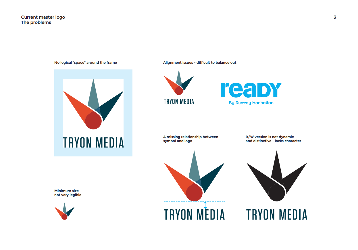
The problem with the current logo is alignment-issues, not very legible in small sizes and lack of character - especially in B/W... and so on.
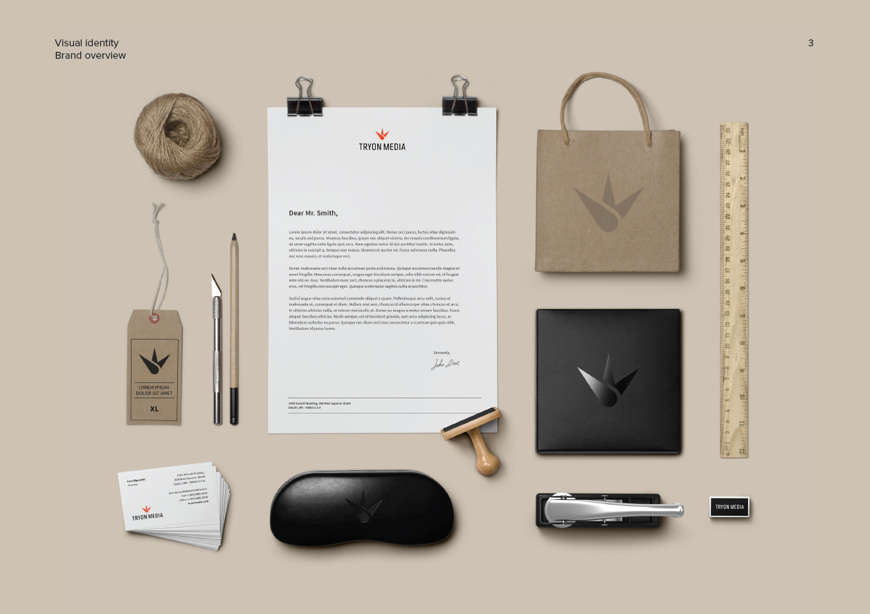
I've included some excerpts from the presentation.
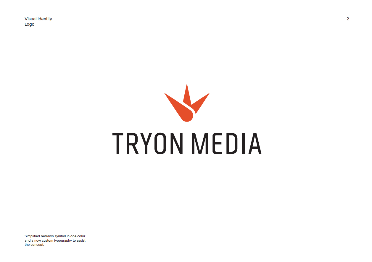
Anywhooo... I've recently presented a new redesign which they love and we are starting to plan the roll out of the identity.
The new design is more simple and with respect to the original idea.
But I'd really like your input on how to properly set some guidelines for this logo - I mean, how to set some rules for the individual sizes of symbol and logotype? Until now I've only done this by eye and simple guides - and the client is requesting a mini brand manual now and my experience is rather vague.
So please guide me you cool type-people :-)
Thanks!!
/S