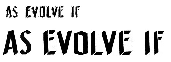
I believe the original font had extra strokes around the letters as seen in the small version of this. In the larger version I think someone edited out those strokes to give it a cleaner look. Any leads are greatly appreciated!

| Attachment | Size |
|---|---|
| asevolveif.jpg | 18.29 KB |