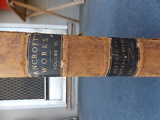
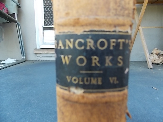
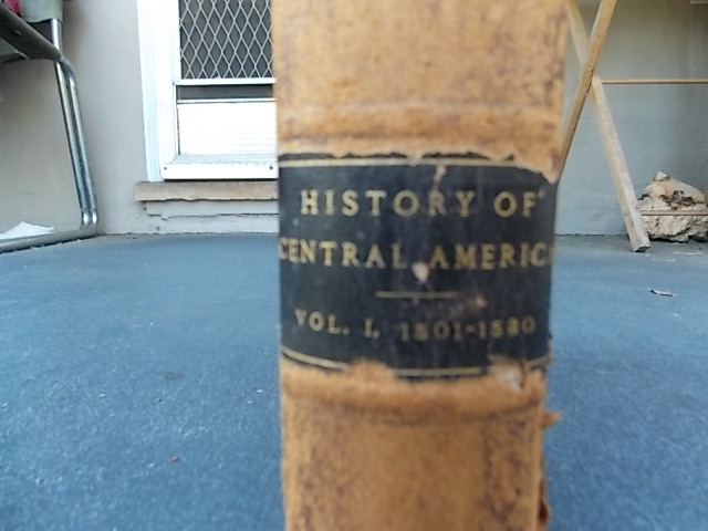
Attached photos are from a volume of Hubert Howe Bancroft's history of western North America. The series was published by subscription from 1883-1890 in 39 volumes, and the fonts used on all volumes are the same, so the font(s) we're looking for would have to have been available over that timespan. Place of publication was San Francisco. All appear to be in some form of Oldstyle, but they don't seem to correlate to anything I've seen in BB&S, ATF or McGrew. Title (Bancroft's Works) is about 5.5mm, which I estimate to be 20pt. The series volume and subtitle are about 4mm (12pt?). The volume and date on the last line of the bottom label appear to be a shorter, expanded version of the same font, and height is about 2.5mm.
The noteworthy features of the two primary fonts are the curve of the capital R; the absence of any serif on the center peak of the W; and the parallel legs of the M. More contemporary oldstyle fonts don't combine all three of these characteristics.
Excuse me if my terminology is amateur, as I'm still relatively new to this. Also pardon me if this message seems to have been posted in substantially similar form twice, I think I lost the first one due to operator error.
Thanks for your help.
| Attachment | Size |
|---|---|
| DSCN0418.JPG | 130.92 KB |
| DSCN0419.JPG | 128.27 KB |
| DSCN0420.JPG | 124.51 KB |