
Hi everyone!
This is my first post! I've currently just started a course specialising in digital design and have an assessment that I need to get feedback on from other designers. I'm still very new to this but here goes nothing!
The main objective for the assignment was to create a shirt and poster for the Salvation Army that can be ordered online; it should showcase their efforts to help and show compassion towards others. I designed my shirt to aim at a broader audience, whereas the poster is intended to show the effort the salvation army has made since 1865.
Please! Any kind of negative/positive feedback would be greatly appreciated!
Thank you so much!
Ben.
PS. I don't know how to change the size of the image, I know that it is too big to see so I have attached copies below.
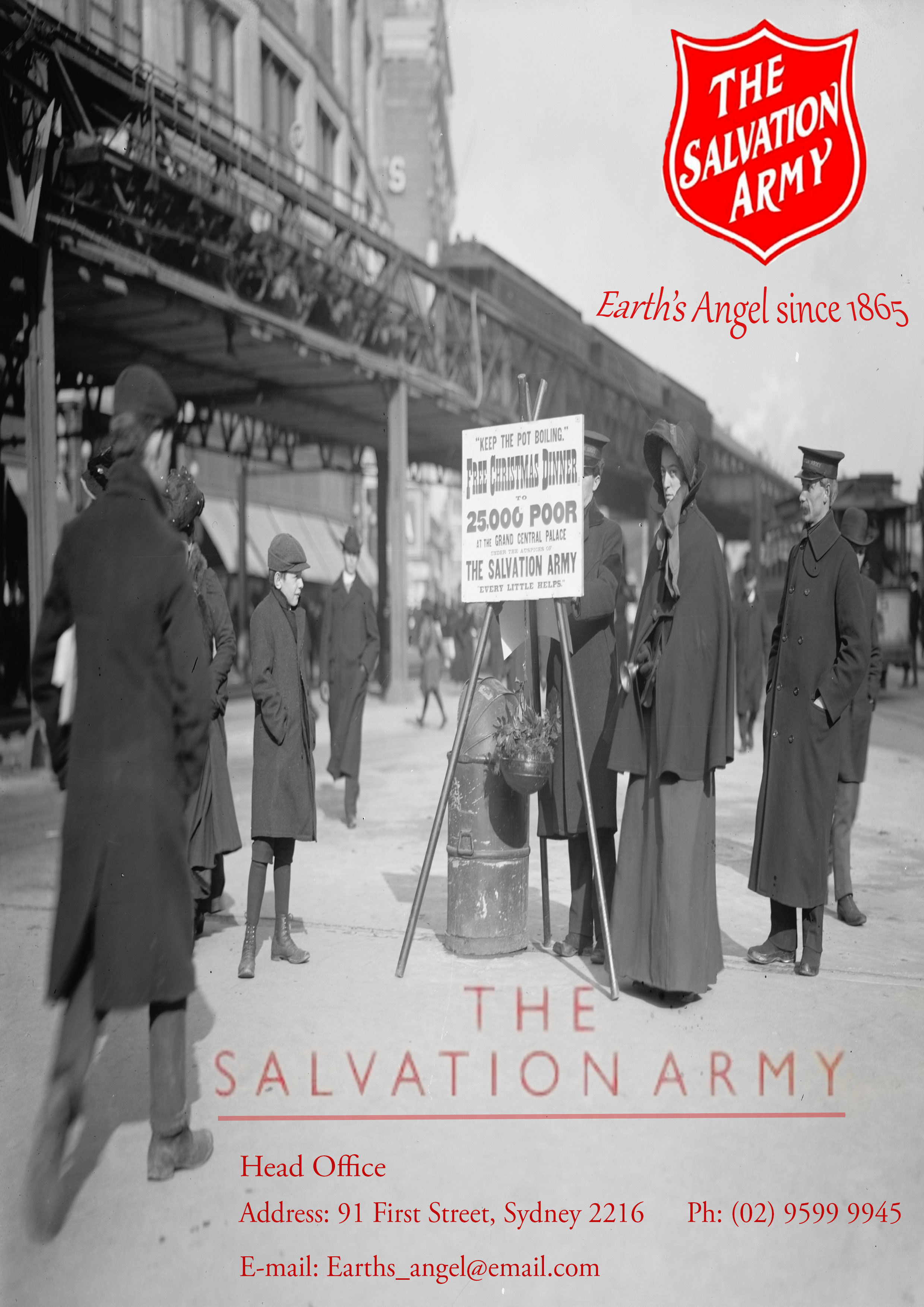
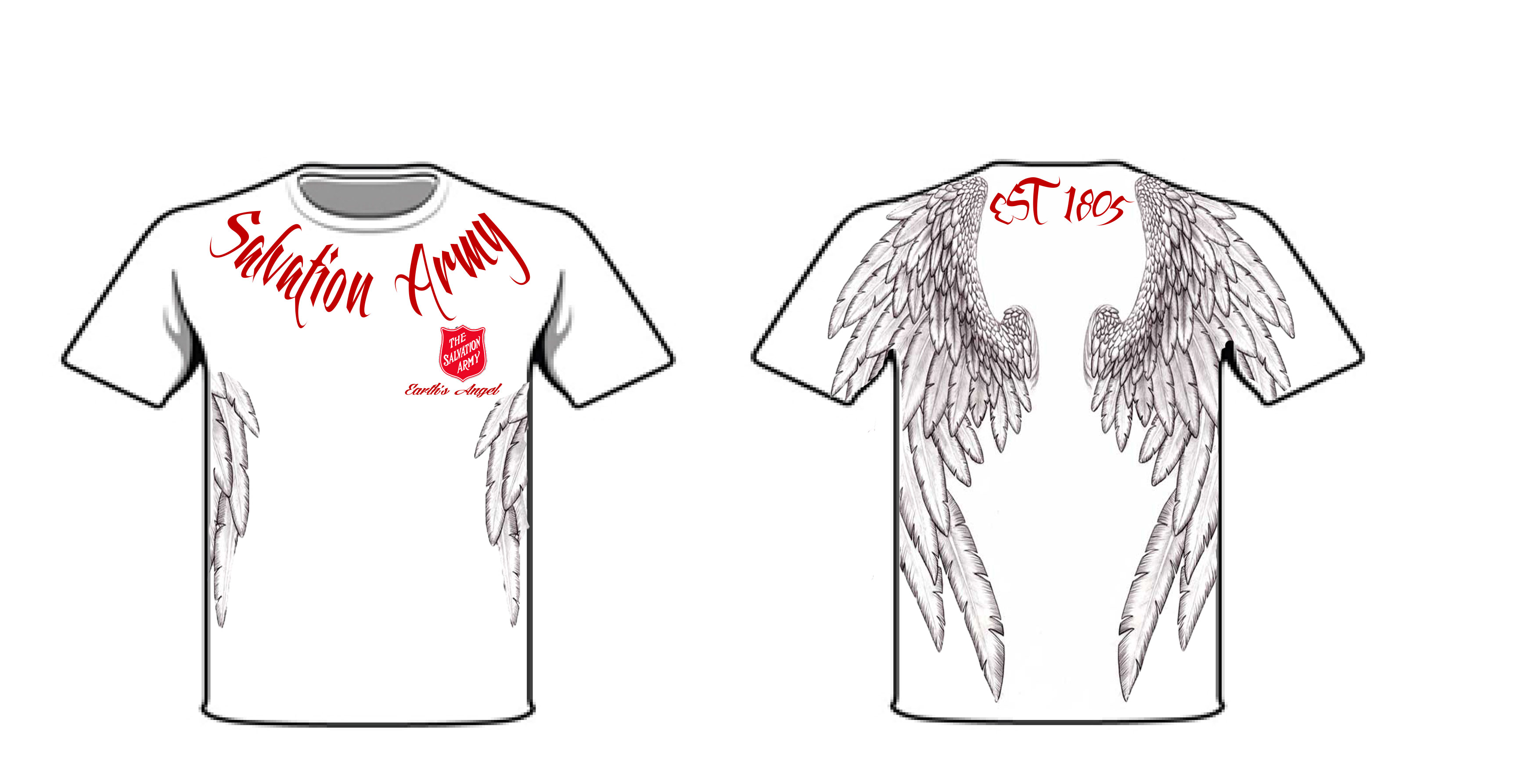
| Attachment | Size |
|---|---|
| SALVATIONPOSTER.jpg | 888.03 KB |
| DraftSalvosShirt.jpg | 412.24 KB |


Not to put you on a specific path, but if you're seeking to speak to a larger audience, why not take a modern approach? You can still use some old images to give it a nostalgic and perhaps even a euphoric feeling (I'm thinking of Monty Python, but less wacky), but perhaps you ought to think of it as a brand that needs to speak to a lot of people. The wings are quite specific in style and exclude a lot of people already, though I do like the idea of using wings. Be careful not to make it look pretentious though.
A red background and a friendly looking sans serif (something like Gloriola perhaps) may put you on the right track. Certainly try to limit the amount of typefaces you use to two. Their logo also feels outdated, though perhaps you do need to refer back to when they were established, but I'm not sure you ought to do that with typography that is not of this time, as it excludes a lot of people.