


Is this embroidered lettering? If so, embroidery machines often have their own fonts.
- Mike Yanega
is there any similar font like that?

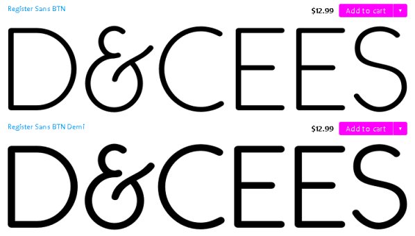
The ampersand is similar to some Art Deco and Speedball designs. For example Register Sans BTN
As for the capital letters, you might like Mark Simonson's Goldenbook http://www.myfonts.com/fonts/marksimonson/goldenbook/ which has capital letters similar in proportions to your sample and also has similar tiny serifs. It has a late 1920's flavor.
Don
Captured from web.archive.org on 14 Apr 2015. view this capture