
Hi,
Does anybody know the typeface/typefaces used for the classic London A – Z map?
Any help would be much appreciated,
Thanks in advance,
David
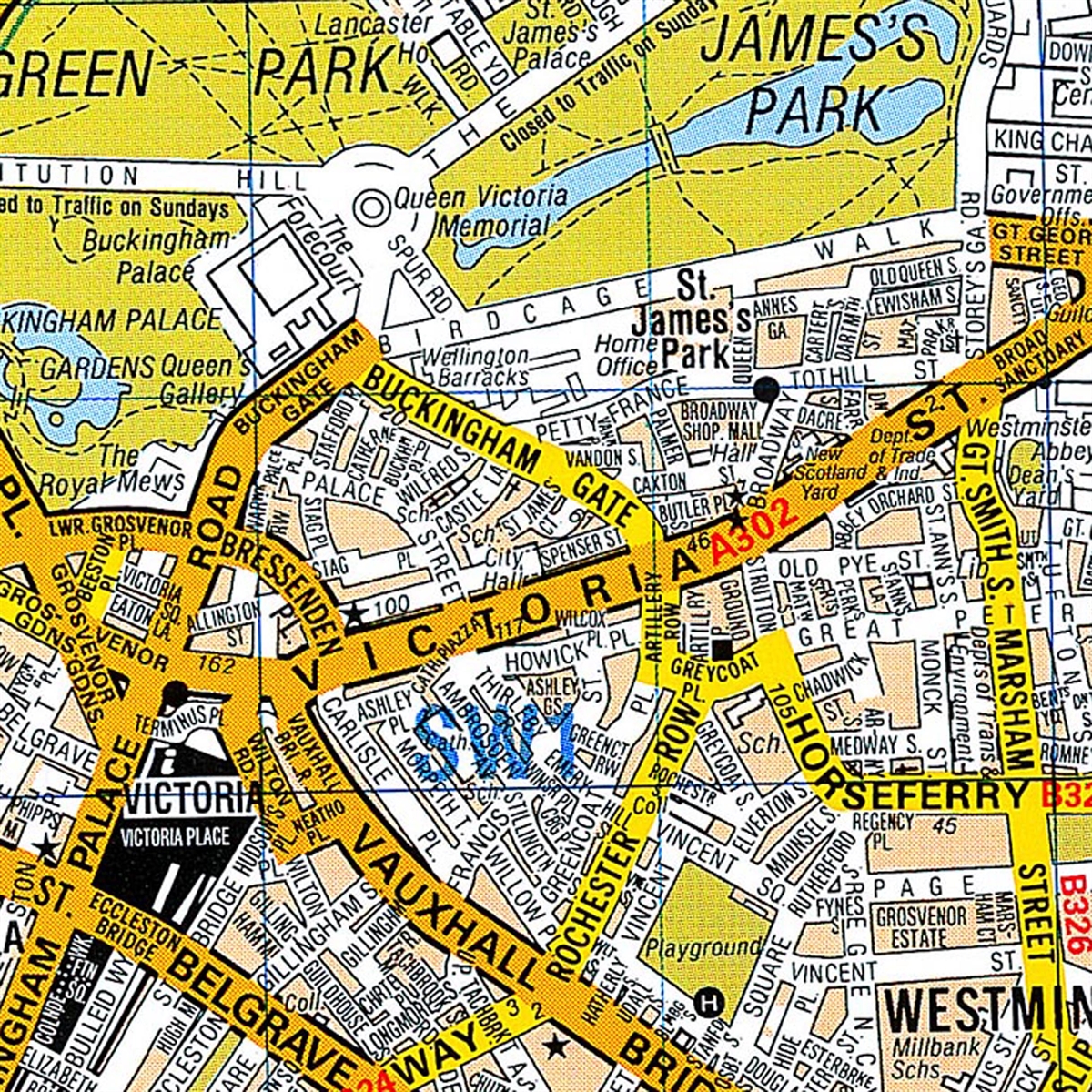
Hi,
Does anybody know the typeface/typefaces used for the classic London A – Z map?
Any help would be much appreciated,
Thanks in advance,
David
Various weights and styles of Univers?

Here's a recent discussion on this topic: http://typophile.com/node/115367
No formal conclusion. I firstly saw Helvetica then somebody else tended to see Univers...
Ah — thanks for the link to the other topic... missed that one.
And thanks for your help — I thought it was probably helvetica/univers also.
Captured from web.archive.org on 24 Jul 2014. view this capture
I recall something like this from the pre-digital era. Indeed, the map design may date from before Univers was created. Looks like versions of Grotesque [Stephenson Blake; Monotype] The narrow letters could be Monotype Grotesque No. 4. But looking at the variations and odd alignments I feel it was probably engraved rather than typeset.
Don