Typophile

Curvy plump slab serif

james millner
Font: 
Heineken
Solved By: 
R.
AttachmentSize
da2YCQU.png267.86 KB

To me, this looks like a free font called ‘Heineken’, mimicking one of the bolder weights of ‘Heineken Serif’, the corporate typeface Lucas de Groot designed for the eponymous Dutch brewery. I’m not sure about the legal status of the free font. Decide for yourself if you find it ethical to use it!

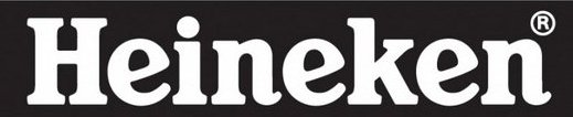
My information is that Alfred Henry Heineken, grandson of the founder, helped develop the wordmark. Note that _e_ has an angled crossbar which suggests an open, i.e. "friendly" style appropriate to beer drinking. The friendly style is continued in the italic style right hand terminals for the n, and the soft rounded outlines of the font
As for the "Heineken" free font, I believe it was developed by a Dutch Heineken fan -- known only as Shamrock -- from the wordmark rather than from the corporate fonts developed by Lucas de Groot [LDG]. In support of this view I note at least three major differences between the LDG and Shamrock letter-forms. 1. _Q_ In LDG _Q_ has a simple tail that does not cross into the counter. In Shamrock _Q_ has a florid tail that swirls up into the counter. 2. _g_ In LDG _g_ is single story. In Shamrock _g_ is two story. 3. _r_ In LDG _r_ has a ball terminal that flows into the stroke. In Shamrock _r_ has a boxy terminal. Both designs are based on very conventional letter-forms that are the logical extension of the wordmark.
I do see a problem in using the "Heineken" free font. The name may infringe the Heineken wordmark or trademark. In other cases where fans have made fonts based on logos they have taken the precaution of changing the name of the font. For example the Coca Cola logo was used as the starting point for a font, but the font is named Loki-Cola.
Disclaimer: This is not legal advice. If you are considering using the "Heineken" free font in a commercial project, see a lawyer.
Don

Thanks Don and R. I don't want to use the font, but wanted to know about it because I couldn't work out what it was - I could find nothing similar.

Somewhat similar Goudy Heavyface http://www.myfonts.com/fonts/adobe/goudy-heavyface/
Don

Some letters of Cheltenham have a similar feel, but others are way off. Also vaguely similar: Centro Slab and Plume.

Captured from web.archive.org on 2 Jul 2014. view this capture