Hey guys,
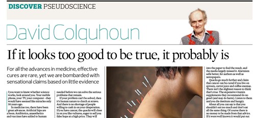
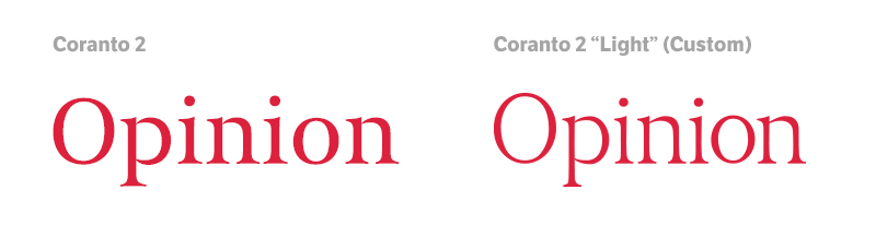
About six months ago, I spent several months redesigning a broadsheet newspaper, and we purchased Coranto 2 and LFT Etica as the pairing for it. I'm extremely happy with it.
We use Coranto 2 Headline for headlines (and sometimes LFT Etica for smaller story headlines and for all headlines in supplements that come with the paper), Coranto 2 for body text, and LFT Etica for things like writer bylines, sub-heads, drop quotes, and the like.
However... I can't help but feel that LFT Etica is a bit boring. I would like to spice things up a bit with a third choice, perhaps for using in things like block heads and under photo captions. I don't know why, but I'm envisioning something a bit more square and a bit less neutral than LFT Etica – having flair – but something that looks like it complements Coranto 2 and LFT Etica rather than being something different entirely. I would then use this font more liberally in the supplements and perhaps in one of the magazines that comes with the paper, but only sparsely in the main broadsheet.
Firstly: is this the done thing? Should I just try and come up with a better pairing that Coranto 2/LFT Etica, or is adding in a third choice a good move, especially if it complements the other two?
Thanks!