
Any ideas on the Brazil 2014 font as in the picture below - thanks:
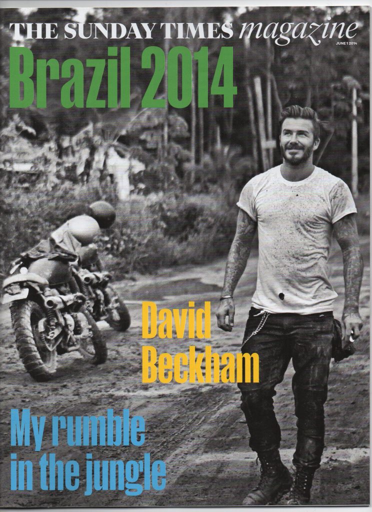
Any ideas on the Brazil 2014 font as in the picture below - thanks:

Looks like Helvetica Ultra Compressed
Cheers!

I don’t know which typeface it is (and would like to know as well), but it’s not Helvetica Ultra Compressed in any case.
Actually R. you are right - Ultra Compressed Helvetica it fits except the arm on the r is too long, missed that - Compacta LET has a shorter arm but other glyph shapes do not work. It could be something that someone has played with.

Probably a proprietary font for the magazine.
Don

Tend to agree with Don and even more when you know The Sunday Times uses Sunday Times, a bespoke typeface exclusively designed by Eduardo Manso.
The closest I have at the moment are Rama Gothic and Monopol, different in many points but with the right design for Rama Gothic /g (off for Compacta and Helvetica Compressed) and /r.
Reminds me of also Knockout, Champion Gothic and a bit of Giorgio Sans.
I agree that it’s probably a custom typeface for the magazine, but it would be nice to learn who created it and to get to see the full character set.
Should have been something here http://www.designweek.co.uk/news/a-new-look-for-the-sunday-times/3037843... but the author, Angus Montgomery, didn't mention the headline font. Perhaps you might ask him if he knows.
Don
Another couple of reports on the redesign http://www.theguardian.com/media/2014/jan/24/sunday-times-redesign-news-uk http://www.inpublishing.co.uk/news/articles/a_fresh_new_look_for_the_sun... Same problem.
Don
Calibre by Kris Sowersby is mentioned in http://magculture.com/blog/sunday-times-magazine-redesign/ but the KLIM version is wide http://typographica.org/typeface-reviews/calibre/
Don
And unfortunately, the cover typeface we are trying to identify here does not seem to appear in any of the redesign samples.

This one by Kris Sowersby might be the same typeface:
https://twitter.com/klimtypefoundry/status/460574205164023808
As usual, great find, Akira! That's the same one. We now have to wait to know the name.
Great find indeed, Akira, thanks!
Good follow up Akira on the Kris Sowersby lead. The _a_ has the same structure as our unknown, so this may indeed be it.
Don
Actually look at the distance between body of a and arm and Kris Sowersby sample is too tight. Lots of look a likes but not it yet.

It's just a heavier weight of the same font, is my guess.
I agree that the heavier weight idea is probably correct. This is what happens if you almost completely fill the counter on the magazine version _a_ and add a little width. Same thing for the magazine version _m_ and the heavy _n_.
Don
Glad I could help. Of course, I meant this might be another weight of the same typeface.
_Manuka_ is the name of a tree in New Zealand, where the Klimt foundry is located, and in Australia. Mānuka honey is a monofloral honey produced from the nectar of the mānuka tree. I wonder if this is going to be the name of the new font?
Don
I wonder if this is going to be the name of the new font?
The name of the font is Manuka.
https://twitter.com/curtismattp/status/465799191420502016
Captured from web.archive.org on 1 Jul 2014. view this capture
Thanks very much!