

Any ideas on these? I found this list years ago and I'm still trying to identify all, studying the metal ones I have...
Thank you all!
Any ideas on these? I found this list years ago and I'm still trying to identify all, studying the metal ones I have...
Thank you all!

9/10/11 look like Bradley:
http://mickeyavenue.com/fonts/bradley/
This was used recently in the game Castlevania: Lords of Shadow, actually!

I recognize quite a few of these as common 19th century typefaces.
It would be helpful if you could cut your image into parts and post them separately. If possible no more than about 6 fonts to a post.
Don
Sure, I'm sorry. Can I post here? This is the first part (1/16). Thank you!

1/16 A variation of 19th century French Ronde scripts. Digital similars include French Script http://www.myfonts.com/fonts/mti/atfrench-script/ Typo Upright http://www.myfonts.com/fonts/bitstream/typo-upright/ Linoscript http://www.myfonts.com/fonts/linotype/linoscript/ Ronde Script http://www.myfonts.com/fonts/grouptype/ronde-script/
Don
The problem is that here (Italy) this is called «Inglese»... in every variation!
Thanks, and I'll thank you again in my thesis too...
Here is the second one (2/16).
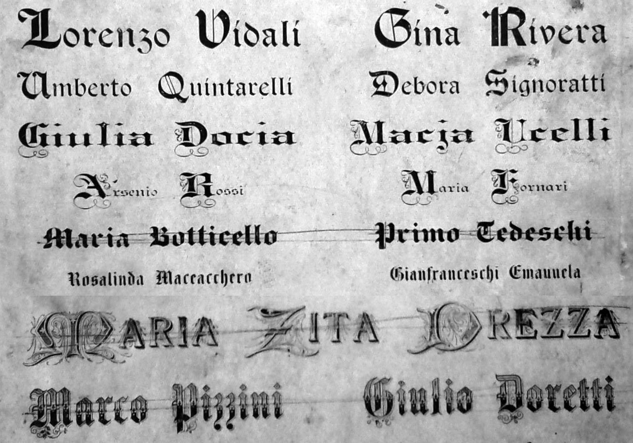
Top two lines are Tudor Black, which was a very popular neo-Gothic revival. A staple with most foundries, it was used well into the 20th century. Jazzed up version with inline treatment by Nick Curtis as Fordor Incised NF http://www.myfonts.com/fonts/nicksfonts/fordor-incised-nf/
Don

Tudor Black is available digitally as Tudor Text by Dan Solo via Dover on the 24 Celtic and Medieval Display Fonts CD.
Thank you!
Can I post another one (3/16)?

Here's another... (4/16)


Moritz-Light. Based on holdings of Solotype Dan X Solo.. http://www.myfonts.com/fonts/solotype/moritz/

Recent issue, but may be close design: Font Diner/Stuart Sandler/Turnpike http://www.myfonts.com/fonts/fontdiner/turnpike/

If both lines are same font G does not match Turnpike

Don, and the /E looks wider. I agree Turnpike isn't it. Dick
Dick, the problem I see with identifying a Victorian sans is that they got little publicity and were not featured by the foundries. They were used relatively rarely. I think the sample is more likely to have been called a Gothic than a Grotesque, if only because of the leg on the R. Many foundries sold these by number and not by a specific name. If I had to guess a name for it, I would call it simply a Gothic Extended.
Don
It's not my fault, the quality of the sample obscures the truth...!
Captured from commoncrawl.org on 21 Apr 2015. original URL
Lines three and four are Extended Black by Julius Herriet, patented on June 1, 1869 and sold by Bruce1
AFAIK no digital.
Don