
Fortunately I finally had the time to continue my first efforts in the conception of a spurless geometric sans.
Any comments would be appreciated! :)

Fortunately I finally had the time to continue my first efforts in the conception of a spurless geometric sans.
Any comments would be appreciated! :)

The "a" looks too cyrillic.
I really like the rest.

That preview is pretty small, but:
I like the "a" of itself, but it doesn't fit.
The descenders are too long.
If the "J" descends the "Q" should definitely do the same!
hhp
Then I rather chose to let them both NOT descend. ;)
But in general that's a good point about the descenders - I'll try to solve that.
Here is a larger preview with alternative "r" and "a" I may have dismissed to early...
Preview PDF
Do you think that's a better "a"?
Shortened the descenders as well... :)
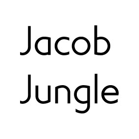
Not sure about the "a". But the rest is all improvement.
hhp
Captured from commoncrawl.org on 21 Apr 2015. original URL