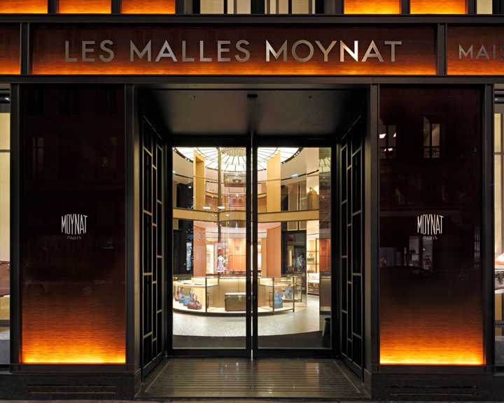
'LES MALLES MOYNAT' has been reborn in December 2011 by LVMH group. It was a well-known high-end trunk (malle in french) manufacturer. A point to consider is almost all companies in the fashion industry business use bespoke typefaces and custom lettering (which sounds obvious).
So, you're right, that's neither Futura or Neutraface but this /S is definitely to close to Futura to be a coincidence (or a customization).
A point for Neutraface, from 'Popular Logos' blog
After some search, type has been customized but still based on Neutraface.
Another point for Futura. Baseline of their main logo is set in Futura.
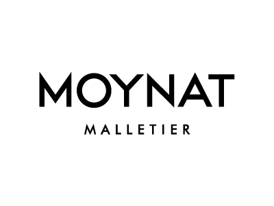
... But 'PARIS' baseline from their website logo looks like Neutraface No.2

Actually, that could easily be a mash-up of these 2 (or a customization of any of these 2):
- /L, /E, /O, /N and /T from Futura
- (alternate)/M and /A from Neutraface No.2
Alternatives but all /S are off: Milano, Noir, Arquitecta, Celias, Radikal, Ano
Finally, looks like it could be a retracing of an old advertising poster: http://www.pinterest.com/pin/457608012107592199
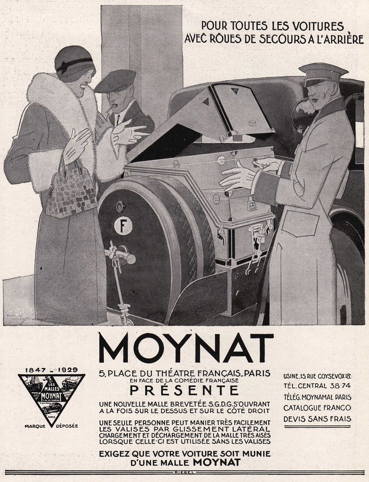
So my final idea would be they modified Futura (or Neutraface No.2) /M, /O, /Y, /N, /A and /T to resemble this old advertisement.

What a wonderful find that ad is, Don. The layout, lettering and artwork combine to be, for me, both classy and friendly.
What a wonderful find that ad is, Don.
Part of I'm not Don Mike ;D But thanks, I take it like a compliment as I'm always appreciative of any Don's intervention.

I'm flattered Mike, but obviously this is Ryuk's fine detective work. BTW, what a great advert. The expressions of the owners, and what appears to be an hotel employee, are priceless. Photography would be so inferior. The crisp authority and stylish quality of _MOYNAT_ is complemented by the hand lettered informational text with the flavor of Futura. No grunge, chicken tracks or kid's scrawl here! Handlettering like this from the 1920s and 30s is a gold standard. I'm trying to decide what digital font would match the mix of clarity, subtle variation and friendly tone in the Moynat hand lettering.. Not an easy choice.
Don
Oops - sorry, Ryuk. Thanks to you, then, for posting that image.
Thanks Mike and Don. I was lucky on this one, I don't have your science and knowledge so I try compensate pushing Internet to the limits. Was trying to find a better logo sample when I came across Moynat Pinterest and discovered this beautiful vintage ad with the exact same lettering as we were discussing.
Here is a Futura Hand Written http://www.dafont.com/futurahandwritten.font but it looks childish compared to the lettering in the Moynat Advert. Still have not found anything satisfactory with less "fun" and more lettering polish.
Don
Captured from web.archive.org on 17 Mar 2015. view this capture