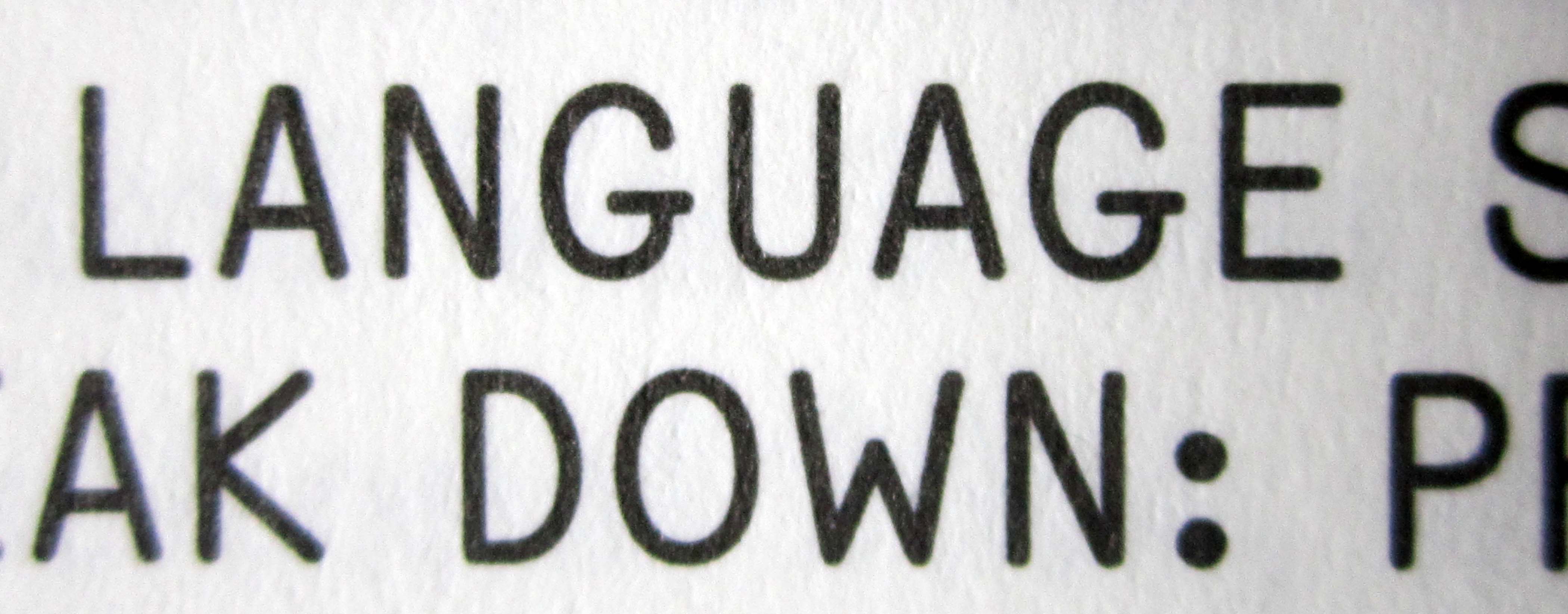
This resembles the mechanical lettering of devices like the Leroy Automatic Lettering Machine. Nick Curtis has a 3-weight font called Planscribe that is based on the output using the Leroy device. It is not an identical match, but its feeling is similar.
I could not find a more similar font.
- Mike Yanega

Your image resized and with contrast enhanced
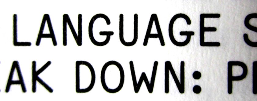

Looks like: Meyer, Alexander/LacrimaMG-SenzaBold
http://www.milieugrotesque.com/typeface-lacrima

Wow. Nice catch Dick! I never heard of them before.
- Mike Yanega
Good find Dick! Always a good idea to check the boutique publishers like Milieugrotesque that are not at Myfonts.
BTW this is a most peculiar font, sans for the upper case, serif for the lower case, both monoline. Does the "Senza" in the name stand for the hybrid nature of the font?
I gather that it is based on the typewriter font in an IBM Selectric typeball or element [what Milieugrotesque calls a golfball] designed in the years when IBM was a real design powerhouse. These designs are a goldmine for digital font makers.
On refection, a hybrid font is an elegant solution for the problems of a monospaced/typewriter font. The serifs on the lower case help to fill the fixed space. The absence of serifs on the uppercase means that the there is less of a horizontal squeeze on the letters to make them fit the fixed space. But this is speculative, as it seems that the original IBM font was only provided as an serifed italic.
Don
Wow, thanks a lot Dick!
it was used on a zine called ''the burninig sand'' (vol.3)
Captured from web.archive.org on 17 Mar 2015. view this capture