
Hi,
There are many fonts (Myriad Pro, Helvetica co.) with upper case numbers,
who are not es high and thick as upeper case letters?
Can somebody tell me why?
Thanks a lot.
Hi,
There are many fonts (Myriad Pro, Helvetica co.) with upper case numbers,
who are not es high and thick as upeper case letters?
Can somebody tell me why?
Thanks a lot.

The standard numerals in most fonts are designed to fit optimally in tabular matter, and don't always fit well in paragraphs of text or headlines. When combining numerals with text, choose a font that has old style figures, like Georgia. When setting numerals in a headline of all caps (e.g., CELEBRATING 100 YEARS), use lining (also known as modern) figures and increase the size by a point or two to match the cap height.
Lining (modern) figures are monospaced, even when the other glyphs are not. When setting lining figures in a headline, you'll want to kern them for the best optical fit.
Thank you @PublishingMojo.
I know how to use different styles of numbers.
But if you look in detail at Myriad pro, you will see the numbers are not exactly reaching the ascenderline.
And more the steams are not as think.
Type designers often choose not to align numerals with cap height or lowercase ascenders. If the user disagrees with the type designer's decision, he or she can manually adjust the height of the numerals, or use a different font.
I hope that's a helpful answer. Maybe your question has more to do with what informs a type designer's decision to make the numerals taller or shorter, or to make the stems thicker or thinner, and I'll have to leave it to other Typophiles to answer that question.

What you have observed is a compromise.
The size and weight of the figures you describe are somewhere between capitals and lower case.
Therefore, they are not overpowering in upper and lower case text, yet still function fairly well in all-cap settings.
However, now that we have the OpenType format that permits thousands of glyphs in a font, it is possible to include many different figure (number) styles in a font, each designed to work in a certain kind of setting.
My current practice is to make the default figures “three-quarter” height, lining, and tabular.
The old style and proportional variants are accessible in the figures section of the OpenType menu in applications such as InDesign, while there are variants for small caps that are activated in the Small Caps feature, and variants for all-cap setting that are activated in the All Caps (case) feature.
Here is how I proliferated the figures in Scotch Modern:
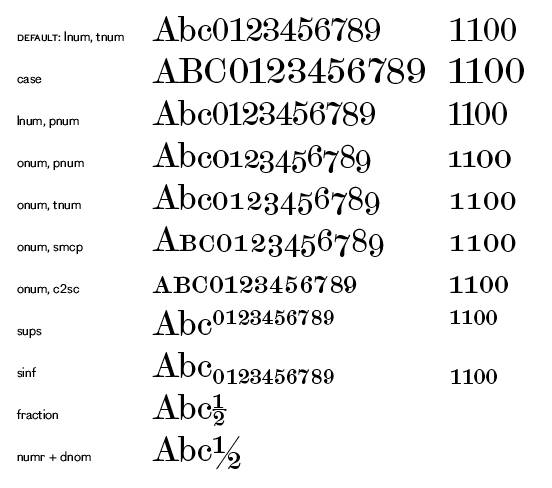
A good overview of contemporary figure-ing in fonts:
http://fontfeed.com/archives/figuring-out-numerals/

Lining (modern) figures are monospaced, even when the other glyphs are not.
? Lining vs. ranging and tabular vs. proportional are two separate issues which are not necessarily related.
What Nick said about compromising to more-or-less work with both case settings is the most important rationale for shorter figures. Making them a different height than caps also disambiguates some: a zero and an O will be more distinct.
And then there is the compromise of compromises, represented by “three-quarter” lining figures with a bit of rangeyness, e.g. in Garamond and Miller.

Yes, hybrid figures, to me are (generally) the best in the business. But I don't think compromise is what's always happening; for example hybrid numerals are in fact focused strongly on being optimal in running text.
hhp
I stand corrected: rather than just being the normal figure shapes resized and reweighted—as compromise—hybrid figures are a design solution in which the glyphs have been specifically shaped and drawn as a set to address the constraints of their usage.
Perfect.
Thank you @Nick, Eliason and Hrant.
Captured from web.archive.org on 19 Jul 2014. view this capture