
Hello,
What are some good typefaces that would be suiting of the 1070 medieval period?
Hello,
What are some good typefaces that would be suiting of the 1070 medieval period?
The most widespread calligraphic standard around that time was the so called Carolingian minuscule. There are plenty of fonts to be found if you look for "carolingian". Please don't expect any upper case letters. It's a minuscule, right? The fusion of majuscule and minuscule into one script system was later on. And you might miss some other fancy letters like €®†¨Ω¨⁄øπå‚∂ƒ©ªº∆¥≈ç√∫~µ∞üöäß!"§$%/()= to name just a few.
https://en.wikipedia.org/wiki/Carolingian_minuscule
Although officially deprecated by Charlemagne the hard-to-read but easier to write script called Merovingian was still popular among scribes and chanceries, so that would be another candidate:
https://en.wikipedia.org/wiki/Merovingian_script

In 1070 Uncial and its "small letter" form were a couple of hundred years old and still prevalent. See the type design work of Victor Hammer.

How would you like to balance historical accuracy, versus what people think it was like, versus actual ease of reading?
hhp

Here is a detail of the Domesday Book, completed in 1086 on orders of William the Conqueror.
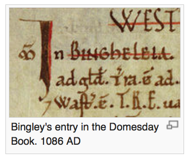
grabbed from http://en.wikipedia.org/wiki/Bingley.

Medieval where? Assuming you mean Europe, there would still be several writing systems in use. I doubt there would be any Merovingian minuscule in use by the eleventh century, but the Visigothic script was still predominant in Christian Spain and the Beneventan script in Latin southern Italy. Plus, of course, Greek, Arabic, Cyrillic, Glagolitic, and Futhark.
Great responses by all!
@DTY I was hoping for Medieval scripts within an English context.
How about this for Carolingia for example? (minuscule and Majuscule?) http://www.dafont.com/carolingia.font
@Michel Boyer good images, thanks
@typerror Victor Hammer as provided me with some good reference points, thanks
@hrant Ease of reading would take precedence. I was hoping for it to be used as a branding/packaging title. The theme of the brand is historic/humour.
It seems to me that actual historical accuracy is essentially moot here. Ergo: just find a readable font that looks medieval.
And avoid the junk (much of it plagiarized) on Dafont.
hhp
Where is the best place to find a font?
If I had to recommend one place: http://www.myfonts.com/
But, a big caveat: many high-quality foundries are not on MyFonts.
hhp
For branding, a decent Carolingian font done to professional standards might be Silentium Pro:
http://www.myfonts.com/fonts/adobe/silentium/
Captured from web.archive.org on 18 Apr 2015. view this capture