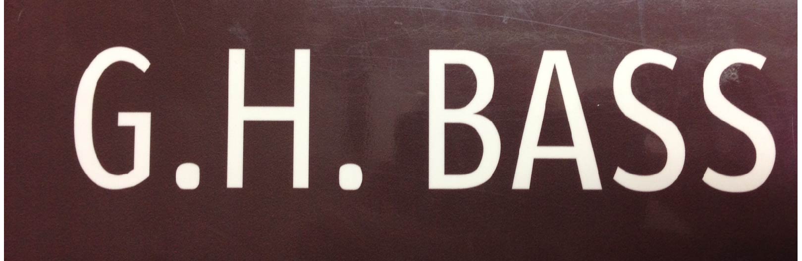
I need an exact match for this sans serif. ITC Officina Sans is very close. There are significant differences. The G is a different shape. The S in the sample has a slightly tapered stroke. The verticals on the A seem to curve ever so slightly, though this one could be due to a tracing...
Any help is greatly appreciated by my client and myself.
Thanks