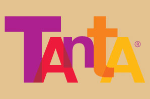
It looks like a colored Helvetica Bold in different sizes :-)
i was thinking the same thing but the small letter "t"of the helvetica looks different :/
i was thinking the same thing but the small letter "t"of the helvetica looks different :/

If so, they lengthened the right side of the t crossbar, but otherwise I would agree.
- Mike Yanega
They probably lengthened the /t crossbar to touch the /A's top corner...
thank you very much
Captured from web.archive.org on 17 Mar 2015. view this capture