
Typophile
Serif without thin part of the stroke?
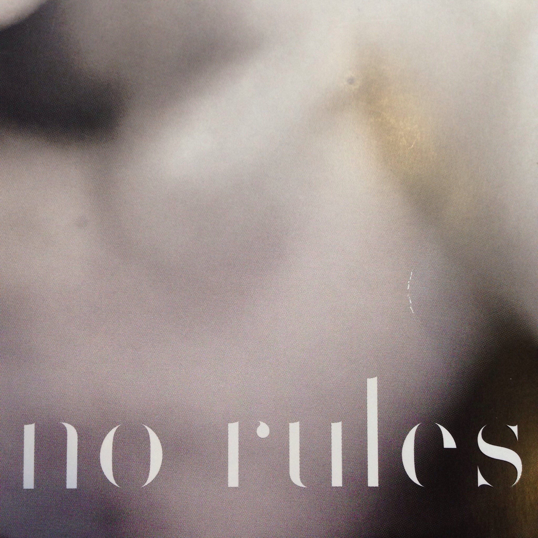

I think this was done by adding white stroke to 'erode' the serifs and thinner strokes. This sample I have attached was made with Monotype Bodoni, and didn't eliminate the places where the curves joined the stems, but those could be edited out. They probably used a different baseline font, but you can see how it works.
- Mike Yanega
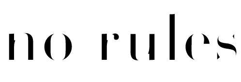
Volterra by Blank Is The New Black
Captured from web.archive.org on 17 Mar 2015. view this capture
Thank you!