

Monotype Zemestro is very close, but I found six or seven others as well that were so similar that it would take side by side comparison to tell them apart (at least for these letters). If you have other letter samples it might help. The letter that was hardest to match was the R, but all the candidate fonts I found had the same basic, straight-leg style, just slightly different counter shapes.
Some other close styles: Sentico Sans, Glober, Prelo, Metronic, Dobra, Vinkel and FF Plus Sans, all at MyFonts.
- Mike Yanega
Looks like Apex Sans Extra Bold from Vllg Fonts
Captured from web.archive.org on 29 Aug 2014. view this capture
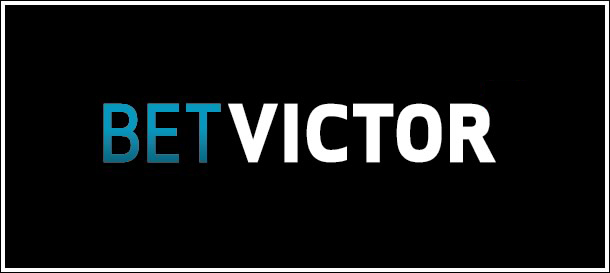

I agree. Here is a link to Apex Sans.
- Mike Yanega