
I'm struggling with the lower case "s" and capital "X". I am happy with the others. :)
| Attachment | Size |
|---|---|
| image.jpg | 1.54 MB |
I'm struggling with the lower case "s" and capital "X". I am happy with the others. :)
| Attachment | Size |
|---|---|
| image.jpg | 1.54 MB |
I'm really happy with this. I drew it all without looking at any references. I know there are similarities to other fonts out there that we have seen. But this is what came out of my mind last night.
I still need to make numbers and special characters and other glyphs.
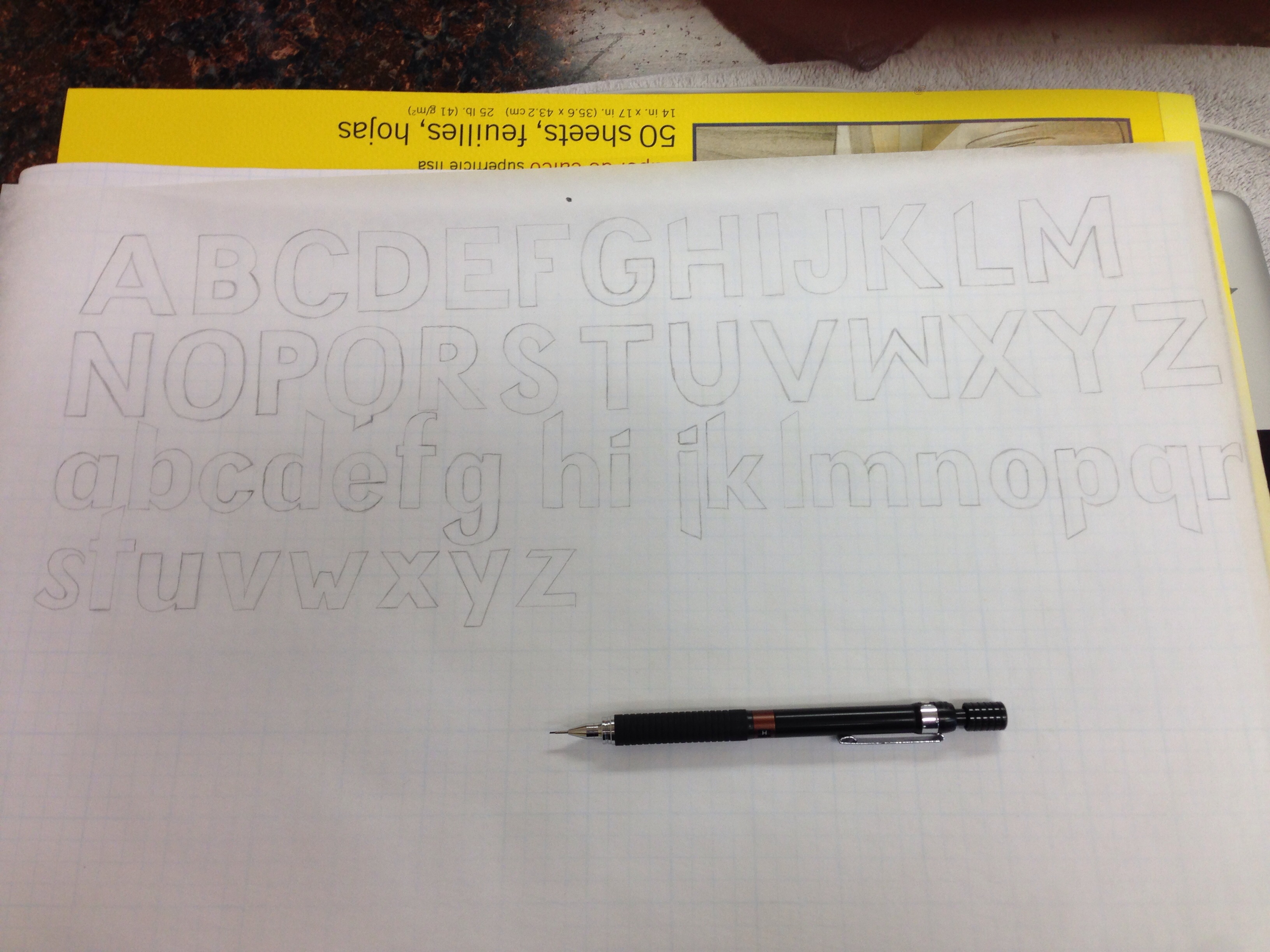

For the "s", make it wider. For the "x", stagger the arms.
The first thing I would do though is figure out which direction(s) those shear should go and and why.
hhp
Nice. You are totally right. Will fix those shears and work on those letters.

To my point of view the angle at the bottom of the | j | is on the wrong side. It should be on the same angle as the | p |. Also, the ascender and descender seems too long (see your | g and y |. Try something nearest of the | y |. Keep going.
Captured from commoncrawl.org on 27 Apr 2015. original URL