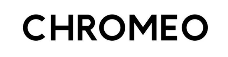
Anyone? Kind of urgent.
Can't find a match. It's close to Avenir with main differences on /G and /M. Also, could be my eyes but a bit confused by the kerning on 'CHROMEO' which looks kind of weird/amateurish/absent (which could be the earmark of a freebie). Letter width looks also unconsistent, /H and /M looking weird among the others... A way to answer could be to buy last issue and inspect PDF type properties...
Some alternatives: Europa, Nevis, Circe, Hurme Geometric Sans 4
I actually did buy it, but the website apparently uses an online reader, so downloading the PDF isn't an option. I agree, it's a very schizofrenic typeface, but I really need it for a school assignment. Anyone else have any suggestions? I'm desperate.
After looking through your suggestions again, I think Hurme may be close enough to pass. Thank you!
Captured from web.archive.org on 17 Mar 2015. view this capture