
I have a font whose default figure style is proportional old-style. Is it possible to easily tweak it so that the default figure style is tabular lining?
I have a font whose default figure style is proportional old-style. Is it possible to easily tweak it so that the default figure style is tabular lining?

What's the font?
hhp
Brill

The very first thing to do when you feel you may like a font is to read its license; Brill displays it even before you can download:
http://www.brill.com/about/brill-typeface/brill-fonts-end-user-license-a...
It is written:
8. Licensee may not alter Font Software for the purpose of adding any functionality which such Font Software did not have when delivered to Licensee by BRILL.
For me, that means "don't touch".
Repeating myself, but: I find no-mod clauses generally unethical.
hhp
8. Licensee may not alter Font Software for the purpose of adding any functionality which such Font Software did not have when delivered to Licensee by BRILL.
Arguably, changing the default number style doesn't add functionality. I changed the default number style from tabular proportional to tablular oldstyle for use with an older text editor, for preparing our invoices. Of course, it was a SIL OFL font, but I can see the reasoning here, too.
The bigger issue is that the Brill fonts can be used without permission only for personal, non-commercial use. I imagine if the intended use fits that category, changing the default number style is permissible.
But why not just make contact with Brill and ask?
It's clearly not permissible. But you'd have to be pretty unlucky or reckless to get in trouble. It's mostly just a scare tactic (which BTW isn't even my main problem with no-mod clauses). Make contact with Brill? If you want them to keep an eye on you, sure... On the other hand the designer of the font might very well be reading all this soon anyway...
hhp
Another issue is
Open Access publications are also considered commercial products under the terms of this license.
which, as I understand it, implies that the font may not be used to write a thesis that is to be submitted electronically (and be made accessible through the Digital institutional repository, as is now done in many universities).
My question is, Is it possible..? Not, is it legal? (Which is not to say that I don't care about the law.) The tweek is to overcome a limitation of Microsoft Word, namely that Open Type number styles cannot be applied to the footnote number reference. Whatever the default number style of the font is, that style will be used in Word for the footnote references. I would prefer to use tabular lining, but to do this, I have to make tabular lining the default number style in the font.
None of this is for commercial use (it is for papers in college), and it would not, in my humble opinion, add functionality to the font. It changes a default "setting." It does not give the font more functionality.
It's entirely doable. But unless you learn to do it yourself (not easy) you might have to look a bit to find somebody to help you break the law.
hhp

what hrant said. it ain't easy.
i do this all the time to our fonts, but there's more to it than you'd think.
You're not getting good advice here, I suggest you ask somewhere else. I tested two ways of doing what you wanted, checking the results in both OpenOffice and InDesign. I neither own nor use MS Word.
Both techniques worked to a degree -- addressed and solved the particular problem you mentioned -- and took less than a half an hour. The half hour includes limited testing. Both had compromises. One way, you loose all OpenType functionality with numbers (arbitrary fractions, true-cut superiors, any number style other than default, etc.). The scaling functions with numbers that MS Word uses should still work -- they did in InDesign. And why wouldn't they?
The other way you retain these as OT features, (except for oldstyle proportional), at the expense of having the wrong kerning with the *default* numbers. The result is not perfect, but then neither are tabular lining numbers.
To do the job properly is, as has been said, a lot of work. Basically, portions of the features code has to be rewritten. That would include some work with the classes used in writing features.
As far as who controls the license, I imagine Brill commissioned the fonts from John, so Brill controls any and all license matters. I would ask them. You don't want to be in violation of either US or European law, right?
I imagine these two techniques are obvious, but in any case, I personally am not going to list them unless Brill, & as a courtesy (not legal requirement) John, both say it's OK.
Edit:
BTW, I'm amazed that Word won't let you associate another font with note calls. That by itself would solve the problem you mentioned.
I suggest you ask somewhere else.
Where do you suggest?
Wherever it is, it sounds like you should spend more time there yourself.
To do the job properly is, as has been said, a lot of work.
Bingo. (Esh.)
I personally am not going to list them
Robbing a bank without saying how you did it is still illegal.
hhp
On a more positive plane, for as long as I can remember MS Word has used a modifiable character style for note numbers in the text. Howerer, by default access to this style is turned off -- part of Word's being "helpful" by hiding "unnecessary" details.
David
Sounds like something they learned from Apple. :-)
hhp
To change the font, you select the footnote reference number (in the footnote) and right click. You can then select "Style", "Modify" and then change the font. I guess that ideally, you should choose a font that produces numbers close to Brill sups* after Word scales them down.
* I don't know how to get them in Word. Here is how they come out in TextEdit:
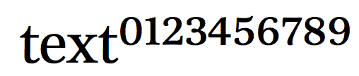
Note that smaller letters need to be a darker weight to maintain the balance.
hhp

1. Yes, Brill own these fonts, they invested a lot of money in them, they're making them freely available for non-commercial use, and yes, they have the right to determine the license permissions under which that happens. That said, I believe the no-modifications clause exists mainly to prevent unauthorised messing with the design, and contra Hrant's comments about 'if you want them to keep an eye on you', I would suggest contacting Brill and explaining what you want and why. They are among the most reasonable and accommodating people I have ever dealt with.
2. Technically, I'd say that the easiest way to get to where you want from where you're starting is to edit the cmap table. You could use TTX, which is free, to dump the cmap table to XML, edit it in a text editor to re-map the appropriate Unicode values to the tabular lining numerals, and then use TTX again to merge the edited cmap table back into the font. You will lose some functionality in OpenType Layout if you do this, because the GSUB lookups for numeral style presume that the default style is oldstyle proportional (which Brill wanted because that is the most common usage in their publications), so changing to other styles and arbitrary fraction support will break. However, it seems to me that for your purposes you could simple edit the font name table too (also using TTX), and simply make a separate font for use in Word footnote style.
They are among the most reasonable and accommodating people I have ever dealt with.
That's reassuring, and good to know.
hhp
You will lose some functionality in OpenType Layout if you do this, because ... [John Hudson]
John, I find your solution rather brutal but, of course, if you are stuck with a dumb text editor, that is the simplest thing to do.
It seems to me though that you can get a fully functional font by just swapping the strings “zero” and “zero.LT” etc everywhere in the ttx files except in the cmap and GSUB tables, and replacing “lnum” by “pnum” and “tnum” by “onum” in the GSUB table. That can be done quite simply with a stream editor, like sed (on one ttx file without GSUB and cmap tables, and another with just GSUB and cmap tables). Or am I missing something?
Michael, the issue is, there are lnum and tnum features, but no onum and pnum features. Very efficient code given how this font is constructed, but harder to mess with. I didn't go & look at the classes to see just what would be involved in creating the two extra features, and esp. their interaction with superiors and fractions, but in any case, this is about the point where the project can move from simple to complex. Or am *I* missing something?
In any case, not needed for solving the OP's problem, as given. But affiliating another font with the Word footnote call instruction seems better yet...
Here is what I get in Word for Mac with the resulting font (sorry, my word is in French).
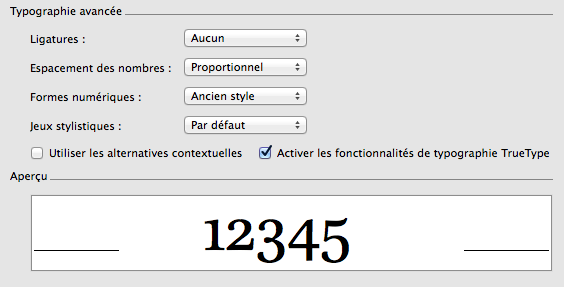
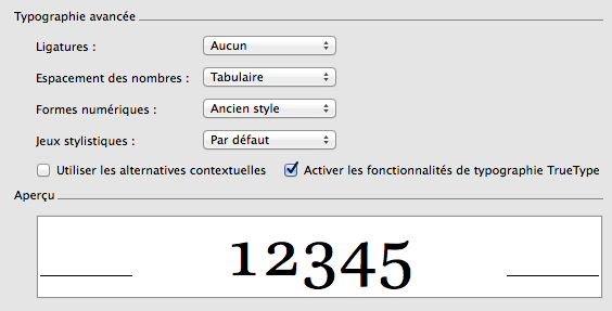
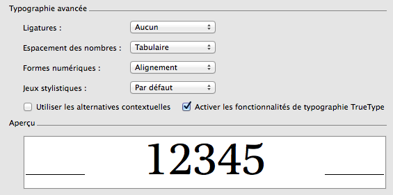
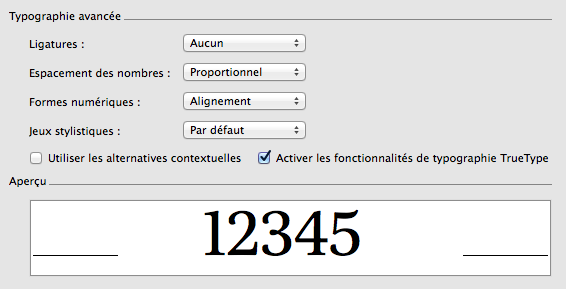
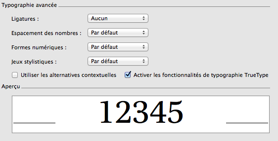
affiliating another font with the Word footnote call instruction seems better yet
Yeah, just use Arial.
hhp
I tried with Utopia Std Caption and liked the result. But that's another question.
Then Georgia should do fine too. Why bother downloading something?
hhp
Then Georgia should do fine too. Why bother downloading something?
That's always a matter of taste. Here is a comparison
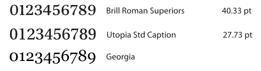
Then just use Times. As a layman once said when asked to compare Times to Georgia, true story: "This Times is better than that Times."
My point all along is: if good typography were merely about meeting conscious layman expectations, we wouldn't need good typographers.
hhp
My point all along is: if good typography were merely about meeting conscious layman expectations, we wouldn't need good typographers.
For me a good typographer is someone like Charles, that can make do with the fonts he can manage to get and fix.
For me a good* typographer is one who leverages the true power of typefaces, and this can only be done by first appreciating this power, as opposed to pretending that what's on hand is fine. Many people don't realize they're not good* because they're blind to this power. Of course compromise (including on cost) is always necessary, but pretending one is not compromising is not.
* Maybe I should say "great", because "good" can imply passable; the sort of person that merely makes the wheels keep moving. Just like most type designers, mind you.
Most of all, a typographer can't really help his users if he has little respect for the field of type design; it's another form of blindness. Vignelli for example is a horrible typographer for this reason.
hhp

Thank you, for the pleistoscenic view.
Wouldn't it be better, simpler, and more educationally friendly, if Brill, or their authorized Mod Men published a version with Proportional Lining figures in the default position?
Sure, a display cut. But then peons would use it for text.
hhp
Thank you, for the pleistoscenic view.
Using the ttx file as a text file instead of a structured xml file reminds indeed of another era. In this case though, all that is required is swapping strings representing glyph names; where those names appear in the structure tree is irrelevant; treating them as text thus seems appropriate; for instance the GPOS table (or its "dump" if you will), whatever its complexity, remains correct after the swaps, without any effort.
Concerning Charles' remark that there is no onum feature, there is a substitution table for "lnum" that takes text figures and replaces them by lining figures. Since the glyph names have been swapped, the effect of the table is to do just the opposite, and the feature needs to be renamed "onum" (this is in the case Proportional Lining is chosen as default).
Thank you for your help. So much for thinking it was something quick and easy...
Many things are only quick and easy if you can afford it. :-/
hhp
More on what I feel makes a good typographer: somebody who grasps the "language of fonts" well enough to not use TheSans* for a bunch of books on different styles of art, just because it's a typeface "on hand".
* A very fine font, outside of context.
Fonts say things. Have the humility to listen.
hhp
Blah Blah Blah. As always, Papazian makes sure his posts are worth no more than what we pay for them. Well, he is true to his beliefs, as he holds free fonts also have no value.
Finally Typophile is blessed by official representation from North Korea.
No matter how good a free font is (such as my own Arasan from the 90s, or more recent fonts made by a very small number of salaried professionals) it won't help a pedestrian typesetter (I reserve "typographer" for those who actually "get" type) contribute to culture. The rest is boring, dead, money.
hhp

The same applies to commercial fonts, too. Buying some fonts of, say, Futura ND won't automagically make me any better.
Captured from web.archive.org on 20 Apr 2015. view this capture
http://www.blackhealthtv.com/