Typophile

Typographic Tattoos??

Hildebrant0 votes

So how about it? A subject that I find myself currently debating. That is the fact that I am designing a tattoo (for myself), and trying to decide what face I want to use. So far mantinia is winning. I am having some latin text tattooed across both of my forearms.

Anyone have typographic tattoos? or Photos?

hildebrant.

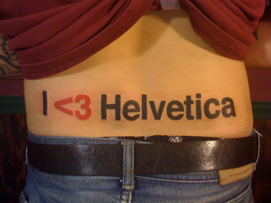
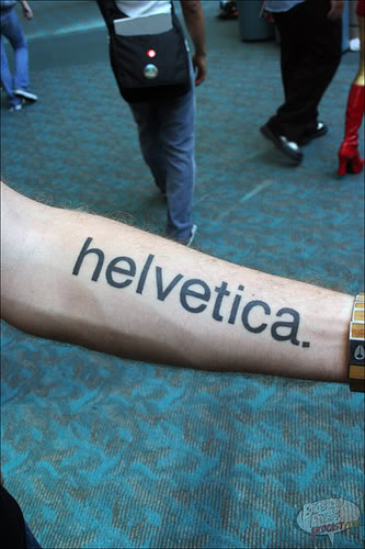
I was looking through a book in Foyles earlier this week on Helvetica, and noticed that someone had had the name tattooed along their forearms in the typeface. I remember thinking it looked “ok” but not much better.

Problem is that it is fairly unlikely that a tattooist will appreciate some of the subtly in your chosen typeface, and may have difficulty replicating its dimensions and spacing in ink under your skin.

Also bear in mind that the skin on your arm moves and distorts quite dramatically. I have a geometric design that runs from shoulder to wrist, and a twist of my wrist distorts the design greatly from wrist to elbow. I knew this would happen and designed it in such a way, with the help of my artist, to make it part OF the design itself. I think that typographic tattoo are inherently going to risk looking wrong due to distortion for large periods of time. That is not even taking into consideration how your body will age with time. Take this into account, and try transferring a design to your arm to see what happens in normal movement.

Another thing to take into consideration is trapping. Ink can spread slightly under your skin over time, and different parts of your arm may be liable to spread at different rates (this is especially true if you are going to have a multiple sitting with your artist — their mood and therefore the execution of their craft will vary between sittings). Be careful therefore when choosing serifed typeface with fine detailing, and bear this in mind when deciding how large your tattoo will be overall.

Remember to take into account how your tattoo will fade too, especially if you are having shading or colour work.

Check out this site — you will find loads of stories and photos, and I believe there galleries have a specific section on typographic tattoos. Those here of a nervous disposition may not want to follow the link, by the way.

http://www.bmezine.com/

> trapping

That’s just too funny. Skin trapping. Sounds like something a cannibal type designer would do.

BTW, Tony di Pietro also has a type tatoo he’s really proud of.

hhp

Is this the one? Originally at the ATypI site, but now only on the way back machine…

http://web.archive.org/web/20020622041442/http://www.atypi.org/tparty/news/stories/PIC00019.JPG

yes

Documentation of a tattoo designed by type designer
Joachim Müller-Lanc

“Documentation of a tattoo designed by type designer
Joachim Müller-Lanc

I’d go with Hangul instead, for the sake of celebrating writing system excellence.

hhp

I’ve always thought Hangul was ugly.

Well, here’s my first and only. They do wander and stretch quite a bit — kinda nice since it’s everything I tell my students *not* to do ;-) Sorry for the Helvetica, hhp.

Didn’t that wrist part hurt?! Ouch.
Or maybe Helvetica served as anesthesia…  ;-)

hhp

>Helvetica served as anesthesia

LOL. The worst thing about the wrist is that the tendons wreak holy hell on the letters.

What does it say?

Back to what I was considering getting.

http://www.kylehildebrant.com/downloads/tattoo_idea.pdf

This would be quite large, Im considering about 8” in length.

What do you guys think?

hildebrant.

On what body part do you want to have it?

—Jacques

Yves asked me to post a photo of my arm. Here it is.

arm

Jacques: Considering the outward part of my forearm.

hildebrant.

:bites tongue on bad joke about 8 inch tattoos and the body parts they should go on:

Was that tattoo in the Helvetica book a real tattoo or just pen? Maybe I just thought it was pen because the wearer was inking in a giant version of the word “Helvetica.”

I know someone with an interrobang tattoo.

One of the guys who works at the best café in Vancouver, possibly the world, had MORRISSEY tatoo’d up his forearm in approx. 140pt Copperplate Gothic. Earlier this year he got bored with the typeface and had the design gone over, and longer wedge serifs and some careful decorative elements added. I was quite impressed by how thoughtfully it was done, even if having the name of a pop singer on your arm is more than a bit stupid.

The best tatoo I’ve ever seen was on a friend’s back: German late mediaeval woodcuts of the seven deadly sins.

> possibly the world

Easy, easy.

hhp

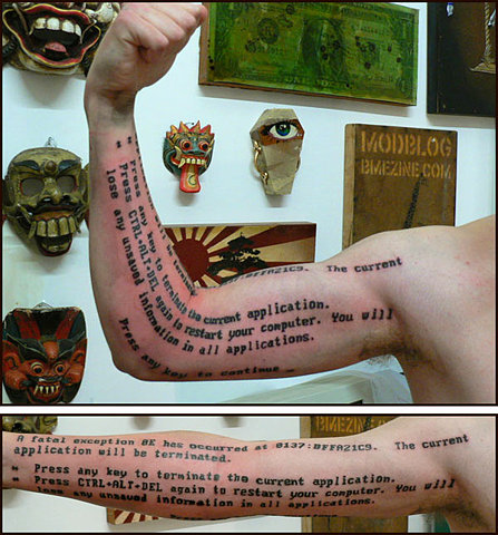
•••• David, is that real? Or some nifty marker work? What happens if you gain a lot of weight? Do they become just plain parallel lines?

Karen, it took about 25 hours at the tattoo studio, it was all done, amazingly, freehand, and yes, its very real. People ask me what I will do if, aged 65, I regret it. I ask them what if I look back aged 65 and regret never having done it?

25 hours! How many tattooists worked shifts? :-) It is amazingly straight for something done freehand.
People often forget that regret works both ways.

David,
you know that I liked your arm tatoo, but I just wonder, looking again to the image, where this one finish? Just before to appear to the other arm Tshirt, so it was all over your body or what? ;)

I will understood if you can’t answer!

John wrote:
“having the name of a pop singer on your arm is more than a bit stupid.”
My first tatoo is a Vespa with a name of my current scooter club on my right arm done in London, at just 18. So, yes, sometimes, when I think about it, I can feel stupid but, after 20 years to live with it, at 99,9% I think it is part of my body and life, and I can’t regret to have done it. The only actual regret I have is the type forms for the tatooed words are not well designed ;)

Karen, it wasn’t one sitting, I’d have passed out! The longest I sat for was 8 hours, but it was done in 3-4 hour segments over a period of a few months.

JFP, it is capped at the top of my shoulder so its the entire arm, minus the hand. There is one on my leg too ( http://www.typographer.com/brighton.jpg ) and on my ear but I think perhaps you saw both those last year at St Martins?

You mentioned the vespa was your first tattoo… does that mean there are more, JFP?

Chris said:

>What does it say?

If that was directed to me, then it says “What we cannot speak about, we must pass over in silence.” Or, alternately, “Whereof one cannot speak, thereof one must remain silent.”

To Yves and only to him*: Come to Vancouver conference and I will show you! ;-)

*I’m pretty sure that you will not came, hehe. ;-)

JFP is being very coy about this. Very coy :-)

Those definitions dont work for me. I prefer this one, from dict.org:

* showing marked and often playful or irritating evasiveness or reluctance to make a definite or committing statement; “a politician coy about his intentions”

:P

>thine English is very sophisticated.

Yeah, those are pretty bookish translations. Essentially, it’s my daily reminder to “shut the •••• up.”

Perhaps I should have deleted the “irritating” portion of the definition for the sake of illustrating my intentions rather than maintaining dictionary accuracy.

Just to be clear here, I meant coy as in playful avoidance, nothing else!

Perhaps I should have deleted the “irritating” portion of the definition for the sake of illustrating my intentions rather than maintaining dictionary accuracy.

Just to be clear here, I meant coy as in playful avoidance, nothing else!

I have one. a modified version of Demuth

I have a Helvetica Neue trademark symbol on my right shoulder. No pictures available right now.

At the time I figured it symbolized control of my own life pretty well… (“I own myself”). Which is why I got it. It beats cliched kanjii tattoos about self-power and self-worth and what not.

Hum, well… which version of the Neue, Adobe or Linotype?

Adobe’s.

So, if cou could / should choose a Typeface / Font to get a tattoo set in, what would it be, then.?
( Beside ‘Sailor Jerry’, by Cubanica.. )

What do you think of ‘Dalliance’, as a choice for ‘Tattoo Type’.?

That seems like a great choice indeed!
Even Tiffany might change her mind.  ;-)

hhp

I think the standard answer to this one is “Brian Bonislawsky, Astigmatic One Eye”

So what’s it going to say? Lorem Ipsum? Quo usque tandem abutere?

This thread is worth digging up.

Sailor Jerry: http://www.typophile.com/forums/messages/29/1301.html

Wasn’t there another one too, Joseph?

P.S. David, do you mind posting your Typophile T pic
you had on your site a while ago? Your tattoo is truly
wikkid. Not mine, it’s the girlie kind. My wife likes
it (it was a birthday present of hers), but my six-
year-old daughter wishes I had chosen the colourful
huge tiger…

More discussion in this thread, including links to photos of some of Brian B’s ink:

Unusual typographic tattoos

My best true typographic tat story is an acquaintance of mine who tried to toughen up his image by getting his last name across his shoulders in “Olde English” — “Thompson” —  Once it was done he looked at it in the mirror and the gangster tattooist had done “Thopson”

So he had it tattooed over with a low-rider.

David, I really like the way you think. I’ll see
what I can do about that crate of Dentergems.
And try to explain to my wife afterwards.

»Once it was done he looked at it in the mirror and the gangster tattooist had done “Thopson”

Don’t know if its true or not, but I heard about a skinhead who tried to enhance his hardman image by tattooing ‘skins’ on his forehead.
Unfortunately, he did it himself, in the mirror, and to everyone else it said ‘sniks’

I had trouble with your link, but I found the image here.
Don’t forget your domain name changed to .org.

Alwaysknowsbetterman

Tell us, Jean Fran

JF, t’es un marrant, toi! I need a wealthier employer…

Nathan, thine English is very sophisticated. I’d translate
that as:
“Shut up if you don’t know what you’re talking about”.

coy adj. coy

Go blame the Americans for not knowing proper English…
I’d pass on the “irritating” bit when we’re talking about
JFP though, that’s totally not him.

Hmm. Should I or should I not post here. I'll post.

Although I will probably never (99.999% sure) I will never get a tattoo. I have to admit that while most are, IMO, ugly, a well designed and specifically typographic tattoo has some kind of appeal. It could be that it just separates the hunters from the gatherers. The tattooes of the maori (I think that is what I'm thinking of) are amazing examples of positive and negative space. And I've found myself watching a lot of those motorcycle shows on the Learning Channel, those guys have some cool tattooes as well.

haha. my ears were burning. Yes. Dalliance is definitely my cup of lapsong... errr whatever Hrant says.

I would use this one or maybe this one or maybe even this one

Impulsiveness strikes again.

Original blog post...
http://www.glennsorrentino.com/articles/view/36

I know a lot of people that went to my college who had type tattoos, and they are collectively the reason I doubt I'd ever consider getting one.

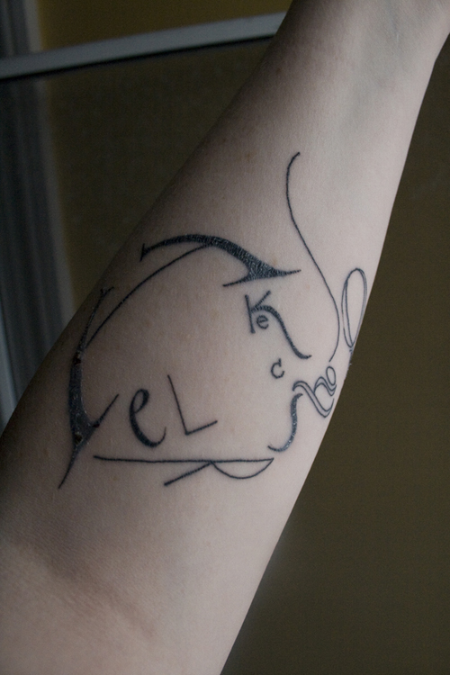
Can anybody guess what typeface this one's in?

The answer is: it was originally Garamond, but it sure isn't anymore.

I figured, although I'm not terribly anxious to go out and get a tattoo (I'm way too over-cautious and afraid I'd regret it at some point) I could not get a tattoo from anybody who had less typography sensitivity than me.

If I got a tattoo with type, and there was a shape or kerning issue, it honestly would bother me literally every time I saw it. I figured if I were ever to get a tattoo, because of my high standards I'd want to go to the best tattoo artist I could find, and I imagine it would be very very expensive and require me to travel some distance to get there.

For my conscience's sake, do you know your artist has decent typographic sensitivity, enough to accurately reproduce your chosen piece? It's a fact that 40% of a tattoo parlour's business is covering up another tattoo artist's mistake. Those odds are just too high for me.

Choosing your tattoo artist is serious business that wants to be seriously considered and researched. There are a lot of hacks out there, but a few artists who truly deserve the name.

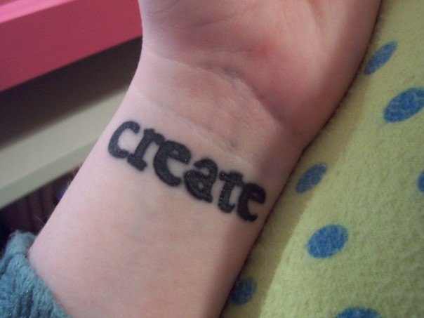
Btw, this sad "create" tattoo looks like the ink is too deep in the skin, causing extra bleeding, apart from being crooked to begin with …

What you said about kerning is certainly true. I have a very abstract tattoo, actually in the same spot as on this image (inside of left wrist), which is basically a line of dots in varying sizes. One dot is quite a bit too far on the left, which used to bug me a lot (now it's just 'the way it is'); the tattooist had it even further out of line first, & when I complained, she protestingly got a ruler, measured it, & then looked at me and said, "Why do you see this? Nobody sees this! It was like HALF A MILLIMETER off!" I'm not going there again.

The Helvetica tat looks really nicely done, though. I mean, it IS Helvetica. :)

It’s a fact that 40% of a tattoo parlour’s business is covering up another tattoo artist’s mistake. Those odds are just too high for me.

Me too. Where did you get that figure of 40 percent? I'm turned off by the idea of altering my body in this way. What's inside counts for infinitely more. Anyway it's more fun doing shadow puppetry letters on the wall on a cold rainy evening with the help of a rusty old kerosene lamp ;^)

j a m e s

ackk.

A person who would get a tattoo, would probably also grafiti the Venus de Milo.

:o)

-=®=-

Heh!

Yep, it all seems barbaric and a brutal way to treat a body.

j a m e s

-=®=-

so... mr hildebrant - did you get it done?

i have most of my right sleeve done, pics here: http://www.flickr.com/photos/armorath/sets/72157608087662106/

i don't have any type tattoos per se, but i do have some words, which i simply asked the tattooist to write, and i was happy with his style of writing.

i have thought about getting some proper type tatts, but i kinda like the idea that the letters on my body are designed just for my body...

One of our authors just got his first book's ISBN tattoed on an arm. I set it for him in one of the OCR faces and he took that to the parlor. I have not yet seen it. Too cold here now: we all have our sleeves rolled down. Maybe in Spring I'll see it.

powers

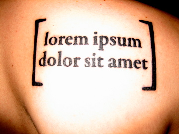
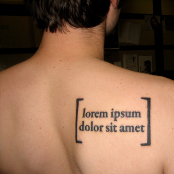
To all of the naysayers out there: it is possible to be satisfied with a type-related tattoo; you just have to go to someone who knows what he's doing.

It looks even better than I had hoped for:


cool!

Could you lighten those brackets a bit?

hhp

Thanks! I've always thought lorem ipsum was a really powerful phrase, because in and of itself it means absolutely nothing, but it has the potential to become absolutely anything. So it simultaneously means nothing and everything.

The text isn't intended to have meaning, but isn't it derived from Cicero's "The Purposes of Good and Evil?"

Awesome stuff. Congrats.
Actually some of those words are at least close to existing ones; "dolor" means "pain" – which I'd say fits a tattoo quite nicely.  :->

Well, yeah, the words have meaning individually, but as a complete phrase it doesn't really make sense.

Dude, it's actual Latin text.

hhp

Track

The original passage began: Neque porro quisquam est qui do lorem ipsum quia dolor sit amet, consectetur, adipisci velit

Translation: "Neither is there anyone who loves grief itself since it is grief and thus wants to obtain it"

There is more thorough explanation of the translation on wikipedia.

I understand that it's taken from a passage in Cicero, but that doesn't mean that it makes any sort of sense. You gave me a translation of the entire passage, not of just that phrase. The phrase begins in the middle of a sentence, in the middle of a word (I'm not a Latin scholar, but I think that "em" is a suffix on "dolor"), and a conjunction is deleted. It's not a complete thought. It's like saying that "monds always reminded him fate of unrequited" makes sense because it's taken from a real passage of text (from Love in the Time of Cholera by Gabriel Garcia Marquez).

As far as I can tell, the actual translation of "dolorem ipsum..." is "pain itself it is pain"; never mind eliminating the "do". Tell me that "lorem ipsum dolor sit amet" by itself makes any sense.

Yes, and I understand what it was that I posted. I was simply providing some context.

Ah, okay. Glad we're in agreement then. (?)

My hairdresser liked the fleurons I used on my wedding invitation. She has it on her arm now:

I'm thinking about getting one myself. Can anyone recommend a tattoo artist who does really good typographic work? I'm in the Denver area, but willing to travel to get this done right.

Also, there's a great book by Ina Saltz called, "Body Type" that is all about typographic tattoos, in case anyone is interested.

Jessica Hische has a couple of good ones. I don't want to grab her photos, but you can go here and see for yourself. Note the wrist too.
http://jessicahische.com/overshares/her-contact-information

Micah Currier, the guy that runs the type casting machines at The Dale Guild, threatened to get a full page of the Kelmscott Chaucer on his back. Thankfully he hasn't followed through.

Other Mica- Is that a Bruce Rogers arrangement?

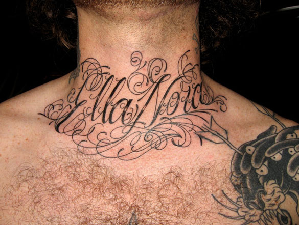
My friend Joseph at Saved Tattoo in Brooklyn does very nice script work. This is on my old buddy Beau's neck-- his mum's name. See JK5 on the site.
http://savedtattoo.com/

Oh, and stay tuned for a new version of Ina's book.

Dan

I still haven't regretted not having been tattooed. Probably the result of growing up in a small port town, and thereby from early childhood on associating tattoos with unemployed, drunken old sailors.

Tattoos are now way too fashionable for me to get one.

hhp

It's not like you'd have to get a tramp stamp, Hrant ;)
Seriously, I think fashion should really be irrelevant both ways.

I found those pictures somewhere on the web, that's not me.

@satya

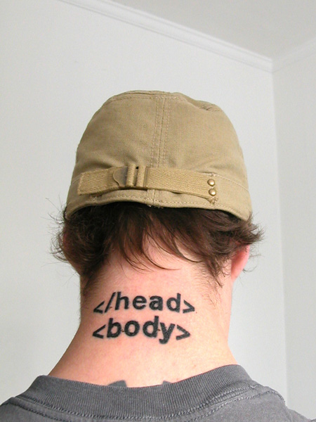
I really hope that head tag had a start, and the body tag has an end. It'd suck to get branded with invalid markup.

Not a tattoo, but still somewhat interesting.

http://www.ignant.de/2009/05/15/skinographie/

@Christopher.
Ewww.
Creepy but cool. I have to look again.

JK5 had done some amazing work. I've admired it for years.

I have to admit, I admire all of you who managed to find a typeface you could permanently use on your body. I would have such a fear that I would find one I liked, and then a month later see a font I had never seen before and wish I could do it over. I'm not sure if it is the fact that my font tastes just change too much, or perhaps the industry evolves too quickly.

For the longest time I have wanted to get my hometown scripted on the top of my foot. I am a native of Arizona, and there are literally like 7 of us left here. The problem? I can't decide on a font.

That's why I picked a Garamond for mine (specifically Garamond Premier Pro). I figure that if I'm going to have a typeface on my body for the rest of my life, it shouldn't be one that's going to go out of style any time soon. So why not use one that's 500 years old?

Although in retrospect I should have used the regular weight instead of the semibold. I thought the regular wouldn't have been hearty enough to hold up, but the bleeding of the tattoo causes it to thicken out a bit. So I guess I should have used the regular weight of the caption cut. But retrospection does not equal regret. I probably would have more regretted not getting a tattoo because I was agonizing over the font.

Here's mine:

it's Sherlock Holmes' profile, done in the letters of his name.

you should see all of Dan Rhatigan's tattoos, they're pretty awesome.

Great blog deciphering "asian" tattoos.

http://hanzismatter.blogspot.com/

From another thread. Just putting it in here to keep them all in one place.

I realize this is a SUPER old post but hopefully the info here will be useful for others too.

My number one suggestion would be to talk with your artist. (or better yet, several artists to see who has the best understanding of type-centric pieces) Take several printed examples of the type you're considering and explain to them what it is about each typeface that you especially like. This way they can tell you how it's not really going to be possible to keep the integrity of the very fine lines in Bodini at 12pt but that perhaps going larger or with a similar, slightly heftier face will give a similar outcome.

Trust a good artist. They want you to be happy!

Nah, in the purest state the Artist only cares about self-expession.
(Fortunately for everybody the pure Artist does not exist.)

hhp

I'm looking at different typefaces to do mine in and have settled on a slab serif of some sort and am leaning towards archer. The problem being that I don't own archer.

I'm hoping this isn't outside my boundaries to ask if there is anyone on here that would be willing to type out the phrase I want, outline it and send it to be in illustrator so I can lay it out the way I want it.

(don't shoot me if this is wrong of me to ask but I only have the best of intentions and wouldn't even begin to know how to any sort of duplication as I'm just a lowly graphic designer with no type design experience)

OK, inner curmudgeon showing through, but as nice as the the designs may be, to me, getting a tattoo is like tagging the Mona Lisa with a spray bomb.

I know Jessica Hische has been mentioned, but here's a pictures of her tattoo:

her's is quite quirky and adorable, although I would prefer it horizontal across the arm if it weren't flexed.

this is me. i NEVER thought i'd get a tattoo but now that i have mine i can't imagine not having it. it's def. not a rock star one like some of you have but i love it and it's perfect for me. it's a 100pt bell gothic comma. yeah it's a bit imperfect but what it represents for me is what matters. now, as far as perfection goes, i named my kid after a font. shazam.

Captured from web.archive.org on 17 Sep 2019. view this capture