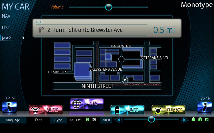
MIT did some testing on how long people looked at dashboard type to read it. They found humanist type more readable than geometric. They have narrower glyphs than geometric, based on circle-my take. Also Verdana, if that's what they used, has better spacing.
Congrats to Carl Crossgrove!
Here is an article on it. It's in the third slide.
I would like to see a comparison to Clearview Highway, which used distance thresholds, as well as time, I believe.