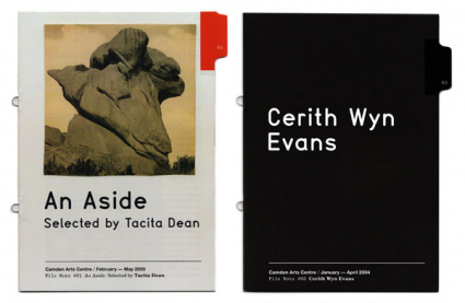
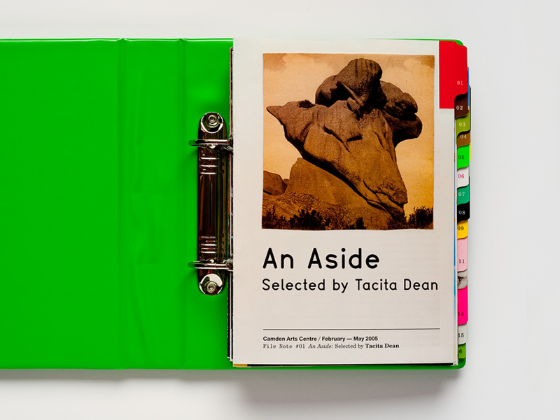
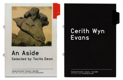
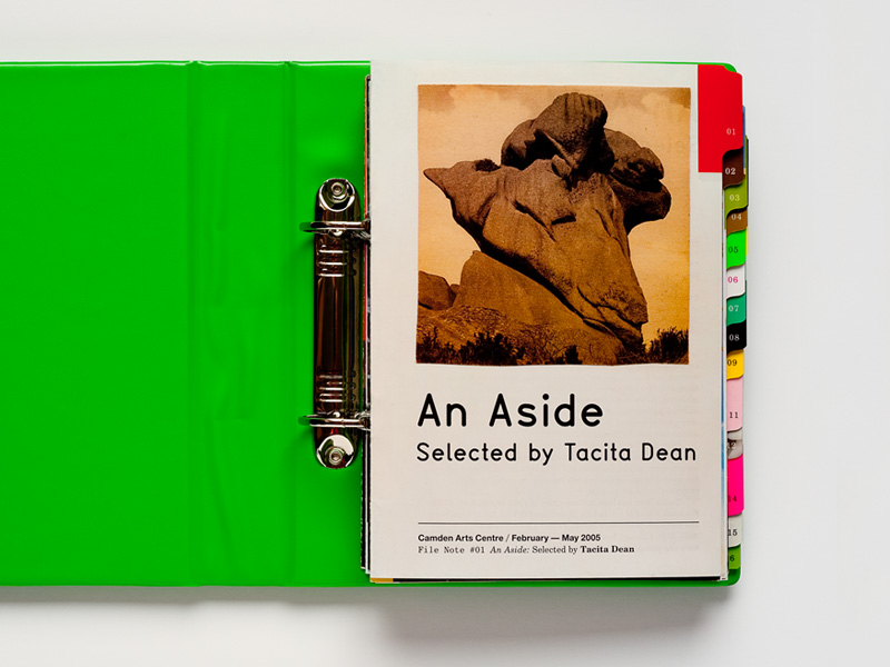
I really dig this combination that Sara DeBondt used in this piece.
Any ideas on all the type being used?
Couldn't find a larger image.
Thanks in advance!
| Attachment | Size |
|---|---|
| Sara-De-Bondt-studio-3.jpg | 112.33 KB |
| Picture-2-425x277.png | 128.58 KB |
I really dig this combination that Sara DeBondt used in this piece.
Any ideas on all the type being used?
Couldn't find a larger image.
Thanks in advance!


| Attachment | Size |
|---|---|
| Sara-De-Bondt-studio-3.jpg | 112.33 KB |
| Picture-2-425x277.png | 128.58 KB |
For the "tall rounded" sans one, Gravostyle looks close but can't be positive for matching. Need to dig more.
For the 3 other bottom ones, I really couldn't tell at this size. The first line could be Helvetica Neue. The second line is a mix of a typewriter (Courier?) and serif, Italic and Bold (Times?).
Hi Ryuk, Gravostyle is an interesting choice but to my eye, the _A_ is a little too narrow, the _d_ looks a little too boxy and the tail on the l and t seem a trifle short. Optimo's design note: "Gravostyle is designed after the basic cut of the generic Swiss engraving font system." None of the engraving machine fonts for which I have samples are any closer. Anyway, I doubt anyone would notice if Gravostyle was used as a substitute.
Don
Another one is Type 1451 LL but I don't think it matches either (some letters closer, some less). Actually, don't know many 'condensed rounded sans' with such a spurred single storey /a... Which finally could appear to be an alternate glyph...
It has also an architectural/engineering/Leroy Lettering feeling like Bryant Condensed, Planscribe, TGL 0-16, Rendering (no lowercases unfortunately) and so... A good one too is Simpliciter Sans.
Captured from web.archive.org on 17 Mar 2015. view this capture