
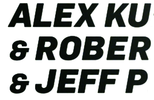
Hi, I have been doing research about this font, but still got no clue. It would be great if someone come across what this font is, thank you very much :) Keith
Hi, I have been doing research about this font, but still got no clue. It would be great if someone come across what this font is, thank you very much :) Keith
It feels DIN Black Italic but some details are off: /&, /J leg terminal... Closest I have is Ciutadella. What's the sample origin?
More alternatives so far: Kelson Sans, Abel (manually slanted), Helsinki (not bad but wrong /&), Nudista
Thanks Ryuk!!! Very appreciated your help!!! But I think that image just combined with some different fonts.. cos i have try using Din it's quite match with that but some letters like A, M, J, don't mate with the image. But thanks and you have been helping me a lot! thanks! :)
Try Robusta Heavy Italic the /& symbol is correct and the other characters seem right too. Its also slanted
Sorry but Robusta does not look to fit at all to me: /O, /R leg, /&, /J leg terminal... Actually, everything :D
Flama Black Italic with a reduced sized ampersand
its either geogrotesque or something super similar
Good call, Les! Looks almost perfectly matching for the lettering. The ampersand is still off.
What's 'off' about the ampersand?


Fun game. Anyone can play. Slant Flama Bold Italic 10 degrees in Fontshop and the sloped vertical strokes on LEKRBFP etc. become precisely vertical. Slant the original image 10 degrees in your graphics program for comparison. Try the game with some of the other font candidates. Most of them do not have a slant of exactly 10 degrees and the mismatch becomes obvious.
Don
Captured from web.archive.org on 2 Apr 2015. view this capture