
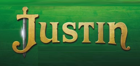
Clearly customised but am wondering what the closest 'starting point' font might be for this?
| Attachment | Size |
|---|---|
| justin.jpg | 96.44 KB |
Clearly customised but am wondering what the closest 'starting point' font might be for this?
| Attachment | Size |
|---|---|
| justin.jpg | 96.44 KB |

Might have used a base font and extensively modified it, or just done as lettering. Only the staff of Antonio Banderas would know for certain.
About the only letters that seem to be relatively unchanged from standard fonts are S, T and I. They are reasonably consistent with Clarendon http://www.myfonts.com/search/clarendon/fonts/
Don
Many thanks Don
Clarendon would seem a reasonable starting point
I may tweet Antonio...
Don't have the answer unfortunately. Could be custom. Some tracks to follow, possibly completely helpless though: 'Medieval' (Dulcinea Serif...), 'Uncial', 'Irish', 'Celtic', David Occhino Design
Thanks Ryuk - you've given me lots to think about there
Just to help you along. The u and n are in a style called uncial -- from the latin word “uncus” meansing hook-shaped like a beak or talon. Two fonts have very nice u and n shapes that could be adapted to your project. English Garden SG http://www.myfonts.com/fonts/spiecegraphics/english-garden-sg/ and Testament CT http://www.myfonts.com/fonts/canadatype/testament/
Don
Thanks Don - and for the latin meaning - it is def that hook-shape in some of the letter forms that the client is after
You meant 'uncial' Don, didn't you? So, my previous comment was not so useless. Anyway, glad to have been of a little help Nathan :) Good luck with your client.
Yes Ryuk, your previous comment WAS very helpful. It got me thinking about the pseudo medieval letterforms. BTW, thanks for correcting my spelling of "uncial," I have edited my second post.
Don
Captured from commoncrawl.org on 27 Apr 2015. original URL
