
Typophile
Metal type, Wood, Chiselled, Engraved with Swashes and Shadow
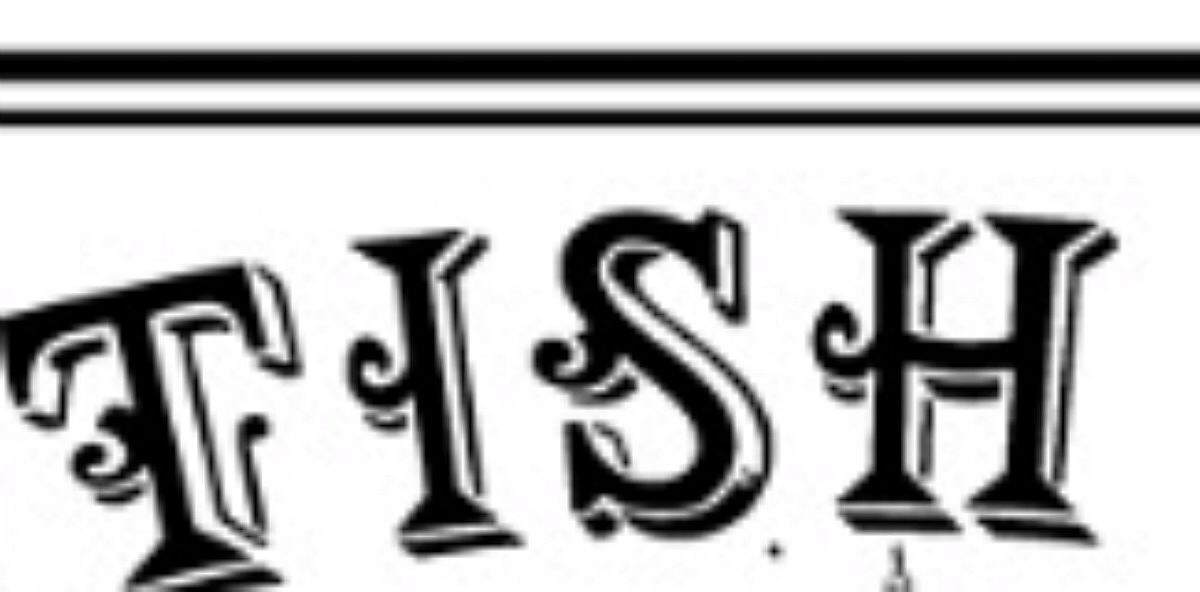

Might help if you gave some hint as to the nature of the image, logo, menu, old book etc and an approximate date.
At first glance this looks like a "Latin" type such as Etienne http://www.myfonts.com/fonts/paratype/etienne/ Latin CT http://www.myfonts.com/fonts/castletype/latin-ct/ ITC Barcelona http://www.myfonts.com/fonts/itc/barcelona/ or Spike http://www.myfonts.com/fonts/quadrat/spike/ with a shadow line and coat-hook ornaments pasted amidships.
This is not to say that someone has not packaged this mish mash as a font. Could have been done by a Victorian typemaker with little imagination or a similarly changed modern designer.
Compare it with the somewhat similar, but much better designed Algerian http://www.myfonts.com/search/algerian/fonts/
Don

The font is Chorus Girl and the only source I'm aware of is on the CD bundled with the 24 Victorian Display Fonts CD-ROM and Book . Dover stopped making and selling these several years ago, so I've linked to one possible solution (just make sure the CD is intact).
This font has been digitized by Dan X Solo for Dover Publications Inc. under the name of Chorus Girl. Should be available here.

I stand corrected. This is an inept Victorian design, rather than a modern mish mash. Looking at the full alphabet, I see no reason to modify my critical appraisal. It's still a somewhat standard Latin with discordant coat hooks pasted on -- presumably so the chorus girls have someplace to hang their costumes after the show.
Don
I agree, Don. Spot-on appraisal.
By the way, Matt. The font was a bit manually stretched (so as to allow for easier hanging of costumes).
Please don't get me wrong, I AM a fan of Victorian ornate typefaces when they are imaginative and well executed. But this one is so uninspired and clunky that it gives a bad name to the whole genre.
Don

The basic issue is that the "hooks" make no sence.
Thank you all very much. I had almost given up so you've made a frustrated designer very happy. Thanks again.
Cheers,
Matt
Captured from commoncrawl.org on 25 Apr 2015. original URL