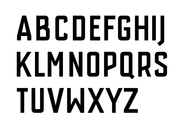
This is my attempt at a squareish condensed sans. It is uppercase at the moment only and is intended to have an industrial feel to it.
There are a lot of issues to be ironed out, but any feedback /suggestions / insults are more than welcome.
| Attachment | Size |
|---|---|
| works-rough-110314.gif | 20.87 KB |