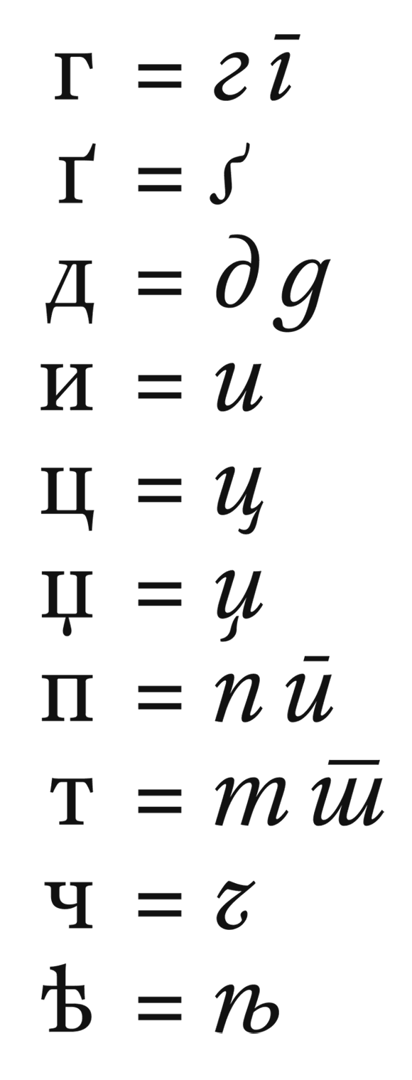
Type does not boil down to any physical tool, or even a set of such. Those who have based their lives on that illusion –because that makes them feel better– want us to believe that. Expose them, for the love of the craft, and the love of mankind's cultural progress.
Reverse-contrast is indeed not an improvement per se, but yes, it can be catalytic in the eventual abolition of the illusion. BTW we should not use "reverse" because that reinforces the skeuomorphic illusion; I recommend "vertical" and "horizontal".
There are about half a dozen typeface designers that are on the right track. Or at least off the wrong one.
hhp