
Check out the font on 'TWO INCH TAPE'. I feel like I've seen this around a lot but I cant find any info on it online. Any ideas?
Thanks!

Font:
Brothers by Emigre
Solved By:
Check out the font on 'TWO INCH TAPE'. I feel like I've seen this around a lot but I cant find any info on it online. Any ideas?
Thanks!
Brothers by Emigre

Good catch Ryuk.
The record is post 2011 so it's almost certainly digital Brothers, which according to Identifont was designed by John Downer for Emigre in 1999. I note from his Identifont biography that he published essays on type history and hand lettering have in Emigré magazine and House magazine. Unfortunately, I have none of these at hand.
Does anyone have any idea as to the source of the original design?
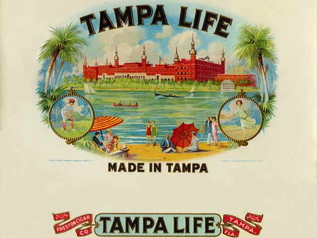
The Myfonts tags included _cigar_ so I looked for matching lettering. I found an online image of a Tampa Life cigar box label from 1927 which looks somewhat similar toe Brothers:
Amazing! Thank you
Captured from web.archive.org on 17 Mar 2015. view this capture
