
Inspired by some lettering on an old Soviet-era electronic device, I have started working on a minimalist, future retro font I'm tentatively calling "Elektromuzika" in reference to the source. Since I am not a native speaker of any language that uses the Cyrillic alphabet, I am looking for some other sets of eyes to look over what I have so far and let me know if these forms are acceptable and legible - bearing in mind the design choices made to fit into the over all style and mood of the font.
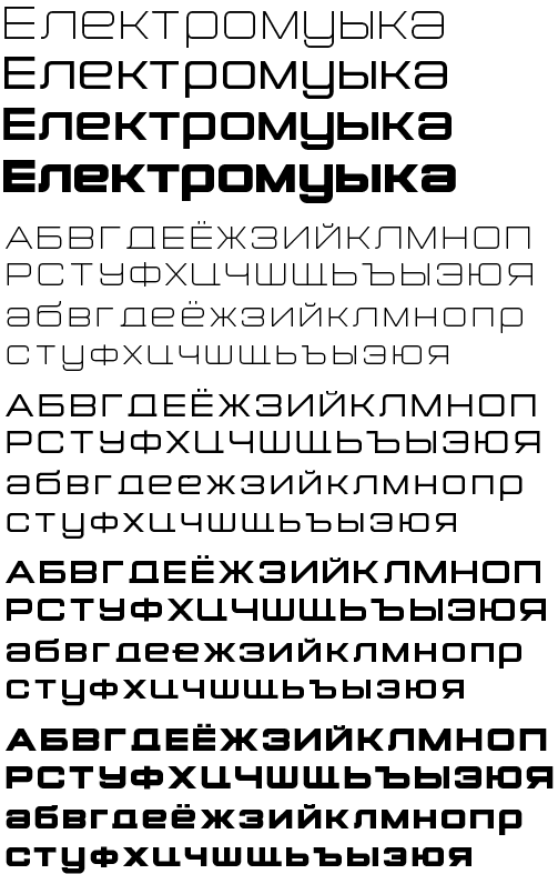
Four weights - Light, Regular, Medium, Bold. The Medium and Bold styles are closest to the original lettering but I'm really digging the light. Some of the more out there design choices, such as the sliced off descenders on the /De /Tse /Schcha etc. were present in the original.
I don't hate the name, I think it works well in English, but if I were a Russian speaker I'd probably think it very odd - so will probably end up changing that. Still a lot of work to do. For instance, I need to work on some of the glyph widths to produce a more even flow. Final product will include full latin glyph set.

I just realized I misspelled the name in the sample provided above. Quelle honte!