
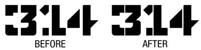
This is my first post EVER but I would like everyone's feedback on a logo i sketched and vectorized: 314
The 314 logo is for an art studio out of Portland, located in a heavy industrial area of the city. The stencil letterings were inspired from the local trains which cross right in front of the studio.
I feel that the "3" needs some editing but im not so sure? The letter is 4 units tall x 4 units wide.
Thanks.

| Attachment | Size |
|---|---|
| 314 Option Showcase.png | 3.26 KB |


thanks