
Hi everybody,
Does anyone know the name of the two typefaces used on this movie poster ?
Thank you for your help !
Tristan
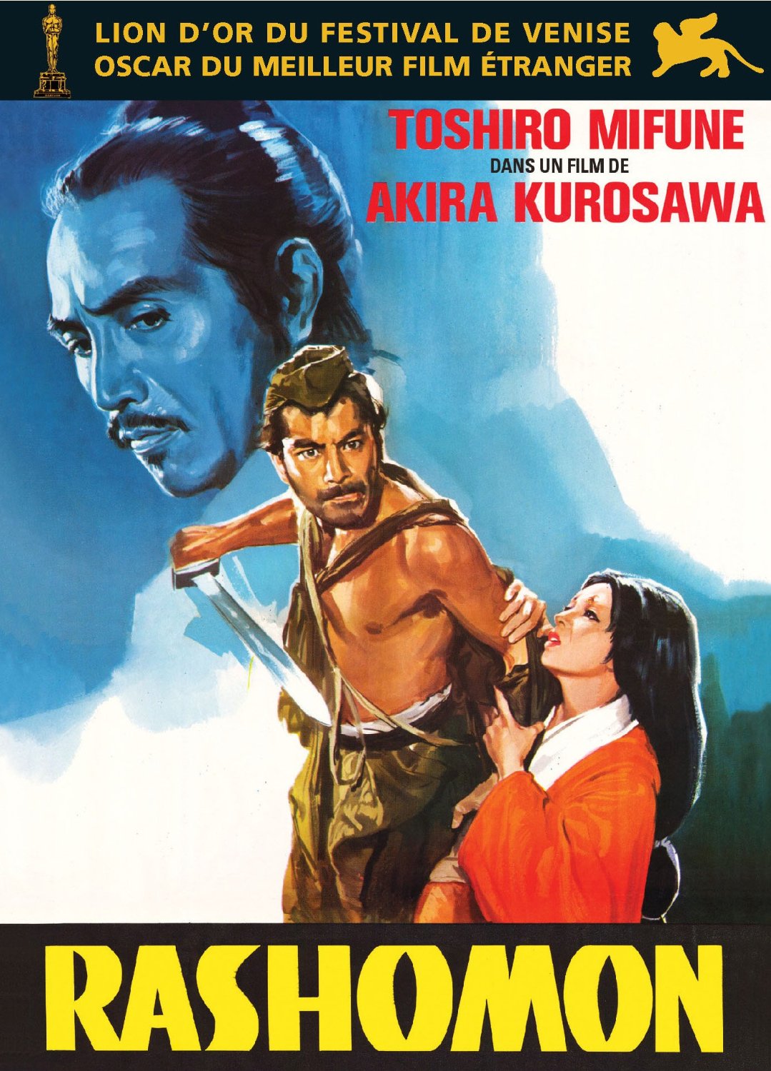
Font:
Aardvark, Block Gothic, Frutiger
Solved By:
Hi everybody,
Does anyone know the name of the two typefaces used on this movie poster ?
Thank you for your help !
Tristan

RASHOMON looks like an adaptation of Font Bureau Aardvark. The A and H have been changed to have normal crossbars, but otherwise this seems like the source (or inspiration) for this lettering.
- Mike Yanega
There are two different sans serif fonts used on the poster but the red lettering looks a lot like Block Gothic from Red Rooster. A little height/width tweaking seems like it would match very well.
The gold sans at the top is something else that looks commonplace.
- Mike Yanega

The gold sans is Univers, by Adrian Frutiger. Available from Linotype and Adobe. Best match is probably the Black (75) weight.
George, you're right. I completely skipped the word OSCAR and was was looking at some other features. My apologies for jumping the gun.
Osamu, I think you had the right designer, just the wrong typeface. I think it's Frutiger.
- Mike Yanega
These are the ones I was looking for. Thanks a lot to all three of you !
Captured from web.archive.org on 1 Jul 2014. view this capture
Osamu, that gold lettering is not Univers. The /S and the /C are the first indications.