Typophile

stamped serif font

Jenny Chillingworth

Hi
Can anyone help with identifying the font used in this stamp please? I'm not sure if the distressed look is inherent to the font design or an effect of stamping. On the same note, I'm not sure whether the character alignment is irregular or whether the letters have been stamped individually.
Any help is very much appreciated.
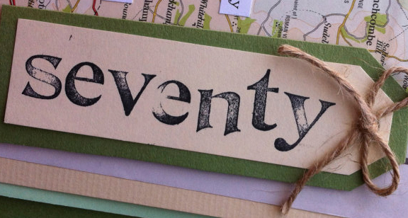
The style is generally called De Vinne, and was used in inexpensive rubber-stamp kits in the 1900s. Unfortunately, the /n doesn't match...

http://www.myfonts.com/fonts/woodentypefonts/de-vinne/

Agree with Nick. Definitely DeVinne. For the /n issue, may it's a 180° rotated /u.
More alternatives (some including a roughen effect): Hand Stamped JNL, Publication JNL, Charter Stamp HF

Thanks for all you help guys. That will do nicely!

Captured from web.archive.org on 14 Oct 2014. view this capture