Typophile

Type Battle 42! Draw 3 contemporary additions to Zapf Dingbats

Jared Benson

It's Monday, and it's time for a Typophile favorite — the Type Battle!
What better way to refine your craft, than to get hands-on with it?
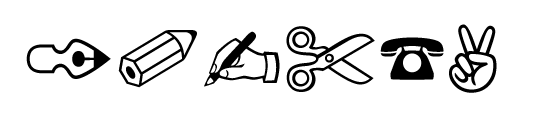
This week's battle: Draw 3 contemporary additions to the world's most ubiquitous dingbat font, Zapf Dingbats.

Winner take all, no holds barred. May the best designer win.

THIS BATTLE ENDS: Friday, 28 February 2014 — Midnight PST

// REQUIREMENTS

- Solution must integrate seamlessly with Zapf Dingbats' design and contain three characters.
- Characters must be custom drawn. No use of existing fonts or clipart!
- Image size: 550 width x 400 height. 72 dpi*
- Color: Black and White
- Format: PNG, GIF or JPG (Preferred in that order. Make sure there are no spaces in the name)

*Please try to keep your file sizes to a minimum! ~50k per file max.

// ABOUT TYPOPHILE TYPE BATTLES

This is your chance to flex your type muscles on a weekly basis. You have one week to create and submit your entry. Anyone may submit a design response to the challenge. You may enter as often as you wish. Post anytime. Critiques and comments are welcome throughout the game, from participants and spectators alike. Smack talk is encouraged.

As with any street battle, there is no panel of judges and no prize — the community decides on merit alone, and you may win the ability to call yourself the best on the block for this challenge.

Link directly to this battle: http://www.typophile.com/battle42
Link to the battle directory: http://www.typophile.com/typebattles

WOOHOO!

I'm in!

Unfortunately I haven't got time to do two more…

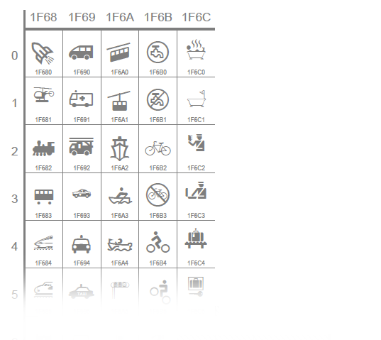
Zapf Dingbats: the most stupid font ever made, i.m.h.o.
No case for laurels.

Enjoy if you wish, but’s not my cup of tea. No thanks.

Andreas, what specifically to you think is so stupid about Zapf Dingbats?

–> what specifically to you think is so stupid about Zapf Dingbats?

The selection of signs. But perhaps the nobilitation of that random set by an own Unicode page – is even more stupid than the font itself.
Well, the horse has left the barn long since, so what the heck …

Andreas, make a symbol that says that. :->

hhp

… in my opinion it would be more interesting to battle for the design of (e.g.) a phone, a pen, a scissor, a car … to fit the style of a particular chosen typeface.
For instance, how would such characters look like when getting moulded in the style of a blackletter or formal script face? :

Anyway, I don’t mean to spoil the game. just my 2 ¢s.

It has been a long time since battles have raged on this forum ;-)

> a symbol that says that

:->
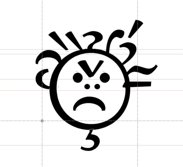
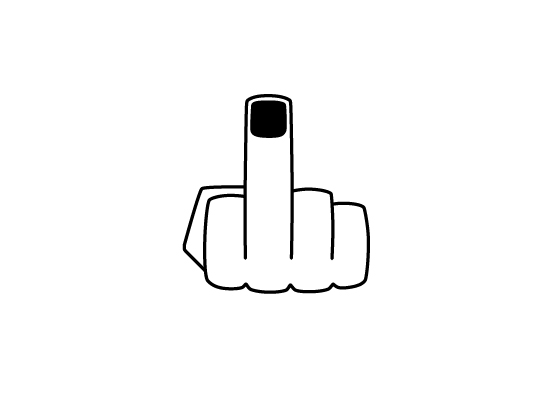
Unicode F666: PISSED OFF BABY

hhp

...contemporary additions...

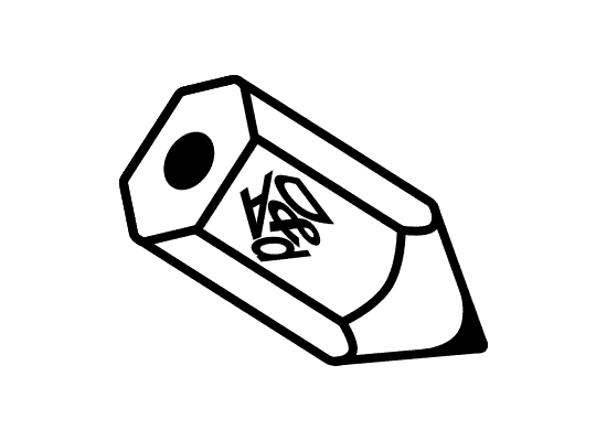
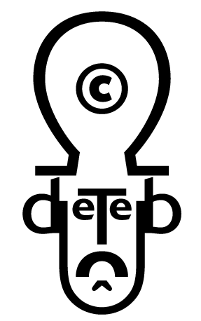
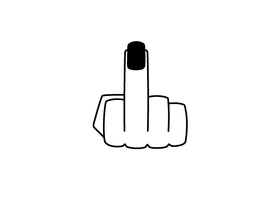
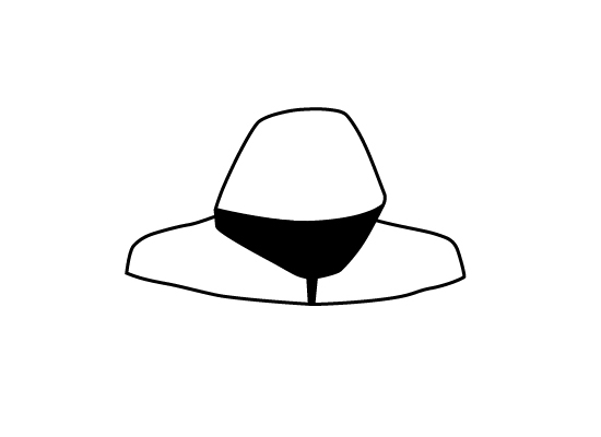
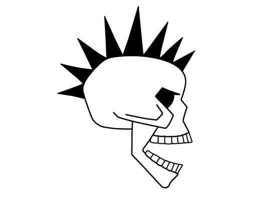
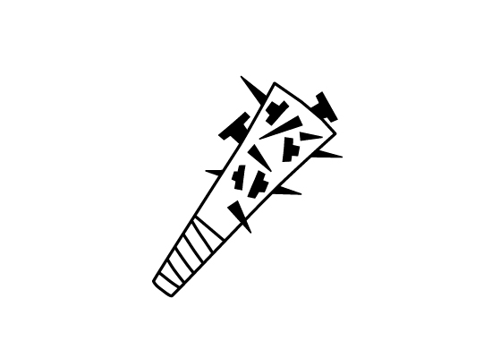
Okey doke, here's a few from me...


...integrate seemlessly they should.

Oops, was I supposed to design dingbats using only type???

;)

No, you don't have to construct them from Type... But rather just make them look like part of the Zapf family of dingbats.

We'll extend this battle for another week to give more time to people to throw their hats in the ring.

Only two from me

Best

I contemplated doing a cross too but dingbats includes one already

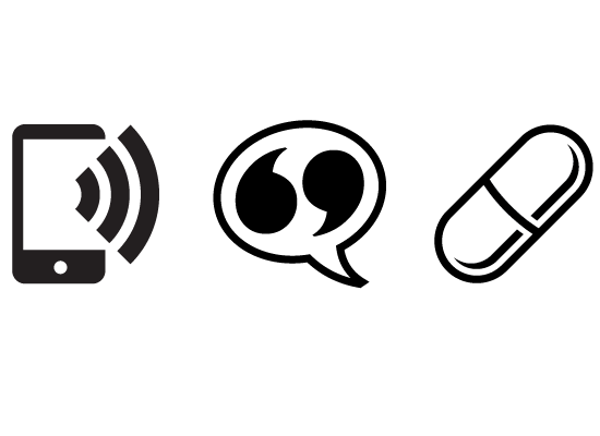
My thoughts on the modern, connected world - summed up in three new dingbats.

Think you've nailed it there Osamu. Might have a go too, though :-)

Captured from web.archive.org on 17 Feb 2015. view this capture