Well established, high end, nationally distributed Fine Art magazine is undergoing a redesign asap (to be started now and completed in days maybe weeks but not months) Sorry for not just telling you my name and what magazine I am redesigning now but I am not at liberty to "publicly disclose" this info but send me an email and I will inform you of everting by email or phone (hurray for technicalities). Of course, you can just look at the art section of any Barnes and Noble newsstand or google high end Fine Art magazine if your in a country that may not have in on the newsstand and figure it out.
If I had a budget (I myself, am not getting a cent for the redesign: Art magazine, even long established ones that target the affluent, often, ironically, generate little in the way of net profits) I would commission something as I have done in the past but clearly that is not an option unless someone reading this really wants to make a name for themselves. What is most likely and has also happened a number of times is that someone is working on a font/font family that fits what I am looking for and so they license it exclusively to the magazine for a token amount, like a dollar, for a set time period, like a few years or until the font is ready to be commercially available. (Don't worry, I will not disclose any names of who I have done this with but all one has to do is pay attention to who are the successful type designers who often have there fonts in magazines before they are commercially available.)
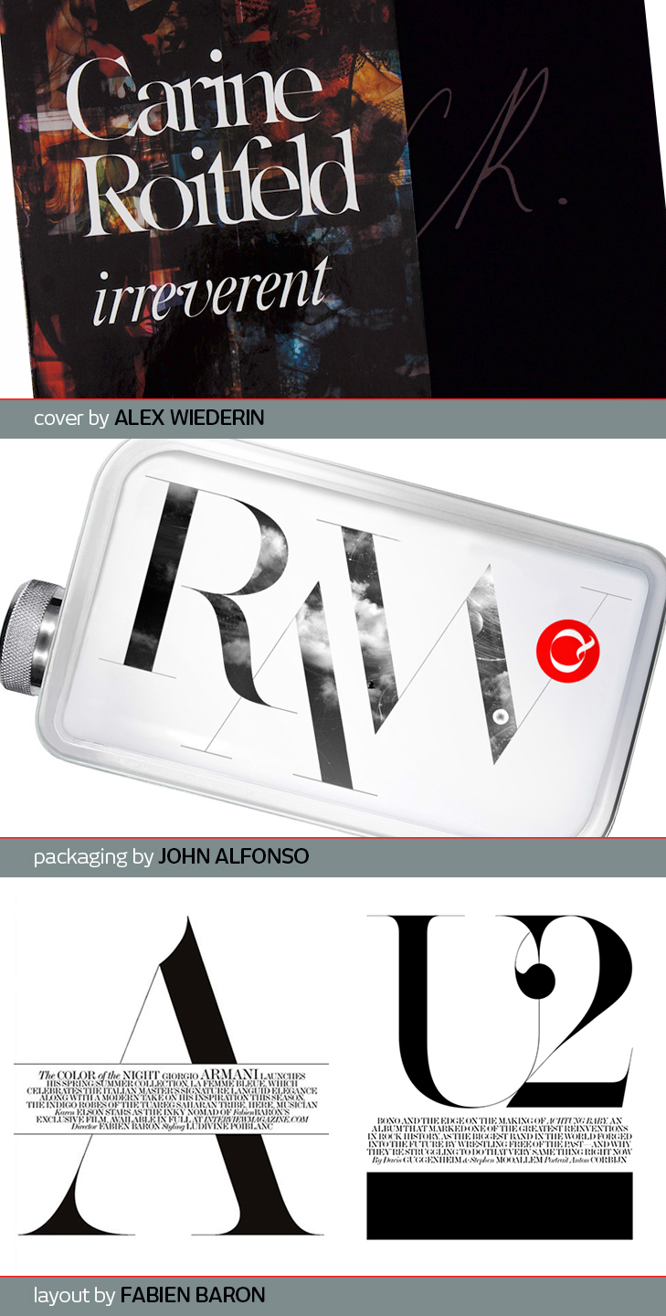
So what am I looking for? A high contrast serif headline face with a hairline thin hairline in the tradition of, but not a duplicate of, Caslon or Didot. More specifically this font has to communicate a "slick high fashion" sensibility through the same visual cues that the fonts BaronMTModern, Carine, do (Examples shown) yet not be so radical that it irritates the predominately visually conservative sensibilities of its current audience who is accustomed to seeing headlines set in the Minion family. In other words I have to strike the delicate balance in the design between creating something "hip" enough to attract design forward members of generation x and millennials (which this publication needs to grow) without alienating the very affluent baby boomer and greatest generation readership it now has. From my perspective BaronMTModern and Carine are two examples that hit this balance perfectly. (though I can nit pick on some details)
Fonts I have considered using but just fell short include:
Big Caslon
(For the most part this would of been perfect but for the fact that everyone has the same cut installed on there computer and the hairline is not as thin as a hairline not to mention there are a few details that would need to be finessed. If any one has created a new version or something that is inspired by Big Caslon please let me know right alway)
Ambroise
(a bit overused right now and its unique attributes do not communicate "slick high fashion" to me)
Williams Caslon
Didot
(I looked at as many cuts by as many people as I could find)
Didot elder
Brunel
Miller Banner
(strong contender if only other magazines were not using it as much. Also, none of the cuts has a hairline as thin as a hairline.)
Thank you for taking the time to read this I will not be getting much sleep till this redesign is done so if you email me I will likely reply fairly quick. (ps I may be contacting some of you whom I have worked with in the past directly with the same message latter- did not want to be a jerk by calling on the weekend to ask for a favor)