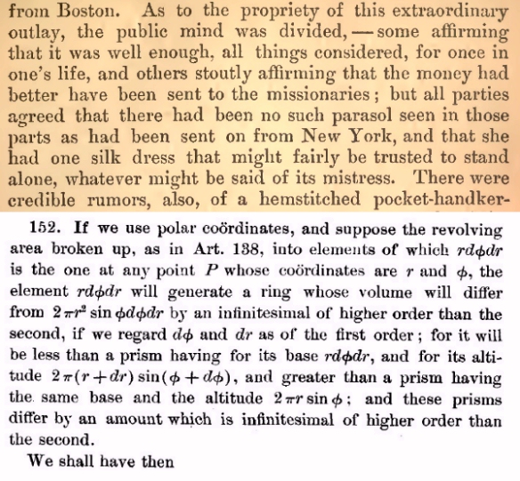
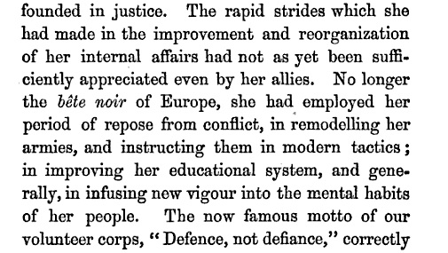
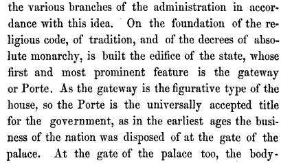
I am trying to find a way of achieving the same colour, evenness and strength that Jenson conveyed, for instance, here:
http://en.wikipedia.org/wiki/File:Jenson_1475_venice_laertius.png
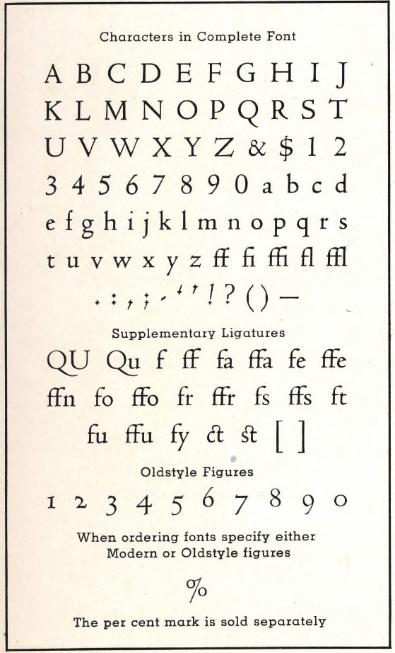
I appreciate that there have been many digital typefaces inspired or informed by Jenson and I’ve tried some of them – Adobe Jenson, Arno, Legacy Serif, Centaur – but somehow all of them create a very different feel on the page.
I have been trying to put my finger on just what it is the 15th-century Jenson has that the modern typefaces don’t and just what it is that I find so attractive about the 1475 sample.
It isn't the archaic features I'm missing, the long ‘s’ for instance. And it isn't the individual letter forms particularly; it’s the look of the whole that’s so special, once one gets a certain distance away from it.
I wonder perhaps if it’s related to the lack, to some extent, of sharp edges in the 1475 sample. Compare a page of Arno (beautiful in its own way) and this sample and the Arno looks much more intricate and clean cut: the serifs are sharper. But it doesn't, to my mind, have quite the same unaffected power that the Jenson does.
Anyway, I wondered if anyone could help with these questions:
(1) What is it that gives the Jenson its special beauty?
(2) Is there any digital typeface which might achieve the same strength and colour?
I am simply looking for a workhorse typeface for everyday use; this isn’t for a specific project. And I am not a type professional, so please excuse any glaring examples of ignorance in what I've written.
Thank you,
Oliver