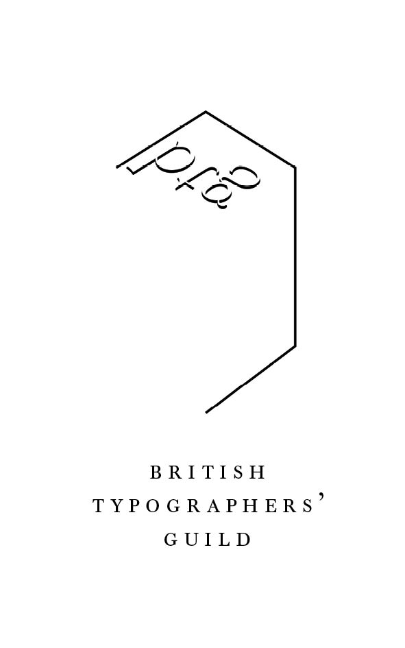
At university we have been given a brief whereby the 'British Typographers' Guild' is being re-formed and we are to create an identity for it. I created the logo attached using the outlines of the characters 'btg' in type metal used for letterpress. I have been told it 'lacks presence'. What are your thoughts and how could I improve it?