
Among the history of typography and the history of foundries, which rare metal typefaces do you wish to see released in digital form?
Provide examples with a brief explanation.
Thanks.
Among the history of typography and the history of foundries, which rare metal typefaces do you wish to see released in digital form?
Provide examples with a brief explanation.
Thanks.

A proper revival of Fleischmann's #65 would be most welcome.
hhp
1. A proper revival of Warren Chappell's Lydian featuring the Gothic capital A and the old style figures.
2. The digital release of Rudolf Koch's Offenbach.
3. The digital release of Monotype Barbou, the second version of Fournier Roman, supervised by Stanley Morison.
4. The complete work of Cassandre in digital form.

I would like to see Vogue and Tempo revived. A few weights of Tempo have been digitized, but only a few. The closest thing to Vogue is James Montalbano's VF Sans, but it's not really the same thing. These aren't exactly "rare" as metal faces go, but it's surprising to me that they have not made it to the digital world.

I remember Vogue from some record jackets and CRACKED magazine. I'm afraid I thought this Intertype take on Futura was one of the ugliest typefaces I saw in serious use, so I'm not surprised no one wanted to revive it. Back in the 1960s, it was associated with very cheaply printed material, from people who couldn't afford a genuine Linotype machine.

Hey Hrant, I thought that you were against digital revivals. I seem to recall a number of comments that were critical of revivals in general. Or, maybe my memory is slipping?
I don't know that much about metal type, but there are a lot of old sign painter letter forms I know will be missed. They don't have meaningful names.
In general I certainly am, because it's no substitute for using one's own insights to properly serve the here & now. But there are a handful of old fonts that contain ideas highly worth promulgating, and literal revivals of such fonts can help break the ice so to speak.
hhp
John, ugly doesn't prevent a font from being usable. Pretty isn't everything.
And besides that, Vogue and Tempo are as different from Futura as any other geometric sans serifs from that era. They were definitely designed to be substitutes, but they weren't exact copies. They had unique qualities of their own. Tempo had a very lovely cursive italic in the lighter weights.
@Mark Simonson:
John, ugly doesn't prevent a font from being usable. Pretty isn't everything.
While this is undeniably true, in general a typeface needs to be aesthetically appealing to commend itself to those who use and purchase fonts. I wouldn't set a high bar for this, but I found Vogue to be distinctly unattractive, and its former use creates negative associations.
And this makes it unlikely to appeal to advertisers, the number one source of demand for typefaces. Also, as a text face, it's not particularly effective; it isn't, say, Ionic No. 5 - acceptable in appearance, and highly legible.
Incidentally, another killer for a typeface, I believe, is looking "dated". Revivals can have subtle changes that fix that, of course. This, for example, is why we don't see much Cheltenham these days, although it's readily available. Even one of my favorites, Cloister Oldstyle, seems to have this flaw to a degree.

I see tons of Cheltenham every time I look at The New York Times. Just saying.
Eh, you never know. The weirdest things have caught on. A young designer might look at Vogue and see something totally different in it than what you see. I half dread the day when Lydian becomes popular again, but I won't be surprised if it happens.
Hey, there was a Lydian revival last year... :-/
hhp

I see *lots* of Lydian these days, in those new-messy-style layouts. Very, very trendy these past couple of years. e.g. this poster or this exhibit.
I'm not surprised.
I wish they could really release the original Monotype of Lydian that was in use in the Seventies.
Find enclosed an onscreen credits from a mid-Seventies series. Notice the crossbar of the capital A.
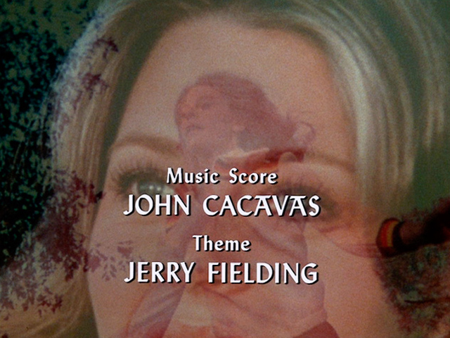
If anyone doesn't recognize the photo, the series is The Bionic Woman, with its star Lindsay Wagner pictured.

Lydian was designed by Warren Chappell for American Type Founders in 1938. The original ATF foundry font included an alternate capital A with a cross bar. This would seem to be the only difference in the Lydian shown in the TV image [Bionic Woman?] and the digital Lydian. The crossbar A is not included in the original design patent image. Reference US design patent D116,996 issued on October 3, 1939.
Don
What's up with the first "A" not having the top bar? Is the guy's name Cacāvās?
hhp
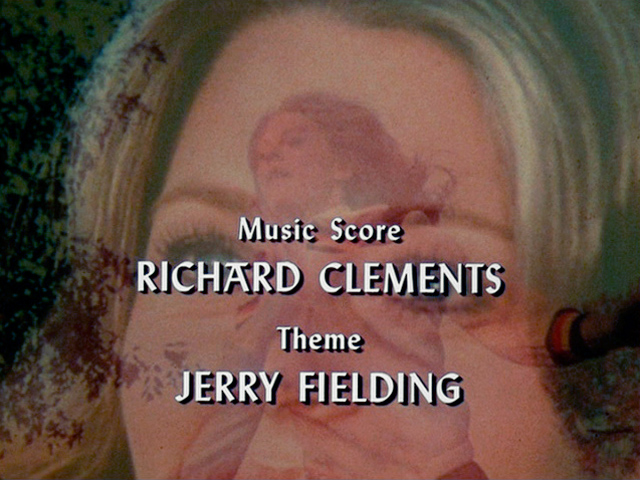
Here's another onscreen credits with the special capital A with a fraktur flavor.
Lydian is influenced by Rudolf Koch's Offenbach and Stahl.

Genzsch & Heyse Antiqua, also known as Nordisk antikva/Nordische Antiqua. It was widely used in the Nordic countries.
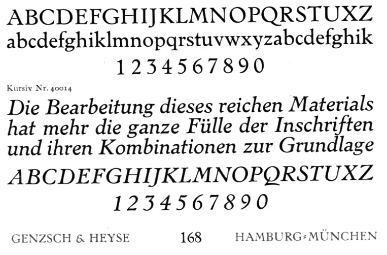
My childhood encyclopædia was set in this typeface, so my taste in type is heavily influenced by it.
Here is a closer look:
http://www.flickr.com/photos/bogtrykkeren/3531503890/sizes/o/
One of my favs too - luscious Italic!
hhp
Odd. I liked the Roman, but the Italic was the one thing I didn't like, as it reminded me of too many horrible nineteenth-century italics. The picture on Flickr, I would have mistaken for Aldus.
I think you mean early-20th-century, since that's when ATF (and later Morison) did their "insensitive" slanted-Romans. This one is crafted, and to me much more harmonious with the Roman (noting that the main job of an Italic is to be subservient) than a conventional overly-cursive "look at meeeee" Italic.
hhp
I wasn't so much thinking of, say, Bookman Italic as Barnhart Brothers' Caslon Old Roman Italic or similar typefaces.

Goudy Companion.
It has some oddities which have been a great inspiration to me.
“I BELIEVE the new letter…both in the roman and italic, is one of the most distinctive types I have ever made. It incorporates features which deliberately violate tradition as to stress of curves, but which are so handled that attention is not specifically drawn to the innovations introduced…its italics show greater consistent original features than any other face I have ever made.”— Goudy’s Type Designs, Frederic Goudy (about his Companion of 1927)
Hi Nick, Goudyfonts.com http://www.goudyfonts.com/shop-numerical/ says a digital revival of Goudy Companion is "in progress" but gives no details other than a "sneak preview" from 2009 of a work in progress by Ascender's Jim Ford http://goudyfonts.blogspot.ca/2009/08/goudys-companion-sneak-preview.html Nothing on Gerald Giampa's list https://www.p22.com/lanston/giampa/Goudy-Type-Face-List.html
Don

Sindre,
there are two digital versions of Genzsch-Antiqua:
http://fontsinuse.com/typefaces/31753/genzsch-antiqua
I wonder when will they revive Linotype Estienne by George William Jones?
Thank you, Florian. I actually found that out myself after posting, and now I found the one that is commercially available here. But I find it hard to tell the quality of the fonts; not too much information on that site.

Florian, Sindre:
Another Genzsch-Antiqua digital version is "Nordik" by Bo Bermdal, 1992.
Regular, Regular SC, Italic and Bold
Why is Nordik on Fonts.com but not MyFonts?
hhp
Also related, PsyOps Tarocco and Red Rooster Stanhope.
Find a series of fonts by Hans Mardersteig:

With regard to Cheltenham, the Matthew Carter's version for the New York Times is a real improvement on the original, in my opinion. It keeps the usable qualities and manages to look fresh and attractive rather than musty and old. Only the irredeemable lower case g is still ugly.
Hi Sindre, as for the quality of Gerhard Helzel's Genzsch-Antiqua, if you can extract fonts from a pdf you can check the quality of the few letters that he has included in his big pdf.
Don
There is an unusual slab serif achieved in 1936 at the Deberny et Peignot foundry entitled Ramsès.
It features very high and exaggerated ascenders and descenders.
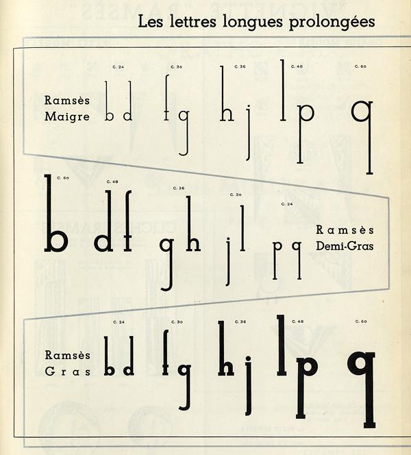
Stymie had elongated ascenders and descenders like that. Also, some alternate characters.
Elongated ascenders and descenders earlier in Parsons. See ATF 1923 Specimen Book.
Don
Stefan, cool. I wonder if the extenders were constructed with parts (as opposed to the letters being whole sorts).
hhp
Is this elongated version of Stymie sold in the digital market? Which retailer?
Thanks in advance.
I don't think so. I've never seen them except in specimens of metal type.

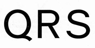
My primary answer to this question is still Mercator (1959) by Dick Dooijes. At least a few Dutch designers have made revivals (some discussion is here) but I don't believe they have been offered for sale. Other fonts today which have been loosely inspired by Mercator are not quite satisfying to me in key respects (nor are Neue Haas, etc.). Mercator's C and S have briefer curves to the terminals than most grotesques, giving them a very open look which I find attractive; and that elegant Q is my all-time favorite (I'm surprised no later sans copied it).
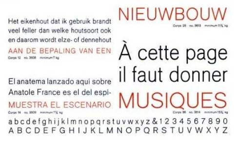
Mercator is a good sans-serif face; given the popularity of Akzidenz Grotesk/Standard and News Gothic, not to mention Helvetica and Univers, I'm surprised that it hasn't remained continuously available.
On the other hand, I see that many of the European typefaces do remain available; Egizio Roman is apparently still offered by both URW and Linotype, although just as "Egizio".
Captured from commoncrawl.org on 19 Apr 2015. original URL
