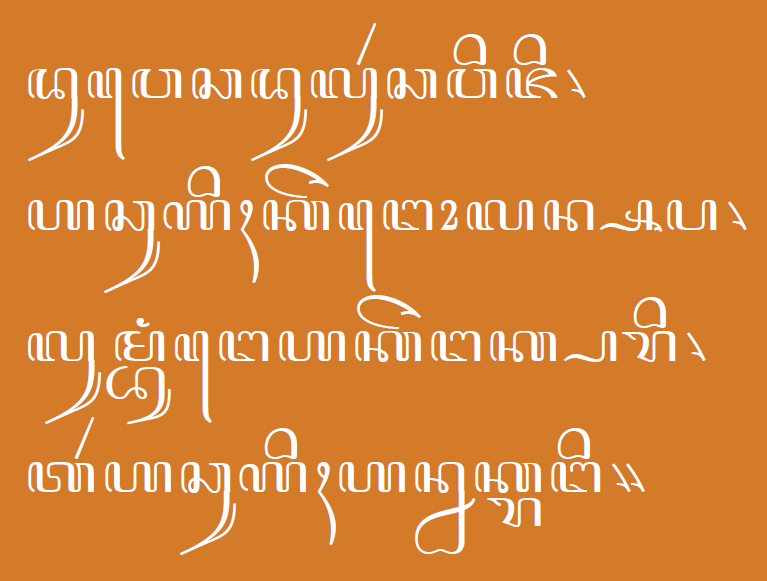
When you set up Vertical Metrics for a font with the Windows 1252 charset, let's say, life is fairly easy.
The outer limits of descenders and ascenders and diacritics above and below are readily seen.
However, if the font is expanded in the future there may be glyphs that extend much higher and/or lower than anything in that first group of glyphs. In fact, it's a certainty.
Sooooo.....
In light of the vast experience of some of the folks here at Typophile, I was wondering if someone could share what glyphs are the tallest and what glyphs are the lowest (and the languages to which they belong) once you venture past, say, the Adobe Latin 2 set or Windows 1252.
Any advice on what glyphs to use for the uppre and lower outer limits?
All thoughts appreciated.
rich