Hi,
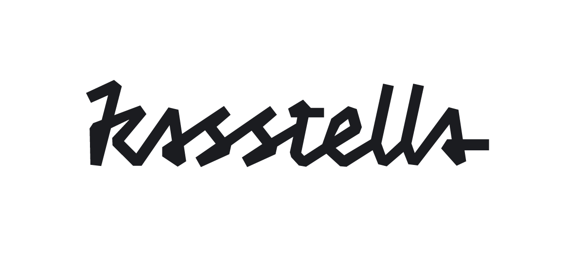
I haven't posted here for a while, good to be back. I just want to throw a bit of a curveball really, it's a logo I'm working on for part of my own business; related to design and print. I don't want to say too much as i'd like some feedback, first impressions, initial thoughts. It's essentially a sketch so any comments on design and polishing up would be great, though I'm just looking for feedback on what impression this letterform gives. It's the first time I've tackled any sort of weird script like this and, to be honest, I'm not sure wether to progress.
Many thanks for your thoughts!
J