Typophile

Archive through August 27, 2003

Hrant H Papazian

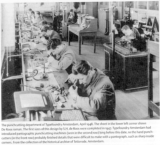
I think I've found some good evidence for my position on trapping of metal fonts in general, and Tetterode's Pascal* in particular.

tetterode.jpg

It's from "Dutch typefounders' specimens" (Lane and Lommen). The photo is about 11 years prior to the production of Pascal, but I suspect not much had changed in the meantime.

* http://www.themicrofoundry.com/other/Pascal60.jpg
I think one of those young'uns in the first row simply messed up that "b".

hhp

Hrant,

Am I missing something? Where does it say anything about "ink trapping"?

Nice pic though?

Gerald Giampa

:cries: Not the ink trapping debate again.

Well, there's more to this photo/caption than trapping, actually. Like the fact that quality-minded foundries had to manually overcome the pantograph's limitation(s). This is something I had a hunch about in the previous thread, and now there's proof (and I don't use that word lightly).

hhp

Hrant,

Just for the record.

You agree there is nothing to support your "ink trap fantasy".

Topic "Trapping".

Gerald Giampa

Hrant,

Topic "Trapping"

Just what is the connection? Is is "Bait"?


Gerald Giampa

Gerald,

I remember the trapping argument between you and Hrant from a previous thread.
I have no idea which of you is correct and though I had initial, mild, passing interest in the question, the way the debate ran soon cured me of that.
My current position on the trapping debate is that I don't know, and I don't care. In fact, I don't give a flying •••• through a ring donut whether trapping is a real phenomena, or a fantasy.
What is blindingly obvious though, is the connection between the previous debate and Hrant's image. In the previous debate you refuted the idea of ink trapping by (among other things) suggesting that the pantograph was not capable of cutting the sharp details required by Hrant's trapping theory. The caption on the new picture from Hrant shows that the fine detail was not in the hands of the pantograph operators, but was left to hand-cutters.
If you can't see the connection then you are either being deliberately stupid, or you are...well...just stupid.

Steve,

Good morning from Finland

Sorry but you and your hero Hrant are both on the wrong thread.

But it sounds like the beer in Jolly Old England is a good as ever. Feeling pretty silly this morning I guess.

Have a nice day.

Gerald Giampa

Hrant,

.0001

Gerald Giampa

Gerald,
Ok, yes, you are just stupid

>your hero Hrant

If you read through the archives, you'll find that I disagree with Hrant on almost everything I've ever discussed with him.
However, with an extensive background in the areas which require the rigorous development of logical arguments I can tell the difference between a consistent position and bland unspecific ramblings.
Hrant, wether right or wrong, is (when he can lay off the abrasiveness) always logical and consistent in his arguments. He is clear in his presentation and is capable of identifying what is and isn't relevant to his case.

You, on the other hand, appear to be incapable of stringing together even a single sentence of coherent argument.

As I said before, I don't know (or care) wether you or Hrant are correct on the trapping issue.
But at least I've heard Hrant's point of view - all we have from you so far is gibberish.
If you have something to say, please say it.

Steve,

I used to be that way too. Anyway, I'm not worried about what you think; you don't do it very often.

And you are on the wrong thread, you said so yourself, so is Hrant, and he said so himself.

Where do you see anything about ink trapping in the caption below the picture???

I am just waiting for Hrant's point. Do you have one?

Smarty pants!


Gerald Giampa

Steve,

I have no doubt you are a nice guy. I am not sure why you are getting involved in this discussion unless you are interested. It occurred to me that perhaps you are interested.

But you have misread, and are misquoting me. I don't really want to go over all the material with you at this point. The last time I began "teaching about pantographs" Hrant and Gerald Lange started
insulting me and the conversation stopped. That is why there is that open letter thing going on I would assume. So some of your issues may be addressed over there on that account. But I do not believe they belong here.

If the conversation had not stopped maybe some of you in the Forum would have learned something. You may not like what you learned. You may have an opinion on it after you have learned. But you may have learned. There are not many people around who cut punches. Do you or Hrant? So this is a second chance and if there is serious rudeness you will be out of luck.

I am certainly not soliciting opinions from the ignorant. Opinions are not great teachers.

And frankly I am not really so picky about all this thread purity stuff, but I would really like to conclude one single question first.

What does this picture with the caption have to do with ink trapping?

For the life of me I am without answer. Maybe you have one. I request specifics, not some generalizations of opinions as I am well versed on those. I understand that you and Hrant do not like pantographs. And at least one of the two of you believe that Pascal link illustrates ink trapping.

For me, the "Pascal Fantasy" is truly laughable. That is where we depart. I am not able to pretend to believe the unbelievable.
.....

Hrant

Hrant,

Sorry something funny happened with your name, that was not intentional, not meant to be an insult.

Also I noticed you are not going to Vancouver. Perhaps if that is the case I may not either. I was hoping to meet. By the way I like the picture.

Gerald Giampa

Steve,

See my posting under Open Letter

Posted on Monday, August 25, 2003 - 6:22 am:

Gerald Giampa

> I request specifics

Until you stop polluting, you will get nothing.

hhp

I have two questions for those that think Hrant is right about pantographs.

I don't know whether I think he's right, because I'm not sure what he actually thinks, but can I answer the questions anyway?

1.) Would you rather have your type cut by an expert hand punchcutter, or by an expert Benton Pantograph punch cutter?

An expert hand punchcutter.

2.) And why?

First of all let me say that this has absolutely nothing to do with ink trapping or whether the pantograph can get a sharp inside corner or not. I would prefer to have a punchcutter cut my type by hand because it would remove several stages of the industrial manufacturing process: no precise and scaled drawings, no card patterns, no brass patterns. The pantograph is an industrial tool that enables a technician to reproduce as a punch a design by a type designer; this is not to say that the technician is without skill or that operating a pantograph is easy, but it is something that large numbers of people were successfully trained to do. In order for those people to be able to do their work, type designers and/or drawing offices had to produce precisely drafted outline drawings of type at large sizes, from which patterns could be derived. Meanwhile, the hand punchcutter can sit down with just the designer's rough-and-ready drawings at any size and produce a typeface. I admire the directness of this process, and the non-division of labour it implies.

Hrant,

You finally read the caption. Good on you! Says nothing about ink trapping. "Probably" does not mean "positively", and "difficult" does not mean "impossible".

I do not know what they are doing. I can only assume the same for you. But I would be happy to find out.

Supposing the author is correct, I read "difficult" as "quicker" for a "foundry" however I am of the opinion earned, "slower" for a punchcutting room providing many "punches for a type composing system".

"Quality controls" and "extra effort" does not necessarily mean "bad" and "sloppy" as you would wish to think! You may have noticed I am kinder than you on this punchcutting room. But that error would never have passed inspection at Lanston, or Monotype or either of the Linotypes.

This same punchcutting room repeated the same error in a different point size. "That sir, is most strange."

And I am not convinced, as the picture is poor, that the galley nearest is one of punches, it could be just type!

Maybe you could send me a clearer picture!

.0001

Gerald Giampa
Lanston Type Company

> the hand punchcutter can sit down with just the designer's
> rough-and-ready drawings at any size and produce a typeface.

Yes, like Radisch for example did so amazingly. Even people like JvK have trusted the master punchcutter.

But the rub is that it's too rarified/slow/expensive, and we'll very rarely get what we "want". So what's a good balance between having the pantograph cut all the sizes from one set of exact drawings versus pure handcutting? For one thing, some characters in some faces can be mathematically derived to satisfation (like the "n") while others (like the "s") can't, at least not without some amazing algorithm. So to me a selective use of the pantograph with subsequent/parallel handcutting is a realistic ideal.

In this scenario, handcutting can be used to sharpen corners (and add traps), since the pantograph was unable.

Note also that ATF used to have complex methods of automatically scaling master drawings to different sizes, to great satisfaction, thanks to the mysterious Benton "cutting slips"...

hhp

Hrant,

......
(and add traps), since the pantograph was unable.
......

Not that they would wish to? Also, how sharp is sharp? And what has led you to that belief?

And where do you see anyone in the picture cutting ink traps? Where do you see anyone speaking with authority in the caption indicating ink traps? You don't. It is "impossible" to find.

Where do you read anything that says "impossible" in the caption? I can answer that for you. You don't! You read "difficult".

Also I am interested in pursuing your other comments as to your choice and your reasons. But a bit later.

But if that would be your choice and those your reasons, so be it!


Gerald Giampa
Lanston Type Company

BTW, although this thread is called "Trapping", I personally would welcome [intelligent] discussions concerning the pantograph (including its limitations and effects of the nature of type design) - unless somebody would like to start a totally separate thread on that. I would even welcome discussions about things like optical scaling, although certainly those would be better housed here:

http://www.typophile.com/forums/messages/30/12686.html

hhp

Hrant,

If it is reasonable, it is reasonable. I am. So I suppose the question is for others. Probably if we agree it is fine, it will be fine.


Gerald Giampa

> Once the pattern is completed it can within some size constraints be used to cut other sizes of punches with the proper scaling.

Could you please elaborate on this? I'd be very interested.

> It is possible to hand-nick out tight corners with a graver once the punch is cut, and I have done this to every patrix and punch I have cut over the past 25 years.

There you go.
This is exactly the type of thing that Tetterode is doing in that photo/caption.
How is this not a limitation of the pantograph?

> not a soul has mentioned a thing about a good fitting.

Because it's unrelated, not unimportant.

Concerning the use of Monotype fonts for hand-setting, is it not true that:
1) The quality is highly variable (much more than foundry type), because it's a DYI deal?
2) It necessarily uses softer alloys which wear faster?
3) The italics are made to fit the Roman widths, which most people consider a serious flaw?

As for Linotype, you can't handset it, plus from what I
know the alloys are even worse, and there's no kerning.

BTW, what about photopolymer, Jim?

I'm not being elitist, just quality-minded, more than cost-minded. When it comes to preserving the integrity of a type designer's design decisions (for example the incorporation of trapping, or even just making very sharp inside corners), it seems that the pantograph needs help. That doesn't make it useless, not at all (like I opined above), but it does make it dangerous not to see its limitations. You can't blame the tool for the results, but you can admit for example that the pantograph created a great excuse for (gradually) dismissing optical scaling, as well as making fonts with rounded inside corners.

hhp

I should clarify that when I answered Gerald's questions, above, I was not intending to suggest that the pantograph is inferior in either output or efficiency to hand cutting punches. I was simply indicating which process I would choose to have a design cut with if I had the choice and all else was equal (no time constraint, equal cost, etc.) I'm simply attracted to the directness of the hand cutting process, in which design and manufacture are so closely entwined, as opposed to the industrial process in which design and manufacture are more distinct. It is the same thing that I enjoy about designing type directly on the computer.

Jim

Thanks for all the information. If I may though....

In regard to your statement "Remember that Arion Press and Pennyroyal Press and most of the fine presses of the UK use Monotype. Nobody could exist if they had to have Stempel type." The recent Pennyroyal Press Bible and many of the Arion Press books are done with photopolymer and, while the UK is somewhat of a holdout, many of the fine presses there are now turning to photopolymer, as have many in the US and elsewhere. The reason is as you stated. Nobody could exist if they had to have Stempel type... but today that would also include Monotype. I could not survive as a letterpress printer without photopolymer. The economics of metal, which includes the labor factor, are quite difficult to work with.

I don't have a problem with metal, I still have tons of it, but I can't afford to stay in business if that is all I have. Since my concerns are primarily typographic (mainly book typography), I will readily admit I am enamored with, and thankful for, the opportunities the digital era has brought with it. Water-washout sheet photopolymer was not used very much by fine printers prior to the digital era and I think the partnering of the two technologies did indeed save letterpress and has ensured its survival. Well, at least, for the moment and the forseeable future.

Jim

Yeah, Arion has been using photopolymer for quite some time. They also do processing for other printers. But yes, the Bible was done in Monotype.

It is more a case of apples and oranges with Monotype vs photopolymer. As a buyer of Monotype versus having my own photopolymer machine, yes, much cheaper for me. If I had my own Monotype caster/composition machine versa buying photopolymer, don't know exactly. Patrick Reagh and Bradley Hutchinson (who did the comp for the Pennyroyal) both were major Monotype printers/casters who switched over to photopolymer. Both Berliner and Hoyem (as mentioned) offer photopolymer as well as Monotype.

Nothing wrong with being happy. And nothing wrong with the old ways. Metal is the founding technology; let's keep that alive as long as we are able. It will always serve as the guide.

Gerald

Jim, that was a golden post! Thanks.

> The resulting round in the corners was very small; two-one-thusandths of an inch.

What I would point out is that 2 mils is about twice the typical ink gain (as reported by Dwiggin, Justin Howes, and the Flexographic Institute). And it's also much coarser than the fine details type designer generally obsess over... So I don't think it's "very small". That said, I totally understand when you say that over-inking/over-impression (sadly the norm in these days of sensationalistic letterpress) makes that moot.

I think the panrograph is fine, as long as you:
1) Fix the inside corners (including any trapping).
2) Greatly limit the size scaling per source drawing - or maybe use those mysterious cutting slips.

Unfortunately, both of those (especially the latter) are/were rare. By vying only to please the superficial wants of the typographically insensitive (if not whorish) customer, type designers failed in their duties to provide for the deep needs of the reader.

> You may be confusing the italic restrictions with Linotype and Intertype

I guess, but I do remember for example that when Sabon was being made, it had to overcome/incorporate a large set of limitations, different for each of Monotype, Linotype, and I forget what else (the German baseline?). So what would the Monotype limitation have been? I remember it being the italic duplexing issue. Anyway, I'll double-check.

> There is just something about the actual handling of type that makes me feel good.

I can dig that.

Here's what I feel as a novice:
http://www.typophile.com/forums/messages/4100/8907.html
Mostly starting from mid-June.

> blacksmith

Funny! I'll have to remember that.

hhp

Gerald,

Good morning to you, from Finland.

You are not misunderstanding it. Monotype have single cellular composition matrices.

A Linotype face, on the other hand, have both the roman and italic "A, B C & so on" punched into the same matrix.

The fit of a Linotype face is determined by the width of the "matrix" itself. In other words Linotype matrices are composed side by side, then cast into a line-of-type.

Monotypes casts each character individually.

That been said, Linotype did an absolutely incredible job of disguising this technical handicap and my hat goes off to them.

However, there is without doubt, a compromise. I think in hindsight their great contribution to the history of printing should not be disparaged. That their punch cutting departments monumental task of manipulating typefaces with great sensitivity should be admired.

I say that knowing that all typefaces are not equal. In other words, instead of looking for some face that is not so good, you should look for their faces that were unbelievably good. Unfortunately my books are in Vancouver or I would show for you an example. But, I think it would not be hard to find that example of Linotype Caslon Oldstyle. There is dangers in saying much bad about it, because I could surprise you with something. The "Caslon Challenge" was not my idea.

The difficulty in mechanical typesetting was no easy feat and that many fortunes were lost trying to make typesetting quicker. Linotype did that.

Monotype also.

The printing and publishing industries have gained by the inclusion of mechanical setting.

Linotype Companies were fierce competitors to both the English and American Monotypes. I am the owner of the Lanston Type Library, I supplied American Montypes matrices for over a decade, and if I can admire Linotypes great work, I believe all of us should capable of keeping our opinions in perspective.

I admire them because they simply did a remarkable job. They gave us lots of trouble.

Gerald Giampa
Lanston Type Company

Sorry for the double post,

It did not indicate it had been posted. Sorry in any event.

Gerald Giampa

John,

You wrote,

"I should clarify that when I answered Gerald's questions, above, I was not intending to suggest that the pantograph is inferior in either output or efficiency to hand cutting punches. I was simply indicating which process I would choose to have a design cut with if I had the choice and all else was equal (no time constraint, equal cost, etc.) I'm simply attracted to the directness of the hand cutting process, inwhich design and manufacture are so closely entwined, as opposed to the industrial process in which design and manufacture are more distinct. It is the same thing that I enjoy about designing type directly on the computer."

Unfortunatley I have not decided what I would do. Although the foundation for my instincts lie in your comment "It is the same thing that I enjoy about designing type directly on the computer."

I will try to write later, hopefully in a cohesive fashion, what my particular thoughts are. I say that with the danger that frankly I have not decided what I would do.

Although what would be good for me may not be what I would recommend for others. Even given the same set of circumstances. I am taking personality, and skills into account. Knowing my own strength, and my own weakness.

My line quality on paper is one of my weaknesses. I think I would be stuck learning to cut type by hand. But that is no answer to my question, is it?

Gerald Giampa
Lanston Type Company

Hrant,

I have been thinking about this.

* http://www.themicrofoundry.com/other/Pascal60.jpg
I think one of those young'uns in the first row simply messed up that "b".

I was wondering if you could save some time for me, I am having trouble finding your showing of the different point sizes.

You may not believe it but I may have an explanation for it. Also, could you tell me what is your source of the other point sizes? Could you be so kind as to move it over here?

And also, is your font of type brand new? Or was it been used before you got it?

This is not a trick question. And I may not have any explanation. But it certainly is a puzzle.

Thanking you in advance.

Gerald Giampa
Lanston Type Company


Hrant --

I think your question about the different constraints may have been answered here, but just to summarize . . .

Linotype had the constraints of duplexing (roman with italic, or roman with bold, usually) wherein the equivalent letters in each design had to have the same set width. It also had the constraint of being unable to perform any kerning.

Monotype had the constraint of a unit-width system. I am not as familiar with Monotype's matrix grid, so I may not have a grasp of all the details, but: due to the arrangement of the grid, I believe, certain characters were required to have the same unit value. This was the source of the 18-unit system, although it's unclear to me whether all Monotype models conformed to the same system. I think there were a few different configurations developed. See McGrew, page 294, for a diagram of one such arrangement.

So, in creating Sabon, Tschichold had to contend with both the Monotype unit system and the Linotype duplexing and nonkerning.

-- Kent.

Kent,

Kerning was easy on a Monotype, 6 pt. just as easy as 12pt. Foundry type "very not easy" with 6pt.

There were two methods of kerning. One by keyboarding, the other by casting kerned characters and inserting by hand.

There were obvious advantages to keyboarding by unit subtraction on the keyboard. The skills required nothing more than reading the manual.

I believe the unit system for Linotype was 12 units Monotype commonly 18. However there were, 19, 21 units and possibly others. Universe for instance, stepped outside the usual 18 units.

American Monotype produced the Monomatic Caster which eliminated any imaginable complaints with the introduction of their "divorced wedge".

So the question is "which Monotype", American, or English, and "which model" are we talking about?

Gerald Giampa
Lanston Type Company


For everyone,

I am of the opinion that since Hrant and others have confused Linotype duplex matrices as a fault of Monotype then it goes to show just how good Linotype did in hiding the deficiencies in their systems.

Otherwise the confusion would never have come up, especially in the particularly critical nature of this discussion.

It should have been obvious, would you not think!

Gerald Giampa
Lanston Type Company
P.S. And no, I am not working for Linotype.

> Monotype had the constraint of a unit-width system.

There you go - that was it - thanks.

So Jim, isn't an 18-unit constraint a terrible one, at least for some designs?

hhp

Gerald --

Linotype had no unit system. Not in metal. (With the exception of TTS faces, of course.) Widths were independent within a design. The only constraint was that the duplexed characters must match each other.

There are a few characters which were usually most severely affected -- like the italic 'f' and 'j' and, to a lesser extent, often the italic 'a'. These are frequently tell-tale in identifying Linotype setting.

Later, in photofilm, the early Linofilm had an 18-unit system (adopted presumably from Monotype's) because of constraints in the movement of the writing prism.

Hrant --

I believe that the "em" which was divided into 18 units was not a standard face-size em and could be varied according to the requirements of the design (condensed, italic, etc.) So it wasn't as rigid as it first appears. But, of course, it is still a restriction.

-- K.

Hrant,

The way I see it Hrant. If you didn't notice the "duplexed Linotype faces". I am surprised at your sudden concern about "units"?

And remains the question, which Monotype?


Kent,

I have never set type on a Linotype machine. Probably you have? I will leave that matter up to you and Jim Rimmer. He knows them better than I.

However I do have a very good source into the hot metal workings of Linotype if that would be of interest. But in any case, every typeface has units, including postscript.

Gerald Giampa
Lanston Type Company


> An 18 unit system could be very flexible

But not enough to prevent Sabon's lc "a" from being regrettably wide, for example.

> typewriter

Not to mention the seven unit system in some Linotype faces (which I think is different than TTS).

hhp

Jim,

Thank you, if I had said the same thing I would have been accused of trying to sell used Monotypes.

Goudy's Kennerly was indeed the first. That story began, however, with the trauma Goudy had while designing Goudy 38. A story best left untold.

It is illustrative to note that Goudy opted for "less than 18 units" choosing instead "only 15 units" for Kennerley Oldstyle.

This was also the case with the even later typeface, Universe 15 units where chosen, not 18. So some designs required more, some less, some got them and some did not.

But Jim has said much and rather well. I advise a good read.

Gerald Giampa
Lanston Type Company

Hrant,

I have no example of that face at hand. If true, it may have been a regretable engineering decision, not a mechanical restriction.

Gerald Giampa
Lanston Type Company

I am aware that Linotype hot metal had no hard and fast grid of units for a new typeface, but it is my understanding that they did establish grids when they entered the field of making fonts for new technology.

Yes, this is what Kent referred to above: Linotype's adoption of an 18-unit grid in their photosetting equipment. This would have corresponded with the design of Cartier, I believe.

When I was working on Helvetica Linotype a couple of years ago, I found that the digital Helvetica had inherited the unit widths of the phototype version, so promptly re-spaced it.

John,

You say

"When I was working on Helvetica Linotype a couple of years ago, I found that the digital Helvetica had inherited the unit widths of the phototype version, so promptly re-spaced it."

Re-spaced. I thought you re-designed it, was it merely a refit? I hate misquoting?

Gerald Giampa

>I have never set type on a Linotype machine. Probably you have?

Gerald -- No, I haven't actually set type on the Linotype. While I was growing up, however, I used to spend a little time in the back room of the local newspaper where my mother worked and where they were still using Linos into the late 70s.

My interest in Linotype derives from my research on Dwiggins. My understanding of designing type for the Linotype has also been augmented by conversations with Matthew Carter, who provided much of the information I cited above. My understanding of the practical operation of the machine (at least the Model 31) comes from time spent with Gardner Le Poer at the Museum of Printing in No. Andover.

Hrant -- Which 7-unit typeface(s) are you referring to?

-- Kent.

I didn't redesign the basic Latin, although I had Adam Twardoch help revise the Polish L/l slash and ogonek letters because the forms from the old Helvetica CE fonts were not very good. I completely redesigned the Cyrillic and Greek, though, and designed a Hebrew companion.

> Which 7-unit typeface(s) are you referring to?

http://www.themicrofoundry.com/other/lino7.gif

hhp

John,

Yes I saw the Greek, very nice. Needed to be done. It sure makes a difference. I was unaware of your other work. Anywhere I can look and see the other work? I know where to find the Greek.

You did so much I thought you redid everything. I am glad I asked. Thank you.


Gerald Giampa

>> An 18 unit system could be very flexible

>But not enough to prevent Sabon's lc "a" from being regrettably wide, for example.


I forgot to mention: this was most likely a consequence of meeting Lino restrictions, not Mono. (Or possibly a combination of the two.) Lowercase italic 'a' usually suffered in Lino from being too narrow in order to adapt to duplexing with roman. I imagine Tschichold was trying to balance out a bit by making the roman a touch wider.

>> Which 7-unit typeface(s) are you referring to?

>http://www.themicrofoundry.com/other/lino7.gif


Oh, okay. You realize, of course, that this is a self-imposed restriction, not a machine constraint -- the purpose being to make justification easier by having widths in only a few ratios. ATF had a similar idea with their Quick-set Roman. I mentioned this before on the ATypI list but forgot to get back with a post. You can find an image here:

http://www.kentlew.com/Type/QuickSet10pt.gif

And didn't I just read that Boyd Benton was the first to invent such a system of "self-spacing" type in 1882?

-- Kent.


> I imagine Tschichold was trying to balance out a bit by making the roman a touch wider.

Except:
1) You couldn't make it a touch wider on Monotype...
2) Considering the Roman would certainly have been given much more weight, the Italic "a" would have ended up relatively much narrower, right? I mean in appearance, since the Lino restriction of duplexing applied as well. Look at the two "a"s below, would you say that's the case?

http://www.myfonts.com/fonts/linotype/sabon/roman/testdrive.html?s=Regal&p=96
http://www.myfonts.com/fonts/linotype/sabon/italic-oldstyle-figures/testdrive.html?s=Regal&p=96

To me they both look too wide, and that makes it smell like the Monotype's fault.

BTW, I hope JFP is listening - he should know the answers...

> And didn't I just read that Boyd Benton was the first to invent such a system of "self-spacing" type in 1882?

Makes sense - he was one smart cookie.

hhp

[Off-topic, in reply to Gerald's inquiry about Helvetica Linotype: I'll send you a PDF, but probably not for a few weeks (after ATypI). Remind me, if I forget. When we finally update the long languishing Tiro website there will be a section on interesting past projects, where we'll show stuff and provide more documentation (presuming Linotype are agreeable to this).]

Not sure who is the moderator of the General Discussions but he or she has a heavy finger.
Gerald Giampa replied to a message of mine and accidentally duplicated his message. The moderator took out his duplicate as well as my original.

This forum is enough of a mess without continuity. And this is hardly the first time messages have been "accidentally" deleted.

INFORMATION ON UNITS FOR THE LINOTYPE SYSTEM

I contacted Mike Parker. I would provide a bio of his credentials, however I feel that his reputation is well enough known for his work at Linotype. Parker and Mat Carter were both founders of Bitstream, presently Parker is working as a consultant to the Font Bureau.

Graciously Mike sent me this material because I asked him to clarify the Linotype unit system. Also I have a note in uppercase which is not his words. The text is in its entirety with the exception of materials at the end which were edited because they do not pertain to the Linotype question but are personal arrangements for the two of us to meet.

"Dear Gerald,

Normal Linotype matrices were machined to the appropriate width of the pair of characters to be placed one above the other on the matrix,typically:
roman & bold roman 'a' for 10 point Excelsior with Bold, roman & italic 'a' for 10 point Excelsior with Italic, or bold roman & bold italic 'a' for Excelsior Bold with Bold Italic.

To obtain the normal character the matrix sat on normal alignment. To obtain the auxiliary character the matrix was raised a fixed amount, placing the auxiliary character opposite the mold, correctly
aligned.

The Linotype problem in preparing each character was to design the roman, italic, bold and bold italic versions to all fit on on the same width (without, of course, permitting any character to kern off the matrix)." (NOTE,GERALD GIAMPA: LINOTYPE FIT WAS SLIGHTLY WIDER BECAUSE OF MATRIX CONTSTRUCTION.)

'During the nineteen forties Teletype driven Linotype machines came into existence. The idea was to replace linotype operators with faster tape drives. In order to justify lines predictably, each character had to have a predictable width. Fairchild established a standard width for each character expressed in a single fixed set of eighteen units to the set width em to be used for all typefaces regardless of typeface design. The wider the column width, the larger the eighteen unit set width required.

The Associated Press and United Press International distributed their stories in printed form accompanied by punched paper tape containing codes for characters, word spaces, and line endings. You would hang the tape on a teletypesetter-equipped linecaster.

Slugs would emerge at a great pace as long as the machine was equipped with a TTS font with characters cut to the appropriate TTS set widths for the column width.

By the 1960s the most popular newstext font had become 9 point 8 set Corona with Boldface No. 2. The most popular classified font was 5 1/2 point 6 set Spartan Book with Heavy. These two fonts were produced in huge volume, along with others like them, perhaps leading some folk to wrongly believe that all Linotype fonts were cut to the eighteen unit system.

Mike Parker"

Hrant,

"1) You couldn't make it a touch wider on Monotype..."

......

How much is a touch?

Gerald Giampa
Lanston Type Company

Kent,


When was Sabon developed?


Gerald Giampa

Gerald --

According to my references, Sabon was developed in the mid 1960s. Bringhurst says Stempel released the foundry version in 1964, and Linotype and Monotype released machine-composition versions in 1967. Other accounts simply date the design to 1966 or 1967.

Thanks for quoting Mike's letter. This jibes perfectly with what Matthew and I discussed.

Hrant --

I didn't quite follow your second point about Sabon 'a' above. You're right in point 1, he couldn't make it a "touch" wider. Examining Sabon more closely, it appears to be the result of the combined constraints of
Monotype and Linotype together.

The Sabon 'a' is allotted to 9 units, which is wide compared with the 'e', for instance, which is on 8 units. If Sabon had been designed solely for Monotype, the roman 'a' could have been put on 8 units, which would have given a more traditionally Garamondesque proportion; while the italic 'a' could have been placed on 9 units, so as not to be too narrow.

If instead, Sabon had been designed solely for the Linotype, an intermediate width could have been designated that struck a compromise between the duplexed 'a's, with the roman maybe just a tad wider than ideal and the italic just a bit narrow.

But Tschichold had to adapt to both constraints -- duplexing for Lino, unitizing for Mono. So he made the choice to make the two 'a's fit the 9 units (which yields a noticeably wide roman 'a') instead of cramping the italic in the 8-unit slot.

NB: This is just my analysis/reconstruction/conjecture; I don't have an actual account of Tschichold's process.

-- Kent.

Okay, I spent time I probably shouldn't have creating illustrations. Hopefully this will be edifying.

Here is a quick-and-dirty adaptation to show what Sabon might have looked like if Tschichold had chosen to assign the 'a' to 8 units instead of 9:

Sabon adjusted

The narrower roman 'a' looks elegant, but the corresponding, duplexed italic 'a' looks obviously cramped. Since the counter of the italic relates more closely to other characters in the italic, the discrepancy is quite noticeable. The roman 'a' relates less obviously to any other character, so any deviation from ideal proportions is less noticeable.

A narrower italic 'a' is perhaps not especially objectionable in and of itself, and this design might have been accommodated by adjusting the 'b d p q o' etc. *But* because of duplexing these adjustments would not have been possible to reconcile across both faces.

So, Tschichold had to make the best compromises he could, given the combined constraints. Here is the original to compare with:

Sabon original

After all is said and done, I think Tschichold's results are quite understandable and commendable under the circumstances.

-- K.

It would be a mistake for any persons reading these posts or posting their views here to assume that any good pantograph is a second-choice method of cutting a type. Neither is the pantograph a substandard method of making a type. A good pantograph is a precise, marvellous piece of engineering, that properly handled will give you an accurate translation of your original drawing, just like a good digitizing tool will.

As one who has just spent all of Sunday and all of today so far, attempting to re-cut a punch for a damaged lower case f, (normally this takes a few two to three hours) I can assure you that it takes care, dedication and determination to cut a letter on a pantograph, just as it does by the hands of a punchcutter.

After cutting four type designs by hand,I now choose to use the pantograph. Granted, one must make a pattern. Once the pattern is completed it can within some size constraints be used to cut other sizes of punches with the proper scaling. In addition, other weights can be achieved with the same pattern. I do not suggest that a person can make a book and a bold weight, rather, it is possible to compenstae for weights between, say, 12 and 16 point.

I use the pantograph for the same reason that large foundries turned to it in past decades: even with the task of hand cutting master patterns, and then the metal working pattern, I can complete a typeface in one size much quicker than I could if I attempted to hand-cut it.
I admire and respect those who can and do cut punches by hand. Dan Carr of Golgonooza Letter Foundry, and Stan Nelson of the Smithsonian Inst. both do this. I am told that they in return respect my work, which is pantographed.

It is possible to hand-nick out tight corners with a graver once the punch is cut, and I have done this to every patrix and punch I have cut over the past 25 years.

If you are ever fortunate enought to be in the position where you can afford to have a type cut for your private press, take a tip from me: either way is not to be slagged off as inferior. In the end, a good design, well cut and well fitted will be a joy to print with. Incidentally, not a soul has mentioned a thing about a good fitting.

The elitist attitudes, among letterpress printers at least, is not limited to punches. there are those who will not use type that is not cast on a Barth foundry caster, and blow off Monotype as though is were "unclean". In my world, any type that is well designed and is "type high" is worth printing with, and that's that. Hell, there's nothing wrong with the Linotype machine either!

Look--I'm not a crank, and I won't get into a lot of fuss about type. Type is a joyful thing. Some people who post to this forum give me the feeling they just ain't having a good time unless the are calling somebody else "stupid".
Like the sign on my shop door says: "Be nice or go away".

Come visit my foundry/shop if you are coming to Vancouver. See some type being made. Like all Canadians, I have "unlimited beer and wine".

Jim Rimmer

Hrant

You've posed some good points. Let me see if I can answer them.

The adjustments that one can make on a pantograph are: Weight Adjustment, which is done by alteration the size relationship between the width of the cutter and the stylus which is used to trace the pattern. If a cutter is a fixed size, but the stylus which is used for one point size is .100" (or one hundredth thousands of an inch), you will get a certain width of cut removed from the punch blank.
If you use the same cutter again, but decrease the size of the stylus by say 20%, the amount of metal removed will be increased by a relative amount. Since you are cutting the neck of the punch to leave the face, the face will be thinner by that amount. If the scale of reduction is large (like 20 to 1) the relative amount will be very slight, so that for every adjustment for weight there is a fine control over the slimming effect on the face. Sorry this sounds fiddly.

The other adjustment is for condensing, extending and obliqueing. Obliqueing would be reserveved for sans. This is done by making the vertical and horizontal settings for scale on the machine of uneven amounts. One way pulls the letter to extend it. The other way pulls the letter in height to condense it. Obluqueing is a setting where only one of the four adjstments are thrown "off equal".

You are right, and I would never argue otherwise. Nicking out corners IS because of a limitation of the pantograph.
The proper employment of the pantograph requires the hand finishing steps of cleaning up corners and pinches. There have been many punches cut by Monotype (compositioin sizes) where hand finsihing of corners etc was not undertaken. The resulting round in the corners was very small; two-one-thusandths of an inch. A few days ago I printed some pieces which I had set in 10 pt Garamont Small Caps. If you look at the type under a stereo scope, you can see a slight softening of the corners. However when I printed it, it looked very sharp and precise; no soft look, but I'm a fussy pressman. If somebody really dumped the ink to it, it would look bad whatever had been done to the punches.
If you consider that the pantograph saves the lion's share of the cutting and the time, it is a small price to pay to need to finish the punches/patrices by hand. I don't know for certain, but I assume that that is what the great foundries of Europe did in their making of punches. You will have read that there was a great outcry from punchcutters in the early part of the century when the pantograph was finding its way into the craft. The same sort of resistance was met when the Computer hit the graphic design business. Not preaching. Let me sum it up: the pantograph saves the time, and does a perfect job. The corners need a human hand. Remember that Arion Press and Pennyroyal Press and most of the fine presses of the UK use Monotype. Nobody could exist if they had to have Stempel type. You need volume.

>Concerning the use of Monotype fonts etc>

1. The quality is variable only if a bum is casting the type. It was no more a DIY deal than the type being made at ATF. You need a good operator to make type. If it were a DIY affair the caster would only run for about five minutes before the DIYer burned his butt off. Certainly the metal delivery mechanism of the Monotype is not as robust as that on a foundry Pivotal caster or a barth Caster. However, if properly adjusted and maintained the Monotype (Comp*, Orphan Annie, Giant, or Super will deliver very good type that will last a long time. * Type from a Comp caster was never intended to last as foundry type. It was thought of as transient in the way that Lino and Intertype was . . . use it and melt it down. No distribution, and no lost labor. People who buy Composition size fonts from existing foundries in with the idea that they are buying permanent foundry type need to be aware that they are getting soft metal type. This is true of all faces from 6 to 12 point, and a few faces where the foundry has large comp mats up to 24 point. It's disappointing to have that happen, and it gives Monotype a bad name unjustly.

2. On all Monotype machines but the comp caster it is possible to use the hardest of foundry metals. I do this all the time.

3. You may be confusing the italic restrictions with Linotype and Intertype, where the Italic "a" would ride along on the same matrix as the roman "a", and had to be the same width. Monotype had no restrictions artistic restrictions regarding its italics, so in that matter it had the same freedom as foundry type. This applied to the composition as well as the display sizes.

Of course Linotype could not be handset. I sing its praises only in that it could compose very fine books, at least in my opinion, and it prints beautifully. Liontype did overcome the lack of kerning capabilties by making a suite of logotype (kerning pair) matrices of some of ists more artistically based faces. If you bought them, you could set good looking type.

I think Photopolymer has been one of the best things to hit letterpress since its decline as trade in the fifties. Photopolymer has brought the letterpress process into fashion again, and has made it possible for printers to satisfy exactly the wishes of designers. But look--I have been doing this almost continually for fifty-five years. I'm a REALLY old fart, and Photopolymer doesn't do it for me. There is just something about the actual handling of type that makes me feel good. Still.

I do not aim the word "elitist" at you. I just cringe when I get in roomful of likewise old letterpress farts who pull out all their theories about how only a blacksmith (blacksmith is one of their favorite words because its easy to pronounce) would use other than Barth-cast type, and only a blacksmith would use a certain kind of paper. It goes on and on. And without exception they are usually awful printers.

OK, this got long. It's not easy to cover things like this without taking some time; and I am sure this drivel will be of absolutely no interest to most people who read the form . . . but YOU are interested so I responded.

Jim Rimmer

Gerald Lange

You're right, Pennyroyal did do their big bible with photopolymer, so in their case I should have said "have done" regarding Monotype setting. I can appreciate that if a person has to buy Monotype composition, it's a big expense. Arion Press of course have all of M&H Type at their disposal, so I am surprised to hear that they make use of photopolymer. It was my understanding that Arion Press Monotyped its Bible in Romulus.

Do you pay a lot less per page if you make your own cuts in place of having Monotype pages set?

I know I am a spoiled guy, having three casters for my own use, but without them I wouldn't be able to produce The Adventures of Tom Sawyer. In any event I cling to the old ways because it makes me happy. Too many things in the world change. This stays the same.

Jim Rimmer

Hrant

An 18 unit system could be very flexible for a designer, because a particular letter (for instance an h) need not always be assigned a value of 9 units. If for artistic reasons the designer wanted the h to be wider or narrower, that letter could be assigned to another unit row. This did not throw off the positioning as far as the caster was concerned, because the keybuttons on the keyboard could be linked up to accommodate the h's new position by the use of a different set of keybars. The keybars wa a sort of hardware/software that linked up the keybutton with the new position in the matrix case.

Another thing that made the Monotype flexible for unit values was the direct result of FW Goudy's pushing for some expansion of the unit value system. Lanston's resident designer/genius Sol Hess, was responsible for re-engineering this set of new unit values. The first example as far as I know was Goudy's Kennerley. Gerald Giampa would be the one to confirm this since he for many years held the Monotype material and matrix making equipment at his large printing plant/foundry in Vancouver. Kennerley was based on a 20 unit system. There was also a 15 unit system. British Monotype's Univers is, I believe, 15 unit. As Gerald Giampa has noted it was also possible for a keyboard operator to add or subtract units from a particular letter. Of course this is not to do with the design process, but it was a hand feature.

On the matter of italic constraints, there were absolutely no limitations put upon the artistic freedom of italic, other than that the designer had to work within a grid of fixed units. With the ability to pick and choose what amount of units a designer wanted a character to occupy, there was lots of room to move. In addition Monotype characters are made to kern in the matrix case. When I made my own matrixcase of large comp (18 point Hannibal) I had to stick with the precise positions allotted to me by the use of a British Monotype matrixcase layout (and caster wedge which makes these widths in the casting) for British Monotype Garamond, I had no trouble in altering my own characters to fit the spots with an appropriate amount of space each side of the letters. I had the advantage of being able to test these fittings and kernings since I digitized a computer version of the intended hot metal type that I could test and re-test as work progressed, without having to cut a single master patrix. I think Lanston would have loved to have the Computer back in those days.

I am aware that Linotype hot metal had no hard and fast grid of units for a new typeface, but it is my understanding that they did establish grids when they entered the field of making fonts for new technology. I am not informed completely on this, but I remember Rod MacDonald, who did a recreation of Cartier (Cartier Book) mentioned in a previous writing about Carl Dair, that when he visited the Linotype company with the proposal that they do the production on his drawings, he was handed a set of grids to work by. Perhaps Rod could shed some light on this.

One has feel sorry for the poor designers who had to design a typeface for a typewriter back then. Talk about unit constraints!

Jim Rimmer

For a few years beginning about 1956, I operated Linotype machines in and around Vancouver. My first stint was on the Vancouver Province, a daily paper. I was fresh out of my apprenticeship, and I have to admit I was not the best Linotype operator to ever sit at the machine. I can recall that in the first two weeks of my time on the Linotype at the Province, I gave the proofroom something to do. The Linotype and the Intertype are both really marvelous things to see in action. Although they were intended for speed and efficiency, and the Monotype was a more quality-based system, the linecastrs were and are wonderful. I am sorry to have sold my rare Pygmy Linotype.


Jim Rimmer

Mostly for the purposes of clarifying a post I've made to
the ATypI discussion list where I linked to this thread:

hhp

One more...

hhp

I know it's been a while, but the "tetterode.jpg" image in the original post having gone missing is enough excuse to potentially give this thread new life. It's a great shame that we've lost both Gerald G. and Jim since.

Without further ado:

hhp

Captured from web.archive.org on 28 Nov 2014. view this capture