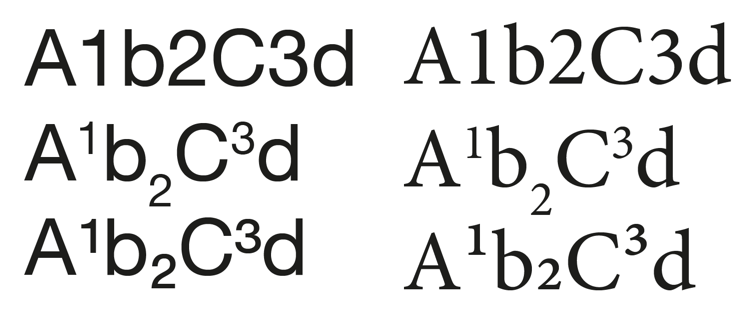
I'm not sure this is the best forum for this, but I'm not sure it is design or build either.
I'm making my first font in FontForge, targeting Type1.
There are some glyphs in it that I don't really see the point of creating, specifically superscript 1,2,3 and the fractions 1/4, 1/2, 3/4
There are already all nine ordinal numbers, and software has to be able to make superscripts (and subscripts) using them (and letters too) as well as fractions.
I can understand if software couldn't do that, maybe that would have been hard for early DOS based word processors, but for software that isn't able to make {super,sub}scripts and fractions, what is in ISO8859-1 isn't enough to even cover many common usages. I suspect most modern software will ignore those glyphs and create the superscript and fractions themselves.
Is it considered poor form to just leave those glyphs empty?
Also, it has a lower case mu which I assume is due to the metric system, it probably was deemed used often enough that latin fonts should have it.
What about additional glyphs that are now used often enough post the creation of ISO8859-1 ? e.g. the Euro? Is there a list of glyphs that are recommended be added to ISO8859-1 fonts somewhere?
Thanks for comments.