
I don't know if it's just me and I've never heard of this optical illusion but do the arms of this E appear to flare into the stem?
I like my corrected version better but I want to get some other thoughts on it. Thanks.
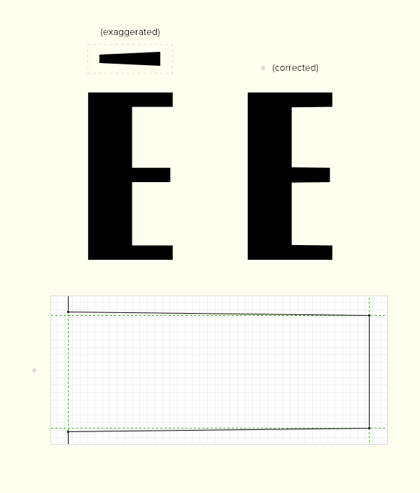
I don't know if it's just me and I've never heard of this optical illusion but do the arms of this E appear to flare into the stem?
I like my corrected version better but I want to get some other thoughts on it. Thanks.
Am I just crazy?

The one on the right looks wrong. I think it's your eyes. I have a similar thing with circles not appearing circular, but slightly super elliptical diamond shaped.

Jack, I have the same impression. But prior to adopting a change, I suggest you to make print tests to see if this illusion persists. Screen bright may induct different impressions than prints.

If anything, the open end has to be thicker (generally).
hhp

I'm with Hrant on this one.

Me too!
Ditto.
> I have a similar thing with circles not appearing circular, but slightly super elliptical diamond shaped.
You are not alone on that, it’s actually a common optical illusion. I mentioned it in the article I just wrote for Communication Arts....
Link?
And you wrote a piece like that last year, right?
hhp
Article is in press, won’t be out until March, sorry!
Sure – just remind me to remind you. ;-)
hhp
I'm sure you'll see me tweet and FB and such when the article is out. It's about how to tell well-crafted fonts from crap, which ends up being basically about all the tricks of human perception you have to compensate for in type design.

Thomas, I would love to read that article as well when it's out.
I also agree the open ends have to be thicker generally, but which E looks better is contextual in my opinion. From a distance the left E looks better, and I suppose this is the best way to view the typeface. When I look up close though I see the left E features semi-transparent pixels to suggest a very slight slant whereas the right E features very sharp horizontal lines. I don't think this is an optical illusion which actually affects the shape of the letter though. I don't think it should be compensated for. Perhaps only if you're doing a really big geometric display letter.
Captured from web.archive.org on 16 Apr 2015. view this capture