
Hi, The Q symbol has probably been customised from the main typeface.
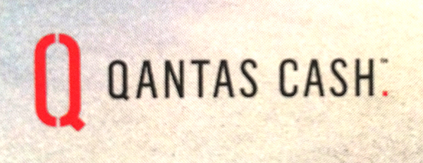

Font:
Flama Condensed
Solved By:
Hi, The Q symbol has probably been customised from the main typeface.

Knowing Qantas, this is likely to be a custom font. It is a very close match for Alternate Gothic No. 3 in terms of character shapes, widths etc. — though Alternate Gothic is quite heavy and doesn't have the straight tail on the /Q/.
Qantas have rebranded recently. You may be interested in seeing their current corporate style book, available here.

Looks like Mario Feliciano’s Flama Condensed to me.
Thanks again for your help osamu.
R - you've got it! Thanks.
Captured from web.archive.org on 25 Aug 2014. view this capture