
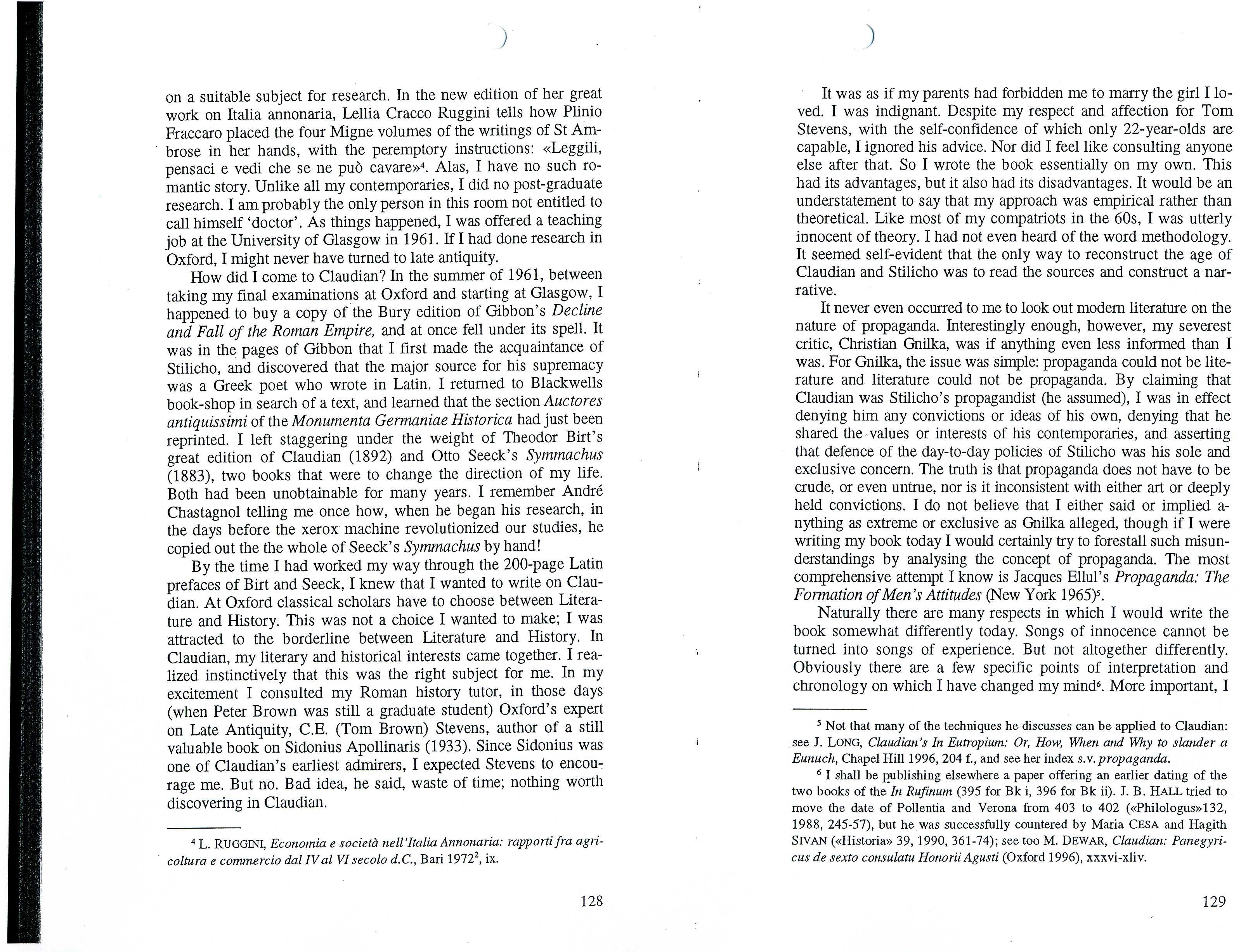
A book published in 2000 by the Italian publishing house L'Erma di Bretschneider uses this font. Since it is a congress volume, it includes contributions in several different languages.
I tried to figure it out with "What the font"; it suggested "Georgia Pro Condensed Light", which is a close match, but the shape of the letter "Q" is clearly different.
Help is very much appreciated!
SNAG-0020.jpg is a very clear scan I did from the book itself.

SNAG-0021.jpg is included because it showes the shape of the letter "Q".

img0009.jpg is a full page scan, unfortunately from a photo copy.

| Attachment | Size |
|---|---|
| SNAG-0020.jpg | 12.73 KB |
| SNAG-0021.jpg | 7.54 KB |
| img009.jpg | 1.83 MB |




Hi there,
thanks a lot for the quick help! The serifs do match!
But which Times variant is it exactly?
In this version, for instance, everything looks more streched:
http://store1.adobe.com/cfusion/store/html/index.cfm?nr=0&store=OLS-US&e...
Thanks again!