
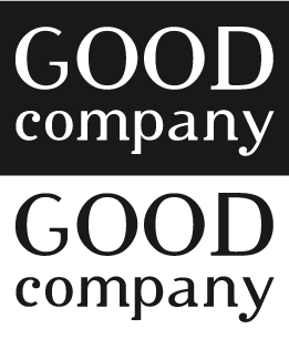
Would love to hear some feedback from experts & general, trying to build a visual identity for a new business venture, The key tags being: Simple, Classy & unique
Would love to hear some feedback from experts & general, trying to build a visual identity for a new business venture, The key tags being: Simple, Classy & unique

I'd say it's too playful and cutesy and as such more fit, say, for a craftwoman's blog than a "strategy consulting". Also with its fancy glyph shapes it doesn't have a "simple" vibe to it. In other words it *is* unique though, but I'm afraid it's neither simple nor classy.

Thanks @apankrat & @Special-k, the default typeface / Cypher is blunt, but wit the added kerning I think..it looks more broken. I assumed the rhythm of the terminals would come off as balanced,..atleast for "Good".
Will work over it again
Captured from web.archive.org on 2 Jul 2014. view this capture
looks like serifs have been randomly hacked off. Not sure what that really communicates...